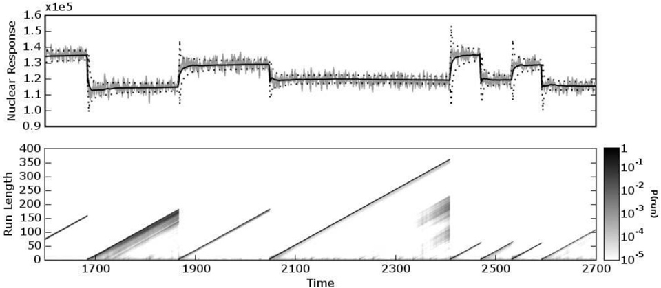
## Combined Chart: Nuclear Response and Run Length vs. Time
### Overview
The image presents two charts stacked vertically. The top chart displays the "Nuclear Response" over time, showing fluctuations and plateaus. The bottom chart is a heatmap showing "Run Length" over time, with the color intensity representing the probability P(run).
### Components/Axes
**Top Chart:**
* **Y-axis:** "Nuclear Response" with a scale factor of x1e5. The axis ranges from 0.9 x1e5 to 1.6 x1e5, with tick marks at 0.9, 1.0, 1.1, 1.2, 1.3, 1.4, 1.5, and 1.6.
* **X-axis:** "Time" (shared with the bottom chart).
* **Data Series:**
* A noisy gray line that fluctuates around a central value.
* A solid black line that represents a smoothed version of the noisy gray line.
* A dashed black line that appears to be a model or prediction.
**Bottom Chart:**
* **Y-axis:** "Run Length" ranging from 0 to 400, with tick marks every 50 units.
* **X-axis:** "Time" ranging from approximately 1600 to 2700, with tick marks at 1700, 1900, 2100, 2300, 2500, and 2700.
* **Colorbar (Right):** Represents "P(run)" (probability of run) on a logarithmic scale, ranging from 1 (darkest) to 10^-5 (lightest). The colorbar has tick marks at 1, 10^-1, 10^-2, 10^-3, 10^-4, and 10^-5.
### Detailed Analysis
**Top Chart (Nuclear Response):**
* **Time 1600-1850:** The nuclear response is relatively stable around 1.4 x1e5.
* **Time 1850-1900:** The nuclear response drops sharply to approximately 1.15 x1e5.
* **Time 1900-2350:** The nuclear response remains relatively stable around 1.2 x1e5.
* **Time 2350-2450:** The nuclear response increases sharply to approximately 1.4 x1e5.
* **Time 2450-2500:** The nuclear response drops sharply to approximately 1.15 x1e5.
* **Time 2500-2700:** The nuclear response remains relatively stable around 1.2 x1e5.
**Bottom Chart (Run Length):**
* The heatmap shows diagonal lines originating from the x-axis. The slope of these lines indicates the rate of increase in "Run Length" over time.
* The intensity of the lines represents the probability "P(run)". Darker lines indicate higher probabilities.
* Several distinct "runs" are visible, starting at different times.
* The run starting around time 2300 shows a more diffuse pattern, indicating a wider range of run lengths with significant probability.
### Key Observations
* The "Nuclear Response" exhibits distinct plateaus and sharp transitions.
* The "Run Length" heatmap shows discrete runs with varying probabilities.
* The time axis is shared between the two charts, allowing for direct comparison of the "Nuclear Response" and "Run Length" behavior.
### Interpretation
The data suggests a relationship between the "Nuclear Response" and the initiation of "runs". The sharp transitions in "Nuclear Response" may be triggering events for the start of new runs. The heatmap provides information about the distribution of run lengths and their probabilities over time. The diffuse pattern around time 2300 suggests a more complex process or a change in the underlying dynamics. The dashed line in the top chart likely represents a model attempting to capture the dynamics of the nuclear response, and its deviations from the actual data (gray line) could indicate model limitations or unmodeled factors influencing the system.