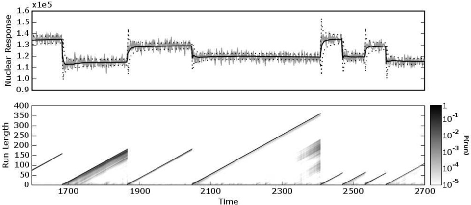
## Line Graph: Nuclear Response Over Time
### Overview
The image contains two subplots: a line graph (top) and a heatmap (bottom). The line graph shows a fluctuating "Nuclear Response" over time, while the heatmap visualizes "Run Length" probabilities across time and run length.
### Components/Axes
#### Line Graph (Top)
- **Y-Axis**: "Nuclear Response" (unit: x1e5, range: 0.9–1.6).
- **X-Axis**: "Time" (range: 1700–2700).
- **Legend**: Not explicitly labeled, but the line is black with gray noise bands.
- **Noise**: Gray vertical bands (likely representing uncertainty or variability).
#### Heatmap (Bottom)
- **X-Axis**: "Time" (range: 1700–2700).
- **Y-Axis**: "Run Length" (range: 0–400).
- **Color Scale**: Logarithmic probability (P(run)) from 10⁻⁵ (light gray) to 1 (black).
- **Legend**: Positioned on the right, with darker shades indicating higher probabilities.
### Detailed Analysis
#### Line Graph
- **Trend**: The line exhibits a step-like pattern with plateaus and abrupt drops.
- **Plateaus**:
- ~1.3 (1700–1900)
- ~1.2 (1900–2100)
- ~1.1 (2100–2300)
- ~1.0 (2300–2500)
- **Drops**: Sharp declines to ~1.0 at ~1900, ~2100, and ~2300.
- **Noise**: Vertical gray bands (likely representing measurement uncertainty) are present throughout.
- **Anomalies**: The y-axis label "x1e5" conflicts with the plotted values (0.9–1.6). This may indicate a unit mismatch or typo (e.g., "x1e5" could refer to a scaling factor for the noise, not the response itself).
#### Heatmap
- **Trend**: Diagonal bands of high probability (dark gray/black) appear at specific time intervals:
- **1900–2100**: A prominent band with run lengths ~100–300.
- **2300–2500**: Another band with run lengths ~100–300.
- **Other Periods**: Lower probabilities (lighter shades) dominate outside these intervals.
- **Key Features**:
- The heatmap suggests periodic "events" (e.g., system resets, failures) that correlate with the line graph's plateaus and drops.
- The logarithmic scale emphasizes rare, high-probability events.
### Key Observations
1. **Correlation**: The line graph's plateaus (stable nuclear response) align with the heatmap's high-probability run length bands.
2. **Anomalies**: The y-axis label "x1e5" is inconsistent with the plotted values (0.9–1.6). This may indicate a mislabeling or scaling error.
3. **Periodicity**: The heatmap's diagonal bands suggest recurring events every ~200–300 time units.
### Interpretation
The data likely represents a system with periodic stability (plateaus in nuclear response) and stress periods (drops). The heatmap's high-probability run lengths during these stress periods imply that the system experiences frequent resets or failures, which temporarily stabilize the nuclear response. The logarithmic probability scale highlights that extreme events (e.g., long run lengths) are rare but impactful. The y-axis label discrepancy ("x1e5") requires clarification, as it may affect the interpretation of the nuclear response magnitude.