\n
## Diagram: Probability Density Functions
### Overview
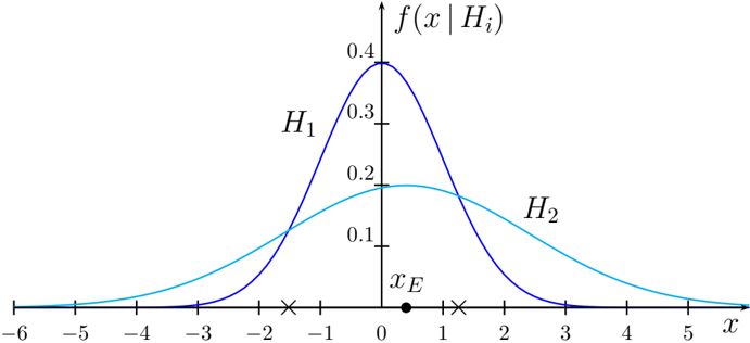
The image depicts two probability density functions (PDFs), labeled H1 and H2, plotted against a variable 'x'. A point 'xE' is marked on the x-axis, and vertical lines with 'x' markers indicate potential decision thresholds. The y-axis represents the probability density, f(x|Hi).
### Components/Axes
* **X-axis:** Labeled 'x', ranging from -6 to 5, with tick marks at integer values.
* **Y-axis:** Labeled 'f(x|Hi)', ranging from 0 to 0.4, with tick marks at 0.1, 0.2, 0.3, and 0.4.
* **Curve H1:** A dark blue, bell-shaped curve peaking around x = 0.
* **Curve H2:** A light blue, bell-shaped curve peaking around x = 2.
* **Point xE:** A solid black circle marking a specific value on the x-axis, approximately at x = 0.
* **Decision Thresholds:** Two 'x' markers are present on the x-axis, one at approximately x = -1 and the other at approximately x = 1.
* **Labels:** H1 and H2 are labels for the respective curves.
### Detailed Analysis
* **Curve H1:** The curve is symmetrical around x = 0. It rises from approximately x = -3 to a peak at x = 0, where f(x|H1) ≈ 0.4. It then declines symmetrically to approximately x = 3.
* **Curve H2:** The curve is also bell-shaped, but shifted to the right. It rises from approximately x = 0 to a peak at x = 2, where f(x|H2) ≈ 0.2. It then declines to approximately x = 4.
* **Point xE:** Located at x = 0, this point represents a specific value of x. The value of f(x|H1) at xE is approximately 0.4, and the value of f(x|H2) at xE is approximately 0.05.
* **Decision Thresholds:** The 'x' markers at x = -1 and x = 1 likely represent decision boundaries or thresholds for a statistical test.
### Key Observations
* H1 has a higher peak probability density than H2.
* H1 is centered around x = 0, while H2 is centered around x = 2.
* The point xE falls within the region where H1 has a significantly higher probability density than H2.
* The decision thresholds are positioned such that one is to the left of xE and one is to the right.
### Interpretation
This diagram likely illustrates a hypothesis testing scenario. H1 and H2 represent two competing hypotheses. The curves f(x|H1) and f(x|H2) are the probability density functions of an observed variable 'x' under each hypothesis. The point xE represents the observed value of 'x'. The decision thresholds at x = -1 and x = 1 are used to determine which hypothesis is more likely given the observed data.
The fact that xE falls within the region where H1 has a higher probability density suggests that H1 is the more likely hypothesis. The decision thresholds are used to formalize this decision, potentially by rejecting H1 if x falls below -1 or above 1. The diagram demonstrates the concept of likelihood ratio testing, where the ratio of the probability densities under the two hypotheses is used to make a decision. The placement of the thresholds influences the Type I and Type II error rates of the test.