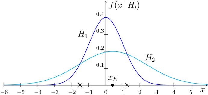
## Line Graph: Probability Distributions of H1 and H2
### Overview
The image depicts a line graph comparing two probability distributions, labeled **H1** (blue curve) and **H2** (cyan curve), plotted against an x-axis and a probability density function (f(x | Hi)) on the y-axis. The curves intersect at a critical point labeled **x_E** (marked with a black dot at x=0). The graph includes axis labels, a legend, and numerical markers.
---
### Components/Axes
- **X-axis**: Labeled "x", ranging from -6 to 5 in increments of 1. Key markers include:
- **x_E**: A black dot at x=0, annotated as the intersection point of H1 and H2.
- **Y-axis**: Labeled "f(x | Hi)", representing probability density, ranging from 0 to 0.4 in increments of 0.1.
- **Legend**: Located on the right side of the graph, associating:
- **H1**: Blue curve (peaks at x=-1).
- **H2**: Cyan curve (peaks at x=1).
---
### Detailed Analysis
1. **H1 (Blue Curve)**:
- **Shape**: Symmetric, bell-shaped distribution.
- **Peak**: Reaches a maximum of approximately **0.4** at x=-1.
- **Tails**: Gradually declines to near-zero values as x moves away from -1.
- **Intersection**: Crosses H2 at x_E (x=0), where f(x | H1) ≈ 0.1.
2. **H2 (Cyan Curve)**:
- **Shape**: Wider, flatter distribution compared to H1.
- **Peak**: Reaches a maximum of approximately **0.2** at x=1.
- **Tails**: Declines more gradually than H1, remaining above zero for a broader x-range.
- **Intersection**: Crosses H1 at x_E (x=0), where f(x | H2) ≈ 0.1.
3. **Critical Point (x_E)**:
- Located at x=0, where both curves intersect.
- At this point, f(x | H1) = f(x | H2) ≈ 0.1.
---
### Key Observations
- **H1 vs. H2**: H1 is narrower and taller, indicating higher probability density concentrated around x=-1. H2 is broader and flatter, suggesting a more dispersed distribution around x=1.
- **Intersection Significance**: The overlap at x_E (x=0) implies equal probability density for both hypotheses at this x-value.
- **Asymmetry**: H1’s peak is left of x_E, while H2’s peak is right of x_E, reflecting differing central tendencies.
---
### Interpretation
The graph likely represents a statistical comparison between two hypotheses (H1 and H2) in a decision-making or hypothesis-testing context. The intersection at x_E (x=0) could represent a **critical threshold** where evidence is equally supportive of both hypotheses.
- **H1’s Characteristics**: The sharp peak at x=-1 suggests H1 is more sensitive to deviations in the negative x-direction. This could indicate a hypothesis favoring specific conditions (e.g., a strict threshold).
- **H2’s Characteristics**: The broader distribution around x=1 implies H2 accommodates a wider range of x-values, possibly representing a more general or flexible hypothesis.
- **Practical Implications**: In scenarios like anomaly detection or classification, H1 might be preferred for precise thresholds, while H2 could be better suited for noisy or variable data.
The graph emphasizes the trade-off between specificity (H1) and generality (H2), with x_E serving as a pivotal point for decision boundaries.