# Technical Document Analysis of Line Chart
## Chart Overview
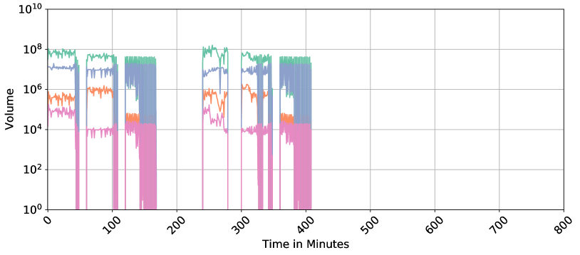
The image depicts a **line chart** with a **logarithmic y-axis** and a **linear x-axis**. The chart visualizes volume data over time, with four distinct data series represented by colored lines. No textual annotations or legends are explicitly visible in the image, but color-coding is used to differentiate data series.
---
## Axes and Labels
- **X-Axis (Horizontal):**
- Label: **"Time in Minutes"**
- Scale: Linear, ranging from **0 to 800** in increments of **100**.
- Ticks: Marked at **0, 100, 200, 300, 400, 500, 600, 700, 800**.
- **Y-Axis (Vertical):**
- Label: **"Volume"**
- Scale: Logarithmic, ranging from **10⁰ to 10¹⁰** in increments of **10²** (e.g., 10⁰, 10², 10⁴, ..., 10¹⁰).
- Ticks: Marked at **10⁰, 10², 10⁴, 10⁶, 10⁸, 10¹⁰**.
- **Gridlines:**
- Light gray gridlines span the entire chart, aligning with axis ticks.
---
## Data Series and Trends
Four colored lines represent distinct data series. Below is a breakdown of their visual trends and approximate values:
### 1. **Green Line**
- **Legend Position:** Top-right corner (color matches legend).
- **Trend:**
- Dominates the chart with the **highest peaks**, reaching up to **~10⁸** (100 million).
- Exhibits **sharp, intermittent spikes** between **0–400 minutes**, followed by a drop to **zero** after 400 minutes.
- Post-400 minutes, the line remains at **zero**.
### 2. **Blue Line**
- **Legend Position:** Top-right corner (color matches legend).
- **Trend:**
- Second-highest volume, peaking at **~10⁷** (10 million).
- Shows **moderate volatility** with smaller spikes compared to the green line.
- Drops to **zero** after 400 minutes.
### 3. **Orange Line**
- **Legend Position:** Top-right corner (color matches legend).
- **Trend:**
- Third-highest volume, peaking at **~10⁶** (1 million).
- Exhibits **smaller, less frequent spikes** than the green and blue lines.
- Drops to **zero** after 400 minutes.
### 4. **Pink Line**
- **Legend Position:** Top-right corner (color matches legend).
- **Trend:**
- Lowest volume, peaking at **~10⁴** (10,000).
- Shows **minimal activity** compared to other lines, with sparse spikes.
- Drops to **zero** after 400 minutes.
---
## Key Observations
1. **Volatility Patterns:**
- All lines exhibit activity **only between 0–400 minutes**, with no data beyond this point.
- The green line is the most volatile, followed by blue, orange, and pink.
2. **Volume Hierarchy:**
- Green > Blue > Orange > Pink (in terms of peak volume).
3. **Logarithmic Scale Impact:**
- The y-axis compresses large values, making differences between 10⁶ and 10⁸ appear less pronounced than they are.
4. **Legend Placement:**
- The legend is located in the **top-right corner** of the chart, but **no labels** are visible in the image.
---
## Missing Information
- **Legend Labels:** The chart includes a legend in the top-right corner, but the textual labels for the colors (e.g., "Series A," "Series B") are not visible in the image.
- **Numerical Data Points:** Exact values for peaks and troughs are not provided; only approximate magnitudes (e.g., 10⁸) are inferred from the logarithmic scale.
---
## Conclusion
The chart illustrates **time-dependent volume trends** for four data series, with activity concentrated in the first 400 minutes. The logarithmic y-axis emphasizes relative differences in volume magnitudes, while the linear x-axis provides a clear temporal framework. Without explicit legend labels or numerical annotations, further interpretation requires additional context.