\n
## Density Plot: Distribution of Positive and Negative Samples
### Overview
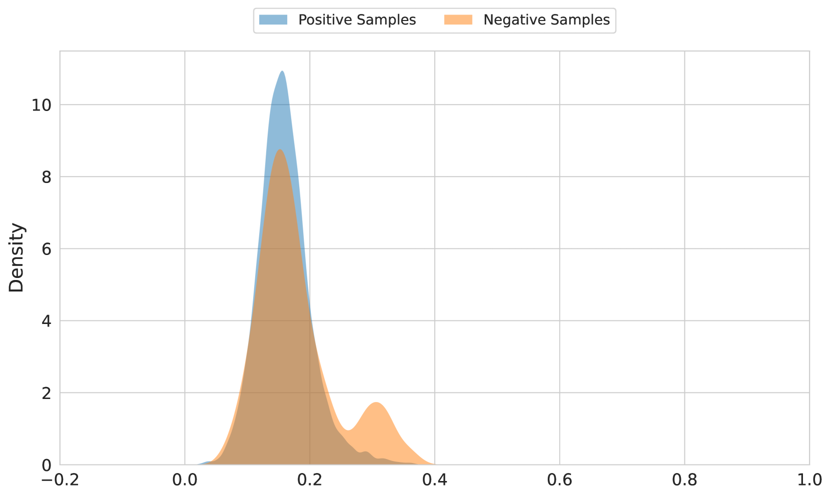
The image presents a density plot comparing the distributions of "Positive Samples" and "Negative Samples". The x-axis represents the range of values, likely representing a score or probability, from -0.2 to 1.0. The y-axis represents the density, ranging from 0 to approximately 10. The plot visualizes the frequency of different values for each sample type.
### Components/Axes
* **X-axis Title:** Not explicitly labeled, but represents a value range from -0.2 to 1.0.
* **Y-axis Title:** "Density"
* **Legend:** Located at the top-right corner.
* **Positive Samples:** Represented by a light blue fill.
* **Negative Samples:** Represented by a light orange fill.
* **Gridlines:** Present throughout the plot for easier value estimation.
### Detailed Analysis
The plot shows two overlapping density curves.
* **Positive Samples (Light Blue):** The density curve for positive samples peaks sharply around 0.15-0.2, with a density of approximately 9.5. The curve quickly descends on either side of the peak. The distribution appears to be concentrated in the range of 0 to 0.3.
* **Negative Samples (Light Orange):** The density curve for negative samples is broader and less pronounced than that of positive samples. It has a peak around 0.05-0.1, with a density of approximately 4.5. The curve extends further to the right, with a smaller peak around 0.3-0.4, with a density of approximately 2. The distribution is more spread out, ranging from -0.2 to 0.4.
### Key Observations
* The positive samples are more concentrated around a higher value (around 0.2) compared to the negative samples.
* The negative samples have a wider distribution, indicating more variability in their values.
* There is significant overlap between the two distributions, suggesting that it may be difficult to perfectly separate positive and negative samples based on this single feature.
* The density of positive samples is significantly higher than negative samples around the 0.15-0.2 range.
### Interpretation
The data suggests that the feature being measured can differentiate between positive and negative samples, but not perfectly. Positive samples tend to have higher values, while negative samples are more dispersed. The overlap in distributions indicates that there is some ambiguity, and some positive samples may have values similar to negative samples, and vice versa. This could be due to noise in the data, limitations of the feature itself, or the presence of underlying subgroups within each sample type. The difference in peak density suggests that the feature is more indicative of positive samples than negative samples. Further analysis, potentially with additional features, would be needed to improve the accuracy of classification.