## Kernel Density Estimation: Distribution of a Continuous Variable
### Overview
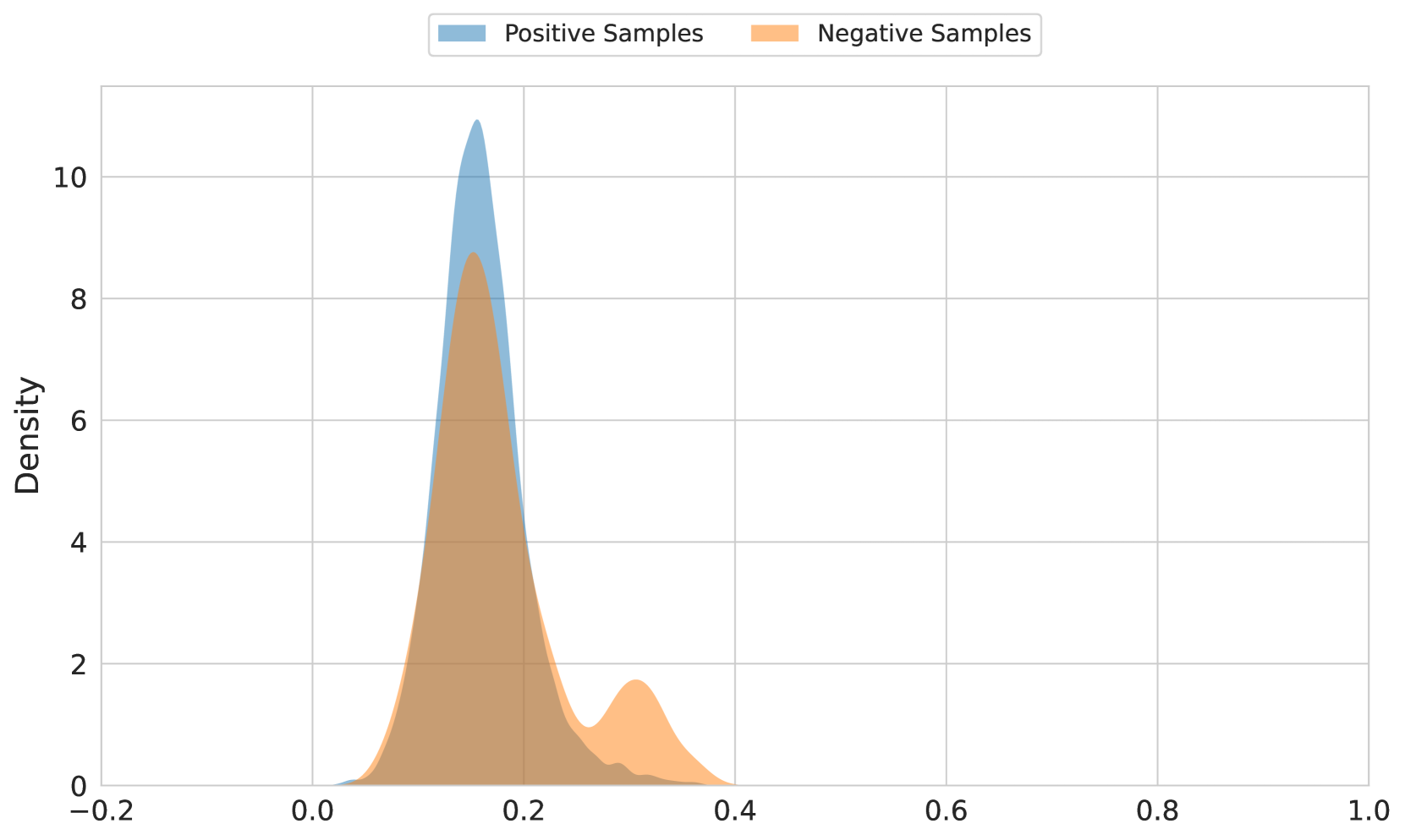
The image displays a kernel density estimation (KDE) plot, which is a non-parametric way to estimate the probability density function of a random variable. The plot shows the distribution of a continuous variable, with two distinct groups: positive samples (blue) and negative samples (orange).
### Components/Axes
- **X-axis**: Represents the continuous variable, ranging from -0.2 to 1.0.
- **Y-axis**: Represents the density of the variable, ranging from 0 to 10.
- **Legend**: Two colors indicate the groups: blue for positive samples and orange for negative samples.
### Detailed Analysis or ### Content Details
- **Positive Samples**: The blue area is concentrated around the value 0.2, indicating a higher density of positive samples in this region.
- **Negative Samples**: The orange area is more spread out, with a higher density around the value 0.6.
- **Overlap**: There is a noticeable overlap between the two groups, suggesting that some samples fall into both categories.
### Key Observations
- **Trends**: The density of positive samples is higher around 0.2, while the density of negative samples is higher around 0.6.
- **Outliers**: There are no significant outliers in either group.
- **Anomalies**: The overlap between the two groups suggests that there might be some overlap in the data, which could indicate a need for further analysis to understand the relationship between the two categories.
### Interpretation
The KDE plot suggests that the variable being analyzed has two distinct groups, with positive samples being more concentrated around 0.2 and negative samples being more concentrated around 0.6. The overlap between the two groups indicates that there might be some correlation or relationship between the two categories. This information could be useful for further analysis to understand the underlying factors that contribute to the differences between the two groups.