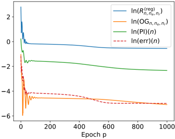
## Chart: Convergence Plot
### Overview
The image is a line chart showing the convergence of several logarithmic quantities as a function of the epoch number 'p'. The chart displays four different data series: ln(R^(reg)_(n,ne,nr)), ln(OG_(n,ne,nr)), ln(PI(n)), and ln(err(n)). The x-axis represents the epoch number, ranging from 0 to 1000. The y-axis represents the logarithmic values, ranging from -6 to 2.
### Components/Axes
* **X-axis:** Epoch p, ranging from 0 to 1000.
* **Y-axis:** Logarithmic values, ranging from -6 to 2.
* **Legend (top-right):**
* Blue line: ln(R^(reg)_(n,ne,nr))
* Orange line: ln(OG_(n,ne,nr))
* Green line: ln(PI(n))
* Red dashed line: ln(err(n))
### Detailed Analysis
* **ln(R^(reg)_(n,ne,nr)) (Blue):**
* Trend: Starts high (around 2.5) and rapidly decreases to approximately 0 within the first 50 epochs. It then slowly decreases further, stabilizing around -0.5 after 400 epochs.
* Data Points:
* Epoch 0: ~2.5
* Epoch 50: ~0
* Epoch 400: ~-0.5
* Epoch 1000: ~-0.5
* **ln(OG_(n,ne,nr)) (Orange):**
* Trend: Starts very low (around -6) and rapidly increases with oscillations to approximately -4.5 within the first 100 epochs. It then slowly decreases, stabilizing around -5 after 500 epochs.
* Data Points:
* Epoch 0: ~-6
* Epoch 100: ~-4.5
* Epoch 500: ~-5
* Epoch 1000: ~-5
* **ln(PI(n)) (Green):**
* Trend: Starts around -1.5 and rapidly decreases to approximately -2 within the first 50 epochs. It then remains relatively stable around -2.2 for the rest of the epochs.
* Data Points:
* Epoch 0: ~-1.5
* Epoch 50: ~-2
* Epoch 1000: ~-2.2
* **ln(err(n)) (Red Dashed):**
* Trend: Starts very low (around -6) and rapidly increases with oscillations to approximately -4.5 within the first 100 epochs. It then slowly decreases, stabilizing around -4.8 after 500 epochs.
* Data Points:
* Epoch 0: ~-6
* Epoch 100: ~-4.5
* Epoch 500: ~-4.8
* Epoch 1000: ~-4.8
### Key Observations
* All four data series show rapid changes in the initial epochs (0-100).
* The ln(R^(reg)_(n,ne,nr)) series converges to a value around -0.5.
* The ln(OG_(n,ne,nr)) and ln(err(n)) series converge to values around -5 and -4.8, respectively.
* The ln(PI(n)) series converges to a value around -2.2.
* The orange and red dashed lines (ln(OG_(n,ne,nr)) and ln(err(n))) are very similar in shape and values.
### Interpretation
The chart illustrates the convergence behavior of different quantities during an iterative process, likely related to a machine learning or optimization algorithm. The logarithmic scale allows for visualizing the changes in quantities that may vary over several orders of magnitude. The rapid changes in the initial epochs suggest that the algorithm is quickly adapting or learning, while the stabilization in later epochs indicates convergence towards a solution. The similarity between ln(OG_(n,ne,nr)) and ln(err(n)) suggests a strong correlation between these two quantities, possibly indicating that OG is related to the error. The fact that R^(reg) converges to a higher value than the others might indicate that it is a regularized quantity, preventing it from decreasing too much.