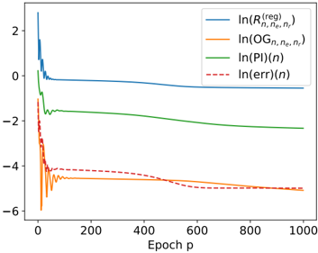
## Line Chart: Logarithmic Performance Metrics vs. Training Epochs
### Overview
The image is a line chart displaying the evolution of four different logarithmic metrics over the course of 1000 training epochs. The chart uses a logarithmic scale on the y-axis (implied by the `ln()` notation in the legend) and a linear scale on the x-axis for epochs. The overall trend shows an initial period of high volatility for all metrics within the first ~50 epochs, followed by stabilization or steady trends.
### Components/Axes
* **X-Axis:**
* **Label:** `Epoch p`
* **Scale:** Linear, from 0 to 1000.
* **Major Ticks:** 0, 200, 400, 600, 800, 1000.
* **Y-Axis:**
* **Label:** None explicitly stated. Values represent the natural logarithm (`ln`) of various quantities.
* **Scale:** Linear representation of logarithmic values, ranging from approximately -6 to +2.
* **Major Ticks:** -6, -4, -2, 0, 2.
* **Legend:**
* **Position:** Top-right corner of the plot area.
* **Entries (in order):**
1. **Blue Solid Line:** `ln(R^{req}_{n, n_e, n_t})`
2. **Orange Solid Line:** `ln(OG_{n, n_e, n_t})`
3. **Green Solid Line:** `ln(PI)(n)`
4. **Red Dashed Line:** `ln(err)(n)`
### Detailed Analysis
**Trend Verification & Data Point Extraction (Approximate):**
1. **`ln(R^{req}_{n, n_e, n_t})` (Blue Line):**
* **Trend:** Starts very high, plummets sharply within the first ~20 epochs, then stabilizes into a very slow, almost flat decline.
* **Key Points:**
* Epoch 0: ~2.5 (peak)
* Epoch ~20: Drops to ~0.0
* Epoch 100: ~ -0.2
* Epoch 1000: ~ -0.5
2. **`ln(OG_{n, n_e, n_t})` (Orange Line):**
* **Trend:** Exhibits extreme volatility (spikes and dips) in the first ~50 epochs, then settles into a stable, slightly fluctuating plateau.
* **Key Points:**
* Epoch 0: ~ -2.0
* Epoch ~10: Sharp dip to ~ -6.0 (lowest point on chart).
* Epoch ~50: Stabilizes around -4.5 to -5.0.
* Epoch 1000: ~ -5.0
3. **`ln(PI)(n)` (Green Line):**
* **Trend:** Shows a consistent, smooth downward slope throughout the entire range, with a slight flattening in later epochs.
* **Key Points:**
* Epoch 0: ~0.0
* Epoch 200: ~ -1.5
* Epoch 600: ~ -2.0
* Epoch 1000: ~ -2.2
4. **`ln(err)(n)` (Red Dashed Line):**
* **Trend:** Follows a similar initial volatile pattern to the orange line but with less extreme spikes. After epoch ~100, it begins a steady, gradual decline.
* **Key Points:**
* Epoch 0: ~ -1.0
* Epoch ~10: Sharp dip to ~ -4.5.
* Epoch 100: ~ -4.2
* Epoch 500: ~ -4.5
* Epoch 1000: ~ -5.0 (converging with the orange line).
### Key Observations
1. **Two-Phase Behavior:** All metrics show a distinct "transient phase" (epochs 0-50) characterized by rapid changes and volatility, followed by a "steady-state phase" (epochs 50-1000) of gradual trends or stability.
2. **Convergence:** The orange (`ln(OG)`) and red dashed (`ln(err)`) lines appear to converge to a similar value (~ -5.0) by epoch 1000.
3. **Relative Magnitudes:** In the steady state, the metrics maintain a clear order from highest to lowest: `ln(R^{req})` > `ln(PI)` > `ln(err)` ≈ `ln(OG)`.
4. **Volatility Correlation:** The initial volatility is most pronounced in the `ln(OG)` and `ln(err)` metrics, suggesting these quantities are highly sensitive to early training dynamics.
### Interpretation
This chart likely visualizes the training dynamics of a machine learning or optimization model. The `ln()` notation indicates the plotted values are orders of magnitude, making it easier to see relative changes across scales.
* **`ln(R^{req})` (Blue):** This could represent a "required resource" or "regularization" term. Its rapid initial drop suggests the model quickly finds a configuration that satisfies a core requirement, after which further optimization yields minimal gains.
* **`ln(PI)` (Green):** Possibly a "Performance Index" or "Profit Indicator." Its steady, smooth decline indicates continuous, stable improvement in the model's primary objective throughout training.
* **`ln(OG)` (Orange) & `ln(err)` (Red Dashed):** These likely represent an "Objective Gap" (difference from optimal) and a direct "Error" metric, respectively. Their correlated volatility and eventual convergence suggest that minimizing the error is directly tied to closing the gap to the optimal solution. The initial spikes may correspond to the model exploring the parameter space or encountering difficult batches of data.
**Overall Narrative:** The model undergoes a chaotic but brief initial learning phase where error and objective gap fluctuate wildly. It quickly stabilizes a key requirement (`R^{req}`) and then enters a prolonged phase of steady, incremental improvement in its core performance (`PI`), while its error and distance from the optimum (`OG`) decrease in tandem and eventually converge. The chart demonstrates successful learning, with all metrics trending favorably (downward on a log scale) over time.