\n
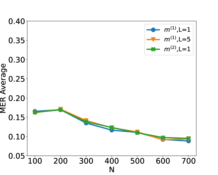
## Line Chart: MER Average vs. N
### Overview
The image displays a line chart plotting the "MER Average" on the y-axis against a variable "N" on the x-axis. Three distinct data series, differentiated by color and marker style, are shown. All three series exhibit a similar overall downward trend as N increases, with values tightly clustered throughout the range.
### Components/Axes
* **Chart Type:** Line chart with markers.
* **X-Axis:**
* **Label:** "N"
* **Scale:** Linear, ranging from 100 to 700.
* **Tick Markers:** 100, 200, 300, 400, 500, 600, 700.
* **Y-Axis:**
* **Label:** "MER Average"
* **Scale:** Linear, ranging from 0.05 to 0.40.
* **Tick Markers:** 0.05, 0.10, 0.15, 0.20, 0.25, 0.30, 0.35, 0.40.
* **Legend:**
* **Position:** Top-right corner of the plot area.
* **Series 1:** Blue line with circle markers, labeled `m^(1), L=1`.
* **Series 2:** Orange line with downward-pointing triangle markers, labeled `m^(1), L=5`.
* **Series 3:** Green line with 'X' (cross) markers, labeled `m^(2), L=1`.
### Detailed Analysis
**Trend Verification:** All three lines follow a consistent visual pattern: they start at a moderate value at N=100, rise slightly to a peak at N=200, and then decline steadily as N increases to 700.
**Data Point Extraction (Approximate Values):**
* **At N=100:**
* `m^(1), L=1` (Blue, Circle): ~0.165
* `m^(1), L=5` (Orange, Triangle): ~0.165
* `m^(2), L=1` (Green, X): ~0.165
* *Note: All three points are nearly coincident.*
* **At N=200 (Peak for all series):**
* `m^(1), L=1` (Blue, Circle): ~0.170
* `m^(1), L=5` (Orange, Triangle): ~0.172
* `m^(2), L=1` (Green, X): ~0.170
* **At N=300:**
* `m^(1), L=1` (Blue, Circle): ~0.135
* `m^(1), L=5` (Orange, Triangle): ~0.145
* `m^(2), L=1` (Green, X): ~0.140
* **At N=400:**
* `m^(1), L=1` (Blue, Circle): ~0.118
* `m^(1), L=5` (Orange, Triangle): ~0.125
* `m^(2), L=1` (Green, X): ~0.125
* **At N=500:**
* `m^(1), L=1` (Blue, Circle): ~0.110
* `m^(1), L=5` (Orange, Triangle): ~0.112
* `m^(2), L=1` (Green, X): ~0.110
* **At N=600:**
* `m^(1), L=1` (Blue, Circle): ~0.092
* `m^(1), L=5` (Orange, Triangle): ~0.092
* `m^(2), L=1` (Green, X): ~0.098
* **At N=700:**
* `m^(1), L=1` (Blue, Circle): ~0.088
* `m^(1), L=5` (Orange, Triangle): ~0.090
* `m^(2), L=1` (Green, X): ~0.095
### Key Observations
1. **Dominant Trend:** The primary pattern is a clear, monotonic decrease in MER Average for all series as N increases beyond 200.
2. **Initial Rise:** There is a slight but consistent increase in MER Average from N=100 to N=200 for all configurations.
3. **Tight Clustering:** The three data series are remarkably close in value across the entire range of N. The maximum visible separation between any two lines at a given N point is small (estimated at ≤0.01 on the MER Average scale).
4. **Minimal Parameter Impact:** The variations in parameters `m` (1 vs. 2) and `L` (1 vs. 5) appear to have a very minor effect on the MER Average compared to the effect of changing N. The orange line (`m^(1), L=5`) is occasionally slightly higher than the others (e.g., at N=300, N=400), but the difference is not dramatic.
5. **Convergence at High N:** At the highest N values (600, 700), the lines remain distinct but very close, with the green line (`m^(2), L=1`) ending marginally higher than the other two.
### Interpretation
The chart demonstrates a strong inverse relationship between the variable N and the metric "MER Average." As N increases from 200 to 700, the average MER consistently improves (decreases). This suggests that whatever system or process is being measured benefits significantly from a larger N value within this range.
The near-overlap of the three lines indicates that, for the conditions tested, the choice between the model variants `m^(1)` and `m^(2)`, or the parameter `L=1` versus `L=5`, is not a primary driver of performance. The system's sensitivity to N vastly outweighs its sensitivity to these specific parameter changes. The slight peak at N=200 could indicate a transitional point or an optimal setting before the benefits of increasing N become dominant. The consistent ranking (with `m^(1), L=5` often slightly higher) might hint at a very subtle performance cost for increasing L, but the data is too clustered to draw a firm conclusion without more precise values. The overall message is that increasing N is the most effective lever for reducing MER Average in this scenario.