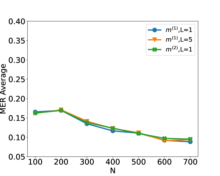
## Line Chart: MER Average vs. N
### Overview
The image is a line chart that plots the MER (Minimum Error Rate) Average against the variable N. There are three data series represented by different colored lines with distinct markers: blue circles, orange triangles, and green diamonds. All three lines show a generally decreasing trend as N increases.
### Components/Axes
* **X-axis (Horizontal):** Labeled "N". The axis ranges from 100 to 700, with tick marks at intervals of 100 (100, 200, 300, 400, 500, 600, 700).
* **Y-axis (Vertical):** Labeled "MER Average". The axis ranges from 0.05 to 0.40, with tick marks at intervals of 0.05 (0.05, 0.10, 0.15, 0.20, 0.25, 0.30, 0.35, 0.40).
* **Legend (Top-Right):**
* Blue line with circle markers: m^(1), L=1
* Orange line with triangle markers: m^(1), L=5
* Green line with diamond markers: m^(2), L=1
### Detailed Analysis
* **Blue Line (m^(1), L=1):**
* Trend: Decreasing.
* Data Points:
* N=100, MER Average ≈ 0.165
* N=200, MER Average ≈ 0.17
* N=300, MER Average ≈ 0.135
* N=400, MER Average ≈ 0.118
* N=500, MER Average ≈ 0.11
* N=600, MER Average ≈ 0.095
* N=700, MER Average ≈ 0.088
* **Orange Line (m^(1), L=5):**
* Trend: Decreasing.
* Data Points:
* N=100, MER Average ≈ 0.165
* N=200, MER Average ≈ 0.172
* N=300, MER Average ≈ 0.14
* N=400, MER Average ≈ 0.122
* N=500, MER Average ≈ 0.11
* N=600, MER Average ≈ 0.095
* N=700, MER Average ≈ 0.095
* **Green Line (m^(2), L=1):**
* Trend: Decreasing.
* Data Points:
* N=100, MER Average ≈ 0.162
* N=200, MER Average ≈ 0.17
* N=300, MER Average ≈ 0.138
* N=400, MER Average ≈ 0.122
* N=500, MER Average ≈ 0.112
* N=600, MER Average ≈ 0.098
* N=700, MER Average ≈ 0.095
### Key Observations
* All three lines exhibit a similar decreasing trend, indicating that as N increases, the MER Average decreases.
* The lines are relatively close to each other, suggesting that the different configurations (m^(1), L=1; m^(1), L=5; m^(2), L=1) have a similar impact on the MER Average.
* The most significant drop in MER Average occurs between N=200 and N=300 for all three lines.
* The lines converge as N approaches 700, indicating that the differences between the configurations become less pronounced at higher values of N.
### Interpretation
The chart suggests that increasing the value of 'N' leads to a reduction in the Minimum Error Rate (MER) Average, regardless of the specific configuration of 'm' and 'L' tested. The convergence of the lines at higher 'N' values implies that the impact of 'm' and 'L' on MER diminishes as 'N' increases. The initial rapid decrease in MER suggests that there are diminishing returns to increasing 'N', as the rate of improvement slows down at higher values. The data indicates that optimizing 'N' is crucial for minimizing error rates, and that beyond a certain point, further increases in 'N' may not yield significant improvements.