\n
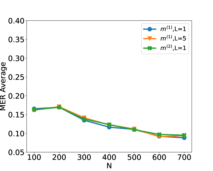
## Line Chart: MER Average vs. N for Different Parameters
### Overview
This image presents a line chart illustrating the relationship between 'N' (likely a sample size or number of iterations) and the 'MER Average' (likely a metric for error or performance) for three different parameter sets: m<sup>(1)</sup>, L=1; m<sup>(1)</sup>, L=5; and m<sup>(2)</sup>, L=1. The chart aims to demonstrate how the MER Average changes as N increases for each of these configurations.
### Components/Axes
* **X-axis:** Labeled "N". Scale ranges from approximately 100 to 700, with markers at 100, 200, 300, 400, 500, 600, and 700.
* **Y-axis:** Labeled "MER Average". Scale ranges from approximately 0.05 to 0.40, with markers at 0.05, 0.10, 0.15, 0.20, 0.25, 0.30, 0.35, and 0.40.
* **Legend:** Located in the top-right corner of the chart. Contains the following entries:
* Blue line with circle markers: m<sup>(1)</sup>, L=1
* Orange line with triangle markers: m<sup>(1)</sup>, L=5
* Green line with diamond markers: m<sup>(2)</sup>, L=1
### Detailed Analysis
* **m<sup>(1)</sup>, L=1 (Blue Line):** The blue line shows a decreasing trend from N=100 to N=400, then plateaus.
* N=100: MER Average ≈ 0.16
* N=200: MER Average ≈ 0.14
* N=300: MER Average ≈ 0.13
* N=400: MER Average ≈ 0.12
* N=500: MER Average ≈ 0.11
* N=600: MER Average ≈ 0.10
* N=700: MER Average ≈ 0.09
* **m<sup>(1)</sup>, L=5 (Orange Line):** The orange line also shows a decreasing trend from N=100 to N=400, then plateaus. It starts slightly higher than the blue line and ends slightly higher.
* N=100: MER Average ≈ 0.17
* N=200: MER Average ≈ 0.16
* N=300: MER Average ≈ 0.14
* N=400: MER Average ≈ 0.12
* N=500: MER Average ≈ 0.11
* N=600: MER Average ≈ 0.10
* N=700: MER Average ≈ 0.09
* **m<sup>(2)</sup>, L=1 (Green Line):** The green line exhibits a similar decreasing trend from N=100 to N=400, then plateaus. It starts and ends lower than the other two lines.
* N=100: MER Average ≈ 0.16
* N=200: MER Average ≈ 0.15
* N=300: MER Average ≈ 0.13
* N=400: MER Average ≈ 0.11
* N=500: MER Average ≈ 0.10
* N=600: MER Average ≈ 0.09
* N=700: MER Average ≈ 0.08
### Key Observations
* All three lines demonstrate a decreasing MER Average as N increases, suggesting that increasing the sample size or number of iterations improves performance (reduces error).
* The parameter set m<sup>(1)</sup>, L=5 consistently yields a slightly higher MER Average than m<sup>(1)</sup>, L=1.
* The parameter set m<sup>(2)</sup>, L=1 consistently yields a lower MER Average than the other two parameter sets.
* The rate of decrease in MER Average diminishes as N increases, indicating diminishing returns.
* All three lines converge towards a similar MER Average value around N=700.
### Interpretation
The chart suggests that increasing 'N' generally leads to improved performance, as measured by the MER Average. The differences between the parameter sets (m<sup>(1)</sup>, L=1 vs. m<sup>(1)</sup>, L=5 vs. m<sup>(2)</sup>, L=1) indicate that the choice of parameters significantly impacts performance. Specifically, m<sup>(2)</sup>, L=1 appears to be the most effective configuration, while m<sup>(1)</sup>, L=5 is the least effective. The plateauing of the lines at higher values of N suggests that there is a limit to the performance improvement achievable by simply increasing N. Further investigation might be needed to determine if other parameters or techniques could be used to further enhance performance beyond this point. The 'L' parameter likely represents a length or level, and the 'm' parameter likely represents a model or method. The convergence of the lines at higher N values could indicate that the effect of the 'L' parameter diminishes as N increases.