# Technical Document Extraction: Line Chart Analysis
## Chart Overview
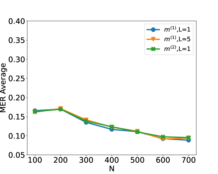
The image depicts a line chart comparing three mathematical models (`m^(1),L=1`, `m^(1),L=5`, `m^(2),L=1`) across varying values of `N` (100–700). The y-axis represents the "MER Average" metric, while the x-axis represents the parameter `N`.
---
### **Axis Labels and Markers**
- **X-Axis (Horizontal):**
- Label: `N`
- Range: 100 to 700 (increments of 100)
- Tick Marks: 100, 200, 300, 400, 500, 600, 700
- **Y-Axis (Vertical):**
- Label: `MER Average`
- Range: 0.05 to 0.40 (increments of 0.05)
- Tick Marks: 0.05, 0.10, 0.15, 0.20, 0.25, 0.30, 0.35, 0.40
---
### **Legend**
- **Location:** Top-right corner of the chart
- **Entries:**
1. `m^(1),L=1` (Blue circles)
2. `m^(1),L=5` (Orange triangles)
3. `m^(2),L=1` (Green stars)
---
### **Data Series Analysis**
#### 1. `m^(1),L=1` (Blue Circles)
- **Trend:**
- Starts at ~0.16 at `N=100`
- Gradually declines to ~0.09 at `N=700`
- Consistent downward slope with minimal fluctuation
- **Key Data Points:**
- `N=100`: ~0.16
- `N=200`: ~0.17
- `N=300`: ~0.14
- `N=400`: ~0.12
- `N=500`: ~0.11
- `N=600`: ~0.095
- `N=700`: ~0.09
#### 2. `m^(1),L=5` (Orange Triangles)
- **Trend:**
- Begins slightly higher than `m^(1),L=1` at `N=100` (~0.165)
- Peaks at `N=200` (~0.175)
- Declines steadily to ~0.095 at `N=700`
- **Key Data Points:**
- `N=100`: ~0.165
- `N=200`: ~0.175
- `N=300`: ~0.145
- `N=400`: ~0.125
- `N=500`: ~0.115
- `N=600`: ~0.098
- `N=700`: ~0.095
#### 3. `m^(2),L=1` (Green Stars)
- **Trend:**
- Starts slightly lower than `m^(1),L=1` at `N=100` (~0.155)
- Sharp decline to ~0.10 at `N=300`
- Flattens to ~0.098 at `N=700`
- **Key Data Points:**
- `N=100`: ~0.155
- `N=200`: ~0.16
- `N=300`: ~0.10
- `N=400`: ~0.11
- `N=500`: ~0.105
- `N=600`: ~0.098
- `N=700`: ~0.098
---
### **Cross-Reference Validation**
- **Legend Colors vs. Line Colors:**
- Blue circles (`m^(1),L=1`) match the blue line.
- Orange triangles (`m^(1),L=5`) match the orange line.
- Green stars (`m^(2),L=1`) match the green line.
- **Spatial Grounding:**
- Legend is positioned in the top-right corner, outside the plot area.
- All data points align with their respective legend labels.
---
### **Conclusion**
The chart illustrates a general trend of decreasing `MER Average` values for all models as `N` increases. The `m^(1),L=5` model exhibits the highest initial performance but converges with the other models at larger `N` values. The `m^(2),L=1` model shows the steepest initial decline but stabilizes at lower `N` values.