## Chart/Diagram Type: Combined Line Graph and Heatmap
### Overview
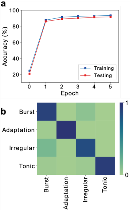
The image presents two sub-figures: (a) a line graph showing the accuracy of training and testing datasets over epochs, and (b) a heatmap displaying the relationship between different categories (Burst, Adaptation, Irregular, Tonic).
### Components/Axes
**Sub-figure (a): Line Graph**
* **Title:** Implicitly, "Accuracy vs. Epoch"
* **X-axis:** Epoch
* Scale: 0 to 5, incrementing by 1.
* **Y-axis:** Accuracy (%)
* Scale: 0 to 100, incrementing by 20.
* **Legend:** Located in the top-right of the graph.
* Training (Blue line with square markers)
* Testing (Red line with square markers)
**Sub-figure (b): Heatmap**
* **X-axis:** Categories (Burst, Adaptation, Irregular, Tonic)
* **Y-axis:** Categories (Burst, Adaptation, Irregular, Tonic)
* **Color Scale:** Ranges from approximately 0 (light green) to 1 (dark blue). The color scale is located on the right side of the heatmap.
### Detailed Analysis
**Sub-figure (a): Line Graph**
* **Training (Blue):**
* Trend: The training accuracy increases sharply from epoch 0 to 1, then plateaus with a slight increase from epoch 1 to 5.
* Data Points:
* Epoch 0: ~24%
* Epoch 1: ~85%
* Epoch 2: ~92%
* Epoch 3: ~93%
* Epoch 4: ~94%
* Epoch 5: ~95%
* **Testing (Red):**
* Trend: The testing accuracy increases sharply from epoch 0 to 1, then plateaus with a slight increase from epoch 1 to 5.
* Data Points:
* Epoch 0: ~22%
* Epoch 1: ~84%
* Epoch 2: ~90%
* Epoch 3: ~92%
* Epoch 4: ~92%
* Epoch 5: ~93%
**Sub-figure (b): Heatmap**
The heatmap represents the relationship between the categories "Burst", "Adaptation", "Irregular", and "Tonic". The color intensity indicates the strength of the relationship, with darker blue indicating a stronger relationship and lighter green indicating a weaker relationship.
* **Categories:**
* Burst
* Adaptation
* Irregular
* Tonic
* **Heatmap Values (Approximate):**
* Burst vs. Burst: ~0.9 (Dark Blue)
* Burst vs. Adaptation: ~0.2 (Light Green)
* Burst vs. Irregular: ~0.3 (Light Green)
* Burst vs. Tonic: ~0.2 (Light Green)
* Adaptation vs. Burst: ~0.2 (Light Green)
* Adaptation vs. Adaptation: ~0.9 (Dark Blue)
* Adaptation vs. Irregular: ~0.3 (Light Green)
* Adaptation vs. Tonic: ~0.2 (Light Green)
* Irregular vs. Burst: ~0.3 (Light Green)
* Irregular vs. Adaptation: ~0.3 (Light Green)
* Irregular vs. Irregular: ~0.9 (Dark Blue)
* Irregular vs. Tonic: ~0.3 (Light Green)
* Tonic vs. Burst: ~0.2 (Light Green)
* Tonic vs. Adaptation: ~0.2 (Light Green)
* Tonic vs. Irregular: ~0.3 (Light Green)
* Tonic vs. Tonic: ~0.9 (Dark Blue)
### Key Observations
* **Line Graph:** The training and testing accuracy are very close, suggesting the model is not overfitting. The accuracy increases rapidly in the first epoch and then plateaus.
* **Heatmap:** The diagonal elements (Burst vs. Burst, Adaptation vs. Adaptation, Irregular vs. Irregular, Tonic vs. Tonic) have high values (dark blue), indicating a strong self-correlation. The off-diagonal elements are generally low (light green), indicating weak relationships between different categories.
### Interpretation
The line graph demonstrates the learning curve of a model, showing how accuracy improves with training epochs. The close proximity of the training and testing accuracy lines suggests good generalization performance. The heatmap visualizes the relationships between different categories, indicating that each category is strongly correlated with itself and weakly correlated with the others. This could imply that the categories are well-defined and distinct.