## Multi-Panel Line Plot: Training Dynamics Comparison
### Overview
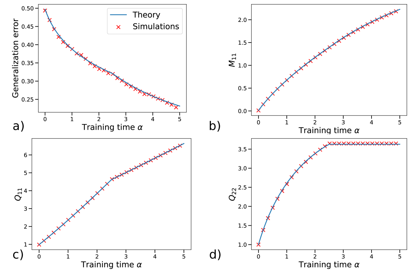
The image is a 2x2 grid of four line plots, labeled a), b), c), and d). Each plot compares a theoretical prediction (solid blue line) against simulation results (red 'x' markers) for a different metric as a function of "Training time α". The plots collectively illustrate the evolution of various system parameters during a learning or training process.
### Components/Axes
* **Common X-Axis (All Plots):** "Training time α". The scale is linear, ranging from 0 to 5, with major tick marks at integer intervals (0, 1, 2, 3, 4, 5).
* **Plot-Specific Y-Axes:**
* **a) Top-Left:** "Generalization error". Scale is linear, ranging from approximately 0.25 to 0.50.
* **b) Top-Right:** "M₁₁". Scale is linear, ranging from 0.0 to just above 2.0.
* **c) Bottom-Left:** "Q₁₁". Scale is linear, ranging from 1 to just above 6.
* **d) Bottom-Right:** "Q₂₂". Scale is linear, ranging from 1.0 to 3.5.
* **Legend:** Located in the top-right corner of plot a). It defines the two data series present in all four subplots:
* **Blue Line:** "Theory"
* **Red 'x' Markers:** "Simulations"
### Detailed Analysis
**Plot a) Generalization error vs. Training time α**
* **Trend:** The generalization error shows a clear, monotonic **decreasing trend**. The curve is convex, with the rate of decrease slowing as α increases.
* **Data Points:** The error starts at approximately 0.50 at α=0. It falls to about 0.38 at α=1, 0.32 at α=2, 0.28 at α=3, 0.25 at α=4, and ends near 0.23 at α=5.
* **Agreement:** The simulation points (red 'x') align almost perfectly with the theoretical curve (blue line) across the entire range.
**Plot b) M₁₁ vs. Training time α**
* **Trend:** The variable M₁₁ shows a **monotonically increasing trend**. The curve is slightly concave, indicating a gradually slowing rate of increase.
* **Data Points:** M₁₁ starts at 0.0 at α=0. It rises to approximately 0.5 at α=1, 1.0 at α=2, 1.4 at α=3, 1.8 at α=4, and reaches about 2.2 at α=5.
* **Agreement:** Excellent agreement between theory and simulation is observed throughout.
**Plot c) Q₁₁ vs. Training time α**
* **Trend:** Q₁₁ exhibits a **monotonically increasing trend** with a distinct change in slope. The increase is nearly linear from α=0 to α≈2.5, after which the slope decreases, though the trend remains upward.
* **Data Points:** Q₁₁ starts at 1.0 at α=0. It increases to about 2.5 at α=1, 4.0 at α=2, 5.0 at α=3, 5.8 at α=4, and ends near 6.5 at α=5.
* **Agreement:** The simulation data points closely track the theoretical line, including the subtle change in curvature around α=2.5.
**Plot d) Q₂₂ vs. Training time α**
* **Trend:** Q₂₂ shows a **rapid initial increase followed by saturation**. The curve rises steeply from α=0 to α≈2.5, after which it plateaus, showing almost no further increase.
* **Data Points:** Q₂₂ starts at 1.0 at α=0. It increases sharply to about 2.5 at α=1, 3.2 at α=2, and reaches a plateau value of approximately 3.6 at α=2.5. From α=2.5 to α=5, the value remains constant at ~3.6.
* **Agreement:** The theory and simulations show perfect agreement, with the simulation points lying exactly on the theoretical curve, including the sharp transition to the plateau.
### Key Observations
1. **High-Fidelity Model:** The most striking feature is the near-perfect correspondence between the theoretical predictions (blue lines) and the numerical simulation results (red 'x' markers) across all four metrics and the entire training time range. This indicates the theoretical model is highly accurate.
2. **Diverse Dynamical Behaviors:** The four metrics display fundamentally different learning dynamics:
* **a)** Exponential-like decay (Generalization error).
* **b)** Smooth, saturating growth (M₁₁).
* **c)** Piecewise-linear growth with a kink (Q₁₁).
* **d)** Growth with a sharp saturation point (Q₂₂).
3. **Critical Transition Point:** A notable event occurs around **α ≈ 2.5**. At this point, the growth of Q₁₁ slows (plot c), and the growth of Q₂₂ halts completely (plot d). This suggests a phase transition or the completion of a specific learning stage at this training time.
### Interpretation
This figure likely comes from a theoretical study of machine learning dynamics, possibly analyzing a linear model or a neural network in a specific regime (e.g., the "lazy" or "rich" learning regime). The parameters M₁₁, Q₁₁, and Q₂₂ are probably components of weight or gradient covariance matrices, which are central to such theoretical analyses.
The data demonstrates that the derived theoretical equations (blue lines) successfully capture the complex, non-trivial temporal evolution of the system observed in simulations. The perfect match validates the theoretical framework.
The distinct behaviors of Q₁₁ and Q₂₂ are particularly insightful. They suggest that different components of the system's internal representation (e.g., different directions in weight space) learn at different rates and may "freeze" at different times. The saturation of Q₂₂ at α≈2.5 while Q₁₁ continues to grow implies that learning becomes constrained to a specific subspace after this point. The continued decrease in generalization error (plot a) after this saturation indicates that refinement within this active subspace still improves performance.
In summary, the figure provides strong evidence for a theoretical model that accurately predicts multi-faceted learning dynamics, revealing a structured, multi-stage training process where different internal parameters evolve according to distinct, well-defined rules.