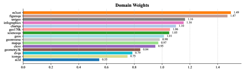
## Horizontal Bar Chart: Domain Weights
### Overview
The image displays a horizontal bar chart titled "Domain Weights." It visually compares numerical weight values assigned to 15 distinct domains, likely representing datasets or task categories in a machine learning or evaluation context. The bars are arranged in descending order of weight from top to bottom.
### Components/Axes
* **Chart Title:** "Domain Weights" (centered at the top).
* **Y-Axis (Vertical):** Lists the names of 15 domains. The axis itself is not labeled with a title, but the domain names serve as categorical labels.
* **X-Axis (Horizontal):** Represents the numerical weight value. It is labeled with major tick marks at intervals of 0.2, ranging from 0.0 to 1.4. The axis line is visible at the bottom.
* **Data Representation:** Each domain is represented by a horizontal bar. The length of the bar corresponds to its weight value, which is also printed numerically at the end of each bar.
* **Color Coding:** Each bar is filled with a distinct, solid color. There is no separate legend; the domain names are directly adjacent to their respective bars.
### Detailed Analysis
The domains and their corresponding weights, listed from highest to lowest, are as follows:
1. **m3cot** (Orange bar): **1.49**
2. **figureqa** (Light brown/tan bar): **1.47**
3. **unifiedqa** (Purple bar): **1.16**
4. **infographicqa** (Light purple/lavender bar): **1.16**
5. **chartqa** (Pink bar): **1.10**
6. **geo170k** (Light red/salmon bar): **1.06**
7. **scienceqa** (Green bar): **1.05**
8. **tatqa** (Light green bar): **1.01**
9. **geomverse** (Grey bar): **0.98**
10. **mapqa** (Light grey bar): **0.97**
11. **clever** (Dark purple/maroon bar): **0.95**
12. **geosqa** (Brown bar): **0.84**
13. **dvqa** (Teal bar): **0.79**
14. **iconqa** (Light yellow/beige bar): **0.75**
15. **ai2d** (Blue bar): **0.55**
**Trend:** The data series exhibits a clear descending trend. The weights start at a high of 1.49 and decrease steadily, with a notable drop between the top two domains (m3cot, figureqa) and the next cluster (unifiedqa, infographicqa). The decline continues to the lowest value of 0.55 for ai2d.
### Key Observations
* **Top Performers:** `m3cot` and `figureqa` are the clear outliers with weights significantly above 1.4, separating them from the rest of the group.
* **Clustering:** There is a tight cluster of domains with weights between approximately 0.95 and 1.16 (from `unifiedqa` down to `clever`).
* **Color Distinction:** The use of a wide palette of distinct colors (orange, brown, purples, pinks, reds, greens, greys, teal, yellow, blue) makes each bar easily distinguishable, aiding in visual comparison.
* **Precision:** Each weight is reported to two decimal places, suggesting a calculated or normalized metric.
### Interpretation
This chart provides a comparative ranking of domains based on an assigned "weight." In a technical context, such weights often signify importance, difficulty, prevalence, or a performance score within a model's training or evaluation framework.
* **What the data suggests:** The domain `m3cot` is considered the most significant or highest-performing according to this metric, followed closely by `figureqa`. The domain `ai2d` is weighted the lowest, indicating it may be considered less critical, easier, or have a lower performance baseline in this specific context.
* **How elements relate:** The direct labeling of values on the bars eliminates ambiguity and allows for precise reading. The descending order immediately communicates the ranking. The color coding, while not explained in a legend, serves to visually separate the many categories.
* **Notable patterns:** The significant gap between the top two domains and the rest suggests a potential tier system. The cluster in the middle indicates a group of domains with relatively similar weightings. The chart effectively communicates a hierarchy of importance or outcome across these 15 evaluated items.