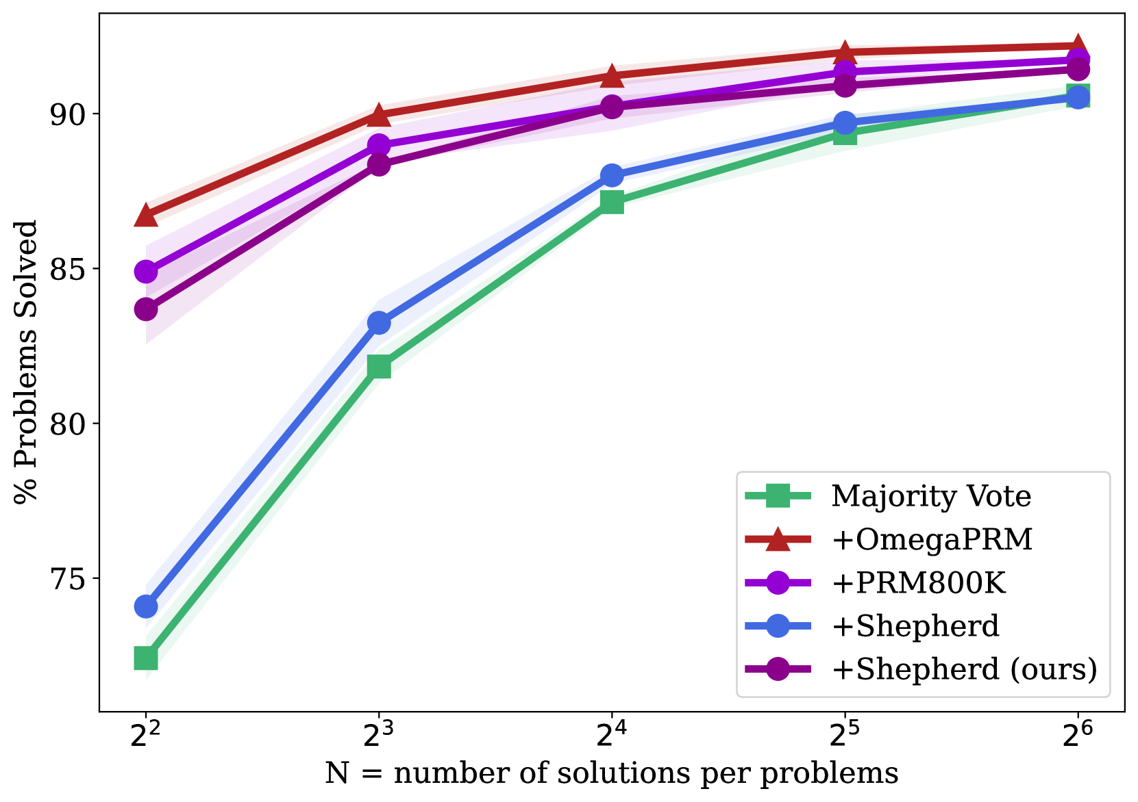
## Line Chart: Performance Scaling with Solution Count
### Overview
This line chart illustrates the performance scaling of five different methods for solving problems as the number of generated solutions per problem increases. The chart plots the percentage of problems solved against the number of solutions (N), which is presented on a logarithmic scale (base 2). All methods show improved performance with more solutions, but they start at different baselines and converge at higher N.
### Components/Axes
* **Chart Type:** Line chart with shaded confidence intervals or variance bands.
* **X-Axis:**
* **Label:** `N = number of solutions per problems`
* **Scale:** Logarithmic (base 2).
* **Ticks/Markers:** `2²` (4), `2³` (8), `2⁴` (16), `2⁵` (32), `2⁶` (64).
* **Y-Axis:**
* **Label:** `% Problems Solved`
* **Scale:** Linear, ranging from approximately 72% to 93%.
* **Ticks/Markers:** 75, 80, 85, 90.
* **Legend (Located in the bottom-right quadrant):**
* **Green Square Line:** `Majority Vote`
* **Red Triangle Line:** `+OmegaPRM`
* **Purple Circle Line:** `+PRM800K`
* **Blue Circle Line:** `+Shepherd`
* **Dark Purple Circle Line:** `+Shepherd (ours)`
### Detailed Analysis
**Data Series and Approximate Values:**
1. **Majority Vote (Green, Square markers):**
* **Trend:** Starts lowest, shows the steepest initial improvement, and continues to climb steadily.
* **Data Points:**
* N=4: ~72.5%
* N=8: ~82%
* N=16: ~87%
* N=32: ~89.5%
* N=64: ~90.5%
2. **+OmegaPRM (Red, Triangle markers):**
* **Trend:** Starts as the highest-performing method and maintains a lead throughout, with a steady, slightly flattening increase.
* **Data Points:**
* N=4: ~86.5%
* N=8: ~90%
* N=16: ~91.5%
* N=32: ~92.5%
* N=64: ~93%
3. **+PRM800K (Purple, Circle markers):**
* **Trend:** Starts as the second-highest, follows a similar trajectory to +OmegaPRM but remains slightly below it.
* **Data Points:**
* N=4: ~85%
* N=8: ~89%
* N=16: ~90.5%
* N=32: ~91.5%
* N=64: ~92%
4. **+Shepherd (Blue, Circle markers):**
* **Trend:** Starts in the middle of the pack, shows strong improvement, and nearly catches up to the top methods at N=64.
* **Data Points:**
* N=4: ~74%
* N=8: ~83%
* N=16: ~88%
* N=32: ~89.5%
* N=64: ~91%
5. **+Shepherd (ours) (Dark Purple, Circle markers):**
* **Trend:** Starts just below +PRM800K and follows a nearly identical, parallel trajectory, ending very close to it.
* **Data Points:**
* N=4: ~83.5%
* N=8: ~88%
* N=16: ~90.5%
* N=32: ~91%
* N=64: ~91.5%
### Key Observations
1. **Performance Hierarchy:** At low solution counts (N=4), there is a clear performance hierarchy: `+OmegaPRM` > `+PRM800K` > `+Shepherd (ours)` > `+Shepherd` > `Majority Vote`.
2. **Convergence:** As N increases to 64, the performance gap between all methods narrows significantly. The top four methods (`+OmegaPRM`, `+PRM800K`, `+Shepherd`, `+Shepherd (ours)`) converge within a ~2% range (91%-93%).
3. **Scaling Efficiency:** `Majority Vote` and `+Shepherd` show the most dramatic relative improvement from N=4 to N=64, indicating they benefit most from increased solution diversity. The top methods (`+OmegaPRM`, `+PRM800K`) show more modest, incremental gains, suggesting they are more efficient with fewer solutions.
4. **Method Grouping:** The chart visually groups the methods into two clusters: the top-performing trio (`+OmegaPRM`, `+PRM800K`, `+Shepherd (ours)`) and the lower-starting pair (`+Shepherd`, `Majority Vote`), though the latter pair closes the gap considerably.
### Interpretation
This chart demonstrates the principle of **scaling test-time compute** in problem-solving AI systems. The key insight is that generating and evaluating multiple candidate solutions (increasing N) reliably improves performance for all tested methods.
* **What the data suggests:** The methods prefixed with "+" (likely representing some form of process reward model or verifier) consistently outperform the baseline `Majority Vote` approach, especially when solution counts are low. This indicates that using a learned verifier to score or select solutions is more effective than simple consensus.
* **Relationship between elements:** The x-axis (N) is the independent variable representing resource投入 (compute). The y-axis (% Solved) is the dependent outcome. The different lines represent different algorithms for utilizing that compute. The shaded bands suggest variability in performance, likely across multiple runs or problem subsets.
* **Notable trends/anomalies:** The most significant trend is the **diminishing returns** for the top methods. Moving from N=32 to N=64 yields a smaller gain than moving from N=4 to N=8. This implies an efficiency ceiling. The near-parallel trajectories of `+PRM800K` and `+Shepherd (ours)` suggest these two methods may be fundamentally similar in their scaling behavior, despite potential differences in training data or architecture. The chart argues that while advanced verifiers (`+OmegaPRM`) provide a better starting point, the advantage they confer becomes less critical as you are willing to spend more compute (higher N) on generating solutions.