## Grouped Bar Chart: Accuracy by Category and Number of Rows
### Overview
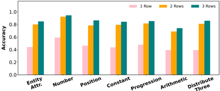
The image displays a grouped bar chart comparing the accuracy of a system or model across seven different categories, with performance measured for three different input conditions: 1 Row, 2 Rows, and 3 Rows. The chart visually demonstrates how accuracy changes based on both the category of the task and the amount of input data provided.
### Components/Axes
* **Chart Type:** Grouped Bar Chart.
* **Y-Axis:**
* **Label:** "Accuracy"
* **Scale:** Linear scale from 0.0 to 1.0, with major tick marks at 0.0, 0.2, 0.4, 0.6, 0.8, and 1.0.
* **X-Axis:**
* **Categories (from left to right):**
1. Entity Attr.
2. Number
3. Position
4. Constant
5. Progression
6. Arithmetic
7. Distribute Three
* **Legend:** Located at the top-right of the chart area.
* **1 Row:** Represented by a light pink/salmon color.
* **2 Rows:** Represented by an orange/gold color.
* **3 Rows:** Represented by a teal/dark cyan color.
* **Data Series:** For each of the seven categories on the x-axis, there are three adjacent bars corresponding to the three series defined in the legend.
### Detailed Analysis
The following table reconstructs the approximate accuracy values for each category and row condition. Values are estimated from the bar heights relative to the y-axis scale.
| Category | 1 Row (Pink) | 2 Rows (Orange) | 3 Rows (Teal) |
| :--- | :--- | :--- | :--- |
| **Entity Attr.** | ~0.45 | ~0.80 | ~0.85 |
| **Number** | ~0.60 | ~0.95 | ~0.95 |
| **Position** | ~0.48 | ~0.78 | ~0.85 |
| **Constant** | ~0.45 | ~0.80 | ~0.85 |
| **Progression** | ~0.48 | ~0.82 | ~0.85 |
| **Arithmetic** | ~0.40 | ~0.70 | ~0.75 |
| **Distribute Three** | ~0.40 | ~0.82 | ~0.85 |
**Trend Verification per Category:**
* **Entity Attr.:** The pink bar (1 Row) is the shortest. The orange bar (2 Rows) is significantly taller. The teal bar (3 Rows) is slightly taller than the orange one. **Trend:** Accuracy increases with more rows.
* **Number:** The pink bar is moderately tall. The orange and teal bars are nearly identical and are the tallest bars in the entire chart. **Trend:** Large jump from 1 to 2 rows; minimal difference between 2 and 3 rows.
* **Position:** Pink is the shortest. Orange is much taller. Teal is taller than orange. **Trend:** Accuracy increases with more rows.
* **Constant:** Pattern is very similar to "Entity Attr." Pink is shortest, orange is much taller, teal is slightly taller than orange. **Trend:** Accuracy increases with more rows.
* **Progression:** Pattern is very similar to "Position" and "Constant." Pink is shortest, orange is much taller, teal is slightly taller than orange. **Trend:** Accuracy increases with more rows.
* **Arithmetic:** Pink is the shortest bar in the chart. Orange is significantly taller. Teal is slightly taller than orange. **Trend:** Accuracy increases with more rows, but overall performance is lower than other categories.
* **Distribute Three:** Pink is very short (similar to Arithmetic). Orange is much taller. Teal is slightly taller than orange. **Trend:** Accuracy increases with more rows.
### Key Observations
1. **Universal Positive Trend:** For every single category, accuracy improves when moving from 1 Row to 2 Rows, and further improves (or stays equal) when moving from 2 Rows to 3 Rows.
2. **Diminishing Returns:** The performance gain from adding a second row (1→2) is consistently larger than the gain from adding a third row (2→3). The jump from orange to teal bars is always smaller than the jump from pink to orange.
3. **Category Performance Hierarchy:** The "Number" category achieves the highest overall accuracy (~0.95 for 2/3 Rows). "Arithmetic" appears to be the most challenging category, showing the lowest accuracy for each corresponding row condition.
4. **Consistent Grouping:** The relative performance between categories is largely preserved across row conditions. For example, "Number" is always the top performer, and "Arithmetic" is always among the lowest.
### Interpretation
This chart likely evaluates a model's ability to reason or perform tasks based on structured data presented in rows (e.g., in a table or database query context). The data suggests several key insights:
* **Data Quantity is Critical:** The model's performance is highly dependent on the amount of context provided. A single row of data is insufficient for high accuracy across all tasks, while two or three rows provide a substantial boost.
* **Task Difficulty Varies:** The nature of the task significantly impacts performance. Tasks involving "Number" are handled with near-perfect accuracy given sufficient data, while "Arithmetic" operations remain challenging even with more context. This could indicate the model's underlying architecture is better at pattern recognition (e.g., in "Number" or "Position") than symbolic manipulation.
* **Optimal Data Point:** For most tasks, providing **2 rows** of data captures the majority of the available performance gain. The incremental benefit of a third row is marginal, suggesting a potential efficiency trade-off in real-world applications where providing more data has a cost.
* **Underlying Pattern:** The consistent trend across all categories implies a fundamental characteristic of the system being tested: its reasoning capability scales with the number of examples or data points it can reference, but it hits a point of diminishing returns quickly. This is a common pattern in machine learning models, where performance improves with more context but eventually plateaus.