## Line Graphs: Frequency vs. Amplitude Analysis
### Overview
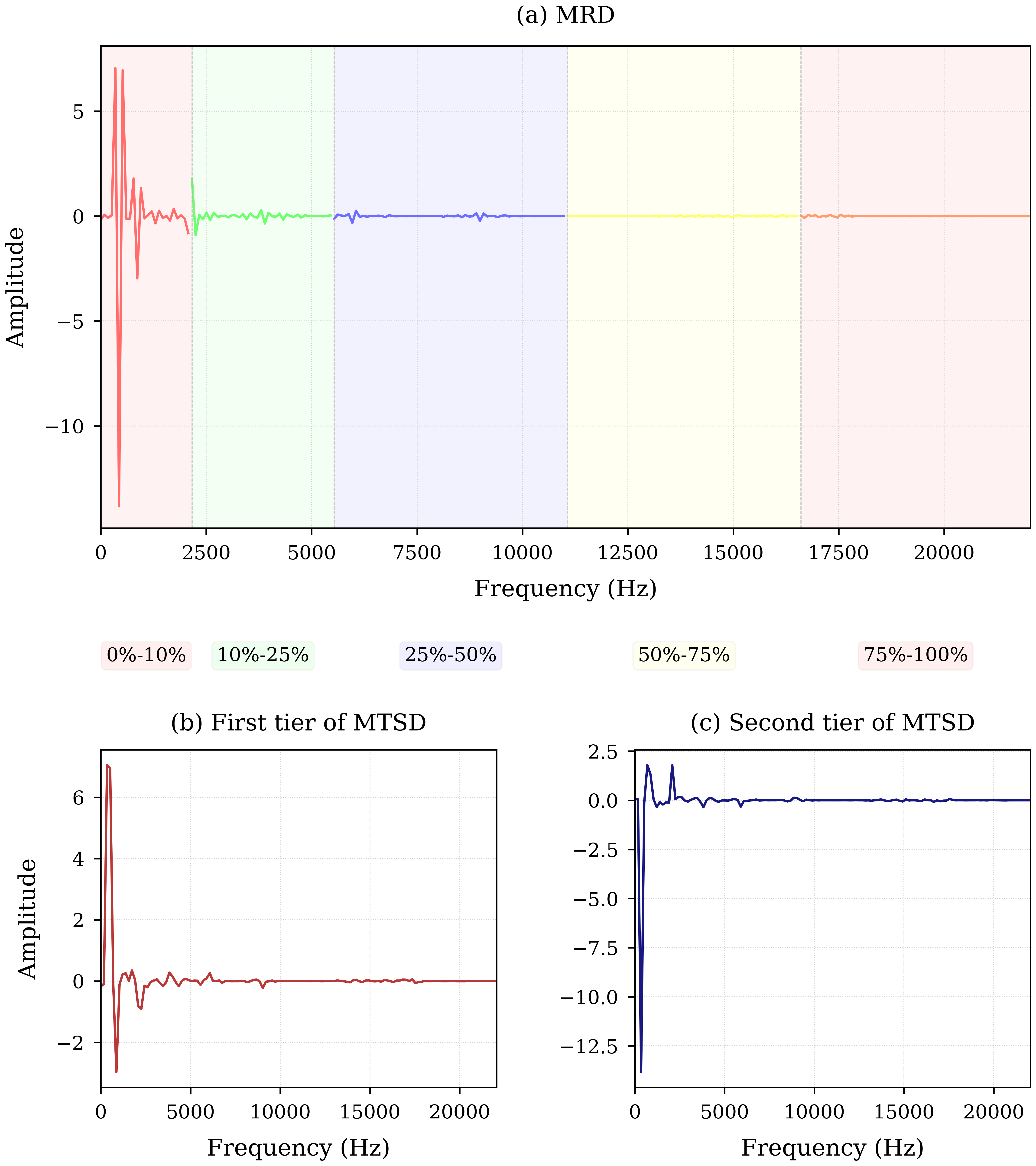
The image contains three vertically stacked line graphs labeled (a) MRD, (b) First tier of MTSD, and (c) Second tier of MTSD. All graphs plot **Frequency (Hz)** on the x-axis (0–20,000 Hz) and **Amplitude** on the y-axis (-12.5 to +6). Each graph includes a legend at the bottom mapping colors to percentage ranges (0%-10%, 10%-25%, etc.). The graphs show distinct amplitude behaviors across frequency bands.
---
### Components/Axes
1. **X-Axis (Frequency)**:
- Range: 0–20,000 Hz
- Labels: 0, 2500, 5000, 7500, 10,000, 12,500, 15,000, 17,500, 20,000 Hz
- Ticks: Every 2500 Hz (except MTSD graphs, which use 5000 Hz intervals).
2. **Y-Axis (Amplitude)**:
- Range: -12.5 to +6
- Labels: -12.5, -10, -7.5, -5, -2.5, 0, 2.5, 5, 6
- Ticks: Every 2.5 units.
3. **Legends**:
- Positioned at the bottom of each graph.
- Color-coded percentage ranges:
- Red: 0%-10%
- Green: 10%-25%
- Blue: 25%-50%
- Yellow: 50%-75%
- Pink: 75%-100%
---
### Detailed Analysis
#### (a) MRD Graph
- **Trend**:
- **0%-10% (Red)**: Sharp peak at ~500 Hz (amplitude ~12), followed by rapid decay.
- **10%-25% (Green)**: Small peak at ~2500 Hz (amplitude ~1).
- **25%-50% (Blue)**: Flat line near 0 amplitude.
- **50%-75% (Yellow)**: Flat line near 0 amplitude.
- **75%-100% (Pink)**: Flat line near 0 amplitude.
- **Key Data Points**:
- Red peak: ~500 Hz, amplitude ~12.
- Green peak: ~2500 Hz, amplitude ~1.
#### (b) First Tier of MTSD
- **Trend**:
- **0%-10% (Red)**: Sharp peak at ~500 Hz (amplitude ~6), followed by decay.
- **10%-100% (No color coding)**: Flat line near 0 amplitude.
- **Key Data Points**:
- Red peak: ~500 Hz, amplitude ~6.
#### (c) Second Tier of MTSD
- **Trend**:
- **0%-10% (Blue)**: Sharp negative peak at ~500 Hz (amplitude ~-12), followed by decay.
- **10%-100% (No color coding)**: Flat line near 0 amplitude.
- **Key Data Points**:
- Blue peak: ~500 Hz, amplitude ~-12.
---
### Key Observations
1. **Dominant Frequencies**:
- All graphs show a dominant peak at ~500 Hz, suggesting a shared low-frequency resonance.
- MRD (a) has the highest amplitude at this frequency (~12), while MTSD tiers show lower magnitudes (~6 and ~-12).
2. **Amplitude Decay**:
- All graphs exhibit rapid amplitude decay beyond 500 Hz, with minimal activity above 2500 Hz.
3. **Negative Amplitude**:
- Second tier of MTSD (c) shows a negative amplitude peak, potentially indicating phase inversion or opposing signal polarity.
4. **Color Consistency**:
- Legends match graph colors exactly (e.g., red in MRD corresponds to 0%-10% frequency range).
---
### Interpretation
- **MRD (a)**: The pronounced peak at 500 Hz (0%-10% range) suggests a strong resonant frequency in this band. The absence of activity in higher ranges (25%-100%) implies filtering or attenuation of higher frequencies.
- **MTSD Tiers (b, c)**: The first tier (b) mirrors MRD’s 500 Hz peak but with reduced amplitude, possibly representing a secondary or attenuated signal. The second tier (c) introduces a negative amplitude peak, which could indicate a phase-shifted component or destructive interference.
- **Technical Implications**: The graphs may represent spectral analysis of signals, with MRD showing raw data and MTSD tiers reflecting processed or filtered outputs. The negative amplitude in (c) warrants further investigation into signal polarity or phase relationships.
*Note: All values are approximate due to lack of gridline precision.*