## Histogram: Rating Frequency Distribution
### Overview
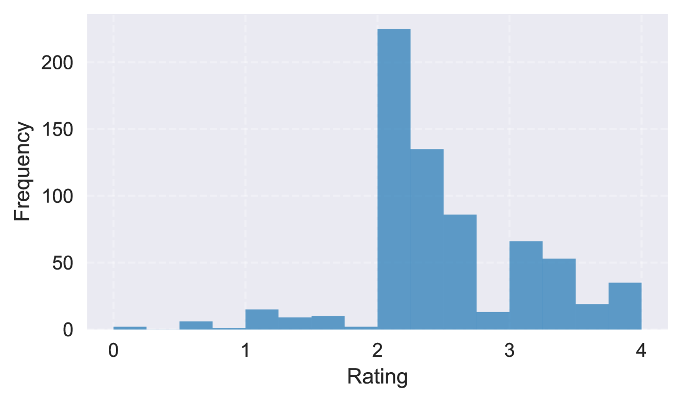
The image displays a histogram chart illustrating the frequency distribution of numerical ratings. The chart uses a single data series represented by blue bars against a light gray grid background. The overall shape indicates a right-skewed distribution with a prominent peak.
### Components/Axes
* **Chart Type:** Histogram
* **X-Axis (Horizontal):**
* **Label:** "Rating"
* **Scale:** Linear, ranging from 0 to 4.
* **Major Tick Marks:** Located at integer values: 0, 1, 2, 3, 4.
* **Y-Axis (Vertical):**
* **Label:** "Frequency"
* **Scale:** Linear, ranging from 0 to over 200.
* **Major Tick Marks:** Located at intervals of 50: 0, 50, 100, 150, 200.
* **Legend:** Not present. The chart contains a single data series.
* **Grid:** A faint, white, dashed grid is present in the background, aligned with the major tick marks on both axes.
### Detailed Analysis
The histogram consists of approximately 16-18 contiguous vertical bars (bins) of varying heights, each representing the frequency of ratings within a specific interval. The bin width appears to be approximately 0.25 units on the Rating scale.
**Estimated Frequency per Rating Bin (from left to right):**
* **Rating ~0.00-0.25:** Frequency ≈ 2 (very low)
* **Rating ~0.25-0.50:** Frequency ≈ 0 (no visible bar)
* **Rating ~0.50-0.75:** Frequency ≈ 5
* **Rating ~0.75-1.00:** Frequency ≈ 2
* **Rating ~1.00-1.25:** Frequency ≈ 15
* **Rating ~1.25-1.50:** Frequency ≈ 8
* **Rating ~1.50-1.75:** Frequency ≈ 10
* **Rating ~1.75-2.00:** Frequency ≈ 2
* **Rating ~2.00-2.25:** **Frequency ≈ 225** (This is the modal class and the tallest bar in the chart, extending above the 200 mark.)
* **Rating ~2.25-2.50:** Frequency ≈ 135
* **Rating ~2.50-2.75:** Frequency ≈ 85
* **Rating ~2.75-3.00:** Frequency ≈ 12
* **Rating ~3.00-3.25:** Frequency ≈ 65
* **Rating ~3.25-3.50:** Frequency ≈ 52
* **Rating ~3.50-3.75:** Frequency ≈ 18
* **Rating ~3.75-4.00:** Frequency ≈ 35
**Trend Verification:** The visual trend shows a dramatic, sharp increase in frequency starting just before Rating 2.0, peaking in the 2.00-2.25 bin. Following this peak, the frequency generally declines in a stepwise fashion towards Rating 4.0, with a secondary, smaller peak in the 3.00-3.25 bin. The region from Rating 0 to 2.0 shows consistently low frequencies.
### Key Observations
1. **Dominant Peak:** The single most frequent rating interval is between 2.00 and 2.25, with a frequency of approximately 225. This bar is significantly taller than all others.
2. **Right-Skewed Distribution:** The bulk of the data (the highest frequencies) is concentrated between Ratings 2.0 and 3.5. The tail of the distribution extends further to the right (towards 4.0) than to the left (towards 0.0).
3. **Low-End Scarcity:** Ratings below 2.0 are relatively rare. The combined frequency for all bins from 0.0 to 2.0 is very low compared to the 2.0-4.0 range.
4. **Secondary Cluster:** There is a noticeable, smaller cluster of higher frequencies between Ratings 3.0 and 3.5.
5. **Bimodal Hint:** While dominated by the peak at ~2.1, the distribution shows a secondary mode around 3.1, suggesting a potential subgroup in the data.
### Interpretation
This histogram visualizes the distribution of a set of ratings, likely on a scale from 0 to 4. The data suggests that the subject being rated (e.g., a product, service, or performance) receives predominantly **moderate to moderately-high scores**.
* **Central Tendency:** The clear mode at 2.0-2.25 indicates that the most common experience or evaluation falls in this mid-range. This could represent a "satisfactory" or "average" benchmark.
* **Polarization Absence:** The very low frequencies at the extreme low end (0-1) suggest that outright poor or failing ratings are uncommon. The distribution is not symmetrically polarized.
* **Positive Skew:** The longer tail towards the higher ratings (3-4) indicates that while extremely high ratings are less common than moderate ones, they occur more frequently than extremely low ratings. This skew often reflects a generally positive, but not exceptional, overall assessment.
* **Potential Subgroup:** The secondary peak around 3.0-3.25 might indicate a distinct segment of raters who had a notably better experience, or it could be an artifact of the binning process. Further investigation would be needed to determine if this is a meaningful pattern.
In summary, the chart depicts a rating system where most outcomes cluster around a central, moderate value, with a bias towards slightly higher scores and very few outright negative ratings.