## Grouped Bar Chart: Performance Metrics vs. k Values
### Overview
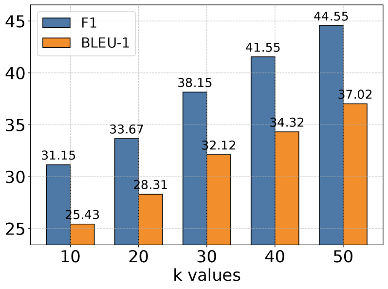
The image displays a grouped bar chart comparing two performance metrics, F1 and BLEU-1, across five different "k values." The chart shows a clear positive correlation between the k value and both performance scores.
### Components/Axes
* **Chart Type:** Grouped Bar Chart.
* **X-Axis:** Labeled "k values". It has five categorical tick marks: `10`, `20`, `30`, `40`, and `50`.
* **Y-Axis:** Numerical scale ranging from 25 to 45, with major gridlines at intervals of 5 (25, 30, 35, 40, 45). The axis title is not explicitly shown, but the values represent performance scores.
* **Legend:** Located in the top-left corner of the chart area.
* A blue square is labeled "F1".
* An orange square is labeled "BLEU-1".
* **Data Labels:** Each bar has its exact numerical value displayed directly above it.
### Detailed Analysis
The chart presents paired data for each k value. The left bar (blue) in each pair represents the F1 score, and the right bar (orange) represents the BLEU-1 score.
**Data Points (k value: F1, BLEU-1):**
* **k=10:** F1 = 31.15, BLEU-1 = 25.43
* **k=20:** F1 = 33.67, BLEU-1 = 28.31
* **k=30:** F1 = 38.15, BLEU-1 = 32.12
* **k=40:** F1 = 41.55, BLEU-1 = 34.32
* **k=50:** F1 = 44.55, BLEU-1 = 37.02
**Trend Verification:**
* **F1 Series (Blue Bars):** The line formed by the tops of the blue bars slopes consistently upward from left to right. The value increases from 31.15 at k=10 to 44.55 at k=50.
* **BLEU-1 Series (Orange Bars):** The line formed by the tops of the orange bars also slopes consistently upward from left to right. The value increases from 25.43 at k=10 to 37.02 at k=50.
### Key Observations
1. **Consistent Positive Trend:** Both F1 and BLEU-1 scores increase monotonically as the k value increases from 10 to 50.
2. **Performance Gap:** The F1 score is consistently higher than the BLEU-1 score at every k value. The absolute gap between them widens slightly as k increases (from a difference of ~5.72 at k=10 to ~7.53 at k=50).
3. **Linear Progression:** The increase in both metrics appears roughly linear across the sampled k values, with no obvious plateau or diminishing returns within this range.
4. **Relative Improvement:** From k=10 to k=50, the F1 score improves by approximately 13.40 points (a ~43% relative increase), while the BLEU-1 score improves by approximately 11.59 points (a ~46% relative increase).
### Interpretation
This chart likely illustrates the results of a hyperparameter tuning experiment for a machine learning model, where "k" is a key parameter (e.g., number of neighbors, beam size, or retrieved passages). The data suggests that increasing the k value within the tested range (10 to 50) leads to better model performance as measured by both the F1 score (which balances precision and recall) and the BLEU-1 score (which measures n-gram overlap with reference text, common in translation or generation tasks).
The consistent gap indicates that the model achieves a better balance of precision and recall (F1) than it does literal surface-form overlap (BLEU-1). The steady, parallel improvement of both metrics implies that the benefit of increasing k is robust and affects different aspects of performance similarly. A practitioner would use this data to select an optimal k value, likely favoring k=50 for maximum performance, while also considering computational costs that typically increase with k. The absence of a performance peak suggests that testing values beyond 50 could be warranted to find the point of diminishing returns.