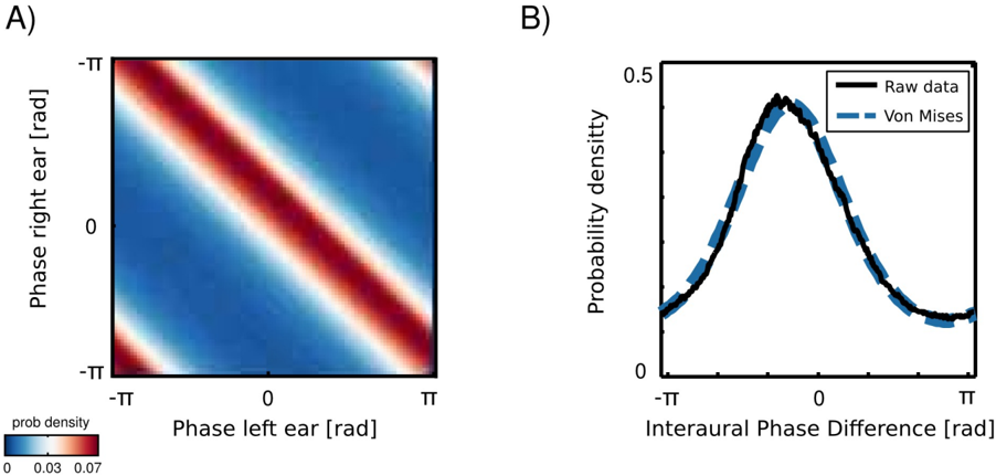
## Chart Type: Heatmap and Line Plot
### Overview
The image consists of two subplots, A and B. Subplot A is a heatmap showing the probability density as a function of the phase of the left and right ears. Subplot B is a line plot comparing raw data and a Von Mises distribution of the interaural phase difference.
### Components/Axes
**Subplot A (Heatmap):**
* **X-axis:** Phase left ear [rad]. Scale: -π, 0, π
* **Y-axis:** Phase right ear [rad]. Scale: -π, 0, π
* **Colorbar:** Located at the bottom-left of subplot A.
* Label: prob density
* Scale: 0 (blue) to 0.03 (light red) to 0.07 (dark red)
**Subplot B (Line Plot):**
* **X-axis:** Interaural Phase Difference [rad]. Scale: -π, 0, π
* **Y-axis:** Probability density. Scale: 0 to 0.5
* **Legend:** Located at the top-right of subplot B.
* Raw data (black solid line)
* Von Mises (blue dashed line)
### Detailed Analysis
**Subplot A (Heatmap):**
* The heatmap shows a diagonal band of high probability density (red) running from the bottom-left (-π, -π) to the top-right (π, π).
* There are also weaker bands of high probability density in the top-left and bottom-right corners.
* The probability density is lowest (blue) in the top-right and bottom-left regions.
**Subplot B (Line Plot):**
* The black solid line (Raw data) shows a bell-shaped curve centered around 0. The probability density is highest at 0 and decreases as the interaural phase difference moves towards -π and π.
* The blue dashed line (Von Mises) closely matches the raw data, indicating a good fit. The Von Mises distribution is also centered around 0 and has a similar shape to the raw data.
* The peak probability density for both curves is approximately 0.45-0.5.
* Both lines are approximately symmetrical around 0.
### Key Observations
* **Heatmap:** The highest probability density occurs when the phase of the left and right ears are similar, as indicated by the diagonal band.
* **Line Plot:** The raw data of the interaural phase difference is well-approximated by a Von Mises distribution.
### Interpretation
The heatmap in subplot A suggests a strong correlation between the phase of the left and right ears. The high probability density along the diagonal indicates that the auditory system is more likely to perceive sounds when the phase difference between the ears is small. The line plot in subplot B confirms this by showing that the interaural phase difference is most likely to be close to zero, and that this distribution can be modeled by a Von Mises distribution. This is consistent with the idea that the brain uses interaural phase differences to localize sound sources. The Von Mises distribution is a circular analogue of the normal distribution, which is appropriate for modeling phase differences, which are circular variables.