## Heatmap & Line Graph: Interaural Phase Difference Analysis
### Overview
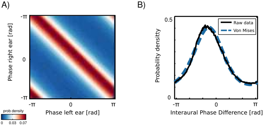
The image presents two visualizations related to interaural phase difference. Panel A is a heatmap showing the probability density of phase combinations between the left and right ears. Panel B is a line graph comparing the probability density of raw data versus a Von Mises distribution fit to the data, both plotted against the Interaural Phase Difference.
### Components/Axes
**Panel A (Heatmap):**
* **X-axis:** Phase left ear [rad], ranging from -π to π.
* **Y-axis:** Phase right ear [rad], ranging from -π to π.
* **Color Scale:** Represents "prob density" (probability density), ranging from 0 (blue) to 0.07 (red).
* **Title:** A
**Panel B (Line Graph):**
* **X-axis:** Interaural Phase Difference [rad], ranging from approximately -π to π.
* **Y-axis:** Probability density, ranging from 0 to 0.5.
* **Legend:**
* Black solid line: "Raw data"
* Blue dashed line: "Von Mises"
* **Title:** B
### Detailed Analysis or Content Details
**Panel A (Heatmap):**
The heatmap displays a diagonal pattern. The highest probability density (red) is concentrated along the diagonal where the phase of the left and right ears are approximately equal. As the phase difference between the left and right ears increases (moving away from the diagonal), the probability density decreases (shifting towards blue). There are alternating red and blue bands along the diagonal, suggesting a periodic pattern in the probability density.
**Panel B (Line Graph):**
The black "Raw data" line initially rises from approximately 0 at -π, reaches a peak around 0 on the Interaural Phase Difference axis, and then declines to approximately 0 at π. The line exhibits some fluctuations. The blue dashed "Von Mises" line closely follows the "Raw data" line, but is smoother. The Von Mises line also peaks around 0, and declines to approximately 0 at π.
* **Raw Data (Black Line):**
* At -π: Approximately 0.02
* At -2.5 rad: Approximately 0.08
* At -1.5 rad: Approximately 0.15
* At -0.5 rad: Approximately 0.25
* At 0 rad: Approximately 0.32
* At 0.5 rad: Approximately 0.28
* At 1.5 rad: Approximately 0.15
* At 2.5 rad: Approximately 0.08
* At π: Approximately 0.02
* **Von Mises (Blue Line):**
* At -π: Approximately 0.02
* At -2.5 rad: Approximately 0.09
* At -1.5 rad: Approximately 0.17
* At -0.5 rad: Approximately 0.27
* At 0 rad: Approximately 0.34
* At 0.5 rad: Approximately 0.28
* At 1.5 rad: Approximately 0.17
* At 2.5 rad: Approximately 0.09
* At π: Approximately 0.02
### Key Observations
* The heatmap (Panel A) shows a strong correlation between the phase of the left and right ears.
* The probability density is highest when the phases are aligned.
* The Von Mises distribution (Panel B) provides a good fit to the raw data, suggesting that the Interaural Phase Difference follows this distribution.
* The raw data exhibits some noise or variability, which is smoothed out by the Von Mises distribution.
### Interpretation
The data suggests that the auditory system is most sensitive to sounds where the phase difference between the left and right ears is minimal. This is consistent with the mechanism of sound localization, where the brain uses interaural phase differences to determine the direction of a sound source. The Von Mises distribution provides a mathematical model for describing the distribution of Interaural Phase Differences, and its close fit to the raw data indicates that this model is a good representation of the underlying neural processes. The heatmap visually demonstrates the probability of different phase combinations, while the line graph quantifies the probability density of the Interaural Phase Difference. The fact that the Von Mises distribution closely matches the raw data suggests that the Interaural Phase Difference is not uniformly distributed, but rather is concentrated around a preferred value (in this case, 0). This concentration likely reflects the brain's preference for sounds originating from the midline.