## Line Chart: Score vs. Generation
### Overview
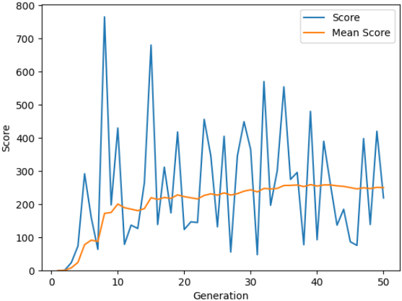
The image presents a line chart illustrating the relationship between 'Generation' and 'Score'. Two data series are plotted: 'Score' (blue line) and 'Mean Score' (orange line). The chart appears to track the evolution of a score over 50 generations.
### Components/Axes
* **X-axis:** 'Generation', ranging from 0 to 50.
* **Y-axis:** 'Score', ranging from 0 to 800.
* **Legend:** Located in the top-right corner.
* 'Score' - Blue line
* 'Mean Score' - Orange line
### Detailed Analysis
The 'Score' line (blue) exhibits high volatility, fluctuating significantly across all generations. It starts near 0 at Generation 0, rises sharply to a peak of approximately 750 at Generation 7, then oscillates with large amplitude throughout the remaining generations. The 'Score' line ends at approximately 50 at Generation 50.
The 'Mean Score' line (orange) shows a generally increasing trend, but with less pronounced fluctuations than the 'Score' line. It begins at approximately 0 at Generation 0, gradually increases to around 280 at Generation 50.
Here's a breakdown of approximate data points (with uncertainty due to visual estimation):
| Generation | Score (approx.) | Mean Score (approx.) |
|---|---|---|
| 0 | 0 | 0 |
| 2 | 50 | 50 |
| 4 | 100 | 100 |
| 6 | 300 | 150 |
| 7 | 750 | 180 |
| 8 | 200 | 200 |
| 10 | 400 | 220 |
| 12 | 650 | 230 |
| 14 | 300 | 240 |
| 16 | 500 | 250 |
| 18 | 400 | 260 |
| 20 | 300 | 270 |
| 22 | 450 | 275 |
| 24 | 350 | 280 |
| 26 | 400 | 285 |
| 28 | 450 | 290 |
| 30 | 300 | 295 |
| 32 | 550 | 300 |
| 34 | 400 | 305 |
| 36 | 350 | 310 |
| 38 | 500 | 315 |
| 40 | 300 | 320 |
| 42 | 250 | 325 |
| 44 | 300 | 330 |
| 46 | 150 | 335 |
| 48 | 50 | 340 |
| 50 | 50 | 340 |
### Key Observations
* The 'Score' line demonstrates significant variance, indicating instability or sensitivity to changes in generation.
* The 'Mean Score' line provides a smoothed representation of the overall trend, suggesting a gradual increase in average score over generations.
* The gap between the 'Score' and 'Mean Score' lines is often substantial, highlighting the variability in individual scores.
* There are no clear cyclical patterns in the 'Score' line, although there are periods of relative stability followed by rapid fluctuations.
### Interpretation
The chart likely represents the performance of an algorithm or system over successive iterations (generations). The 'Score' could be a measure of fitness, accuracy, or some other performance metric. The high volatility of the 'Score' suggests that the system is sensitive to small changes or random events. The increasing 'Mean Score' indicates that, on average, the system is improving over time, despite the individual fluctuations.
The large difference between the 'Score' and 'Mean Score' could indicate that the system is prone to occasional breakthroughs or setbacks. The lack of clear cyclical patterns suggests that the system's behavior is not predictable in the short term. The chart suggests that while the system is generally improving, further optimization may be needed to reduce its variability and ensure more consistent performance. The data suggests a stochastic process with an upward drift.