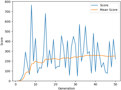
## Line Graph: Score vs. Mean Score Over Generations
### Overview
The image depicts a line graph comparing two data series: "Score" (blue line) and "Mean Score" (orange line) across 50 generations. The y-axis represents "Score" (0–800), and the x-axis represents "Generation" (0–50). The blue line exhibits significant volatility with sharp peaks and troughs, while the orange line shows a smoother, gradual upward trend.
### Components/Axes
- **X-axis (Horizontal)**: Labeled "Generation," ranging from 0 to 50 in increments of 10.
- **Y-axis (Vertical)**: Labeled "Score," ranging from 0 to 800 in increments of 100.
- **Legend**: Located in the top-right corner, with:
- **Blue line**: "Score"
- **Orange line**: "Mean Score"
### Detailed Analysis
1. **Score (Blue Line)**:
- **Initial Phase (0–10 generations)**: Starts at 0, rises sharply to ~300 at Generation 5, then drops to ~100 by Generation 10.
- **Mid-Phase (10–30 generations)**: Exhibits erratic fluctuations, with peaks reaching ~750 (Generation 5), ~650 (Generation 15), and ~550 (Generation 25). Troughs dip below 100 (e.g., Generation 20).
- **Late Phase (30–50 generations)**: Peaks stabilize around 400–500, with a final peak of ~400 at Generation 50.
2. **Mean Score (Orange Line)**:
- **Initial Phase (0–10 generations)**: Begins at 0, rises gradually to ~150 by Generation 10.
- **Mid-Phase (10–30 generations)**: Maintains a steady increase, reaching ~220 by Generation 20 and ~250 by Generation 30.
- **Late Phase (30–50 generations)**: Flattens slightly, ending at ~250 by Generation 50.
### Key Observations
- **Volatility vs. Stability**: The "Score" line shows extreme variability, with sharp spikes and crashes, while the "Mean Score" line demonstrates consistent growth.
- **Peak Correlation**: The highest "Score" peak (~750) occurs at Generation 5, but the "Mean Score" remains low (~100) at this point, indicating outliers skew the mean.
- **Late-Stage Divergence**: By Generation 50, the "Score" line stabilizes (~400), while the "Mean Score" plateaus (~250), suggesting reduced variability in later generations.
### Interpretation
The graph illustrates a system where individual "Scores" fluctuate wildly, but the "Mean Score" reflects a long-term upward trend. The early peaks in "Score" (e.g., Generation 5) may represent transient events or anomalies, as the mean remains low. By Generation 50, the stabilization of "Score" and plateau of "Mean Score" suggest the system reaches equilibrium, with reduced variability in outcomes. The divergence between the two lines highlights the impact of outliers on statistical measures, emphasizing the importance of distinguishing between individual performance and aggregate trends.