## Line Chart: Trend Comparison
### Overview
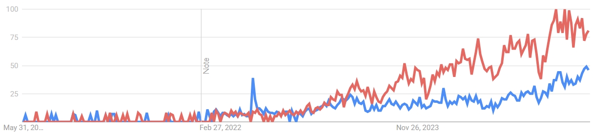
The image is a line chart comparing two trends over time. The chart displays two data series, one in red and one in blue, plotted against a timeline spanning from approximately May 2020 to November 2023. The y-axis ranges from 0 to 100.
### Components/Axes
* **X-axis:** Represents time, with labeled markers at "May 31, 20...", "Feb 27, 2022", and "Nov 26, 2023".
* **Y-axis:** Represents a numerical value, ranging from 0 to 100, with markers at 25, 50, 75, and 100.
* **Data Series 1:** Represented by a red line.
* **Data Series 2:** Represented by a blue line.
* **Note:** A vertical line labeled "Note" is positioned near February 27, 2022.
### Detailed Analysis
* **Red Line (Data Series 1):**
* From May 2020 to approximately February 2022, the red line fluctuates near the bottom of the chart (around 0-10).
* From February 2022 to November 2023, the red line shows a general upward trend with significant fluctuations. It rises from approximately 10 to a peak of around 90-100.
* **Blue Line (Data Series 2):**
* From May 2020 to approximately February 2022, the blue line fluctuates near the bottom of the chart (around 0-10), with a notable spike around the "Note" marker, reaching approximately 40.
* From February 2022 to November 2023, the blue line shows a general upward trend, but less pronounced than the red line. It rises from approximately 10 to around 50.
### Key Observations
* Both data series start at similar low values.
* The red line shows a more dramatic increase than the blue line.
* The blue line has a significant spike around February 2022, marked as "Note".
* Both lines show increased volatility in the later part of the chart.
### Interpretation
The chart illustrates the relative performance or interest in two different entities or phenomena over time. The red line's dramatic increase suggests a surge in popularity or activity, while the blue line's more moderate increase indicates a slower, steadier growth. The "Note" marker and the spike in the blue line could indicate a specific event or factor that significantly impacted the blue line's trend. The increased volatility in both lines towards the end of the chart suggests a period of greater uncertainty or change. Without knowing what the lines represent, it's difficult to say more.