\n
## Line Chart: Time Series Data
### Overview
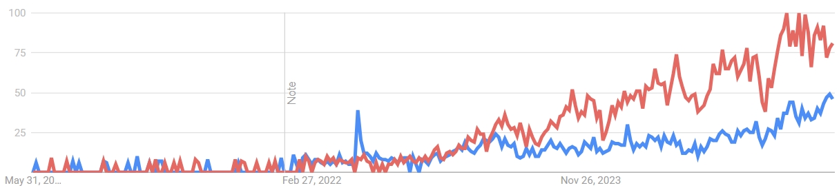
The image presents a line chart displaying two time series datasets over a period from approximately May 31, 2021, to November 26, 2023. The y-axis represents a numerical scale from 0 to 100, while the x-axis represents time. A vertical line with the label "Note" is present, marking February 27, 2022.
### Components/Axes
* **X-axis:** Time, labeled with dates starting from "May 31, 2021..." and ending at "Nov 26, 2023".
* **Y-axis:** Numerical scale from 0 to 100, with increments of 25.
* **Line 1:** Red line, representing one time series.
* **Line 2:** Blue line, representing another time series.
* **Annotation:** A vertical line labeled "Note" at February 27, 2022.
* **No Legend:** There is no explicit legend provided in the image.
### Detailed Analysis
**Red Line (Series 1):**
The red line begins at approximately 5 on May 31, 2021, and fluctuates around this level until February 27, 2022. After the "Note" marker, the line exhibits a generally upward trend, increasing from approximately 15 to a peak of around 95 by November 26, 2023. There are several fluctuations and dips along this upward trajectory.
* May 31, 2021: ~5
* Feb 27, 2022: ~15
* Nov 26, 2023: ~95
* Peak around November 26, 2023: ~95
* Lowest point after Feb 27, 2022: ~20 (approximate)
**Blue Line (Series 2):**
The blue line also starts at approximately 5 on May 31, 2021, and fluctuates similarly to the red line until February 27, 2022. After the "Note" marker, the blue line also shows an upward trend, but at a slower rate than the red line. It increases from approximately 10 to around 50 by November 26, 2023.
* May 31, 2021: ~5
* Feb 27, 2022: ~10
* Nov 26, 2023: ~50
* Peak around November 26, 2023: ~50
* Lowest point after Feb 27, 2022: ~10 (approximate)
### Key Observations
* Both time series exhibit similar behavior before February 27, 2022, fluctuating around low values.
* After February 27, 2022, both series show an upward trend, but the red line increases at a significantly faster rate than the blue line.
* The red line consistently maintains higher values than the blue line after February 27, 2022.
* The "Note" marker at February 27, 2022, appears to coincide with a shift in the behavior of both time series.
### Interpretation
The chart suggests a significant change or event occurred around February 27, 2022, as indicated by the "Note" annotation. This event appears to have triggered a period of growth for both datasets, but with differing rates of increase. The red line's more rapid growth could indicate a stronger response to the event or a different underlying dynamic. The lack of a legend makes it difficult to determine what the lines represent, but the data suggests a correlation between the two series, with the red series consistently outperforming the blue series after the noted event. The values on the y-axis are not specified, so the meaning of the data is unclear without additional context. It could represent growth percentages, index values, or any other quantifiable metric. The fluctuations in both lines suggest volatility or external factors influencing the trends.