## Line Chart: Temporal Trends of Two Unlabeled Metrics
### Overview
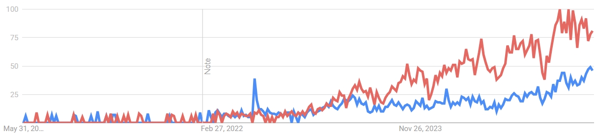
The image displays a line chart tracking two distinct data series over a period of approximately two and a half years. The chart shows a significant divergence in the trends of the two series, with one (red) exhibiting strong, volatile growth in the latter half of the timeline, while the other (blue) remains relatively low and stable with minor fluctuations. A vertical annotation labeled "Note" is present at a specific date.
### Components/Axes
* **Chart Type:** Line chart with two data series.
* **X-Axis (Horizontal):** Represents time. Three date markers are visible:
* Leftmost: "May 31, 20..." (The year is partially cut off, likely 2021 or earlier).
* Center: "Feb 27, 2022".
* Rightmost: "Nov 26, 2023".
* **Y-Axis (Vertical):** Represents a numerical scale from 0 to 100. Major gridlines and labels are present at intervals of 25: 0, 25, 50, 75, 100.
* **Data Series:**
* **Red Line:** One data series.
* **Blue Line:** A second data series.
* **Legend:** No explicit legend is present within the chart area. The series are distinguished solely by color.
* **Annotations:** A single vertical gray line is positioned at the "Feb 27, 2022" date marker. The text "Note" is written vertically (rotated 90 degrees counter-clockwise) to the left of this line.
### Detailed Analysis
**Trend Verification & Data Point Extraction:**
* **Red Line Trend:** The line begins near the 0 baseline with low-amplitude volatility. It shows a gradual, oscillating upward trend starting around mid-2022. The growth accelerates significantly after the "Nov 26, 2023" marker, entering a period of high volatility with sharp peaks and troughs. The line reaches its highest point near the top-right of the chart, approaching the 100 mark.
* **Approximate Key Points:**
* Start (left): ~0-5
* Around Feb 27, 2022: ~5-10
* Mid-2023: Oscillating between ~25 and ~50
* Late 2023/Early 2024: Peaks near ~95-100, with troughs dropping to ~70-75.
* **Blue Line Trend:** The line also starts near 0 with low volatility. It remains largely flat and intertwined with the red line until a distinct, sharp spike occurs just before the "Feb 27, 2022" marker, reaching approximately 40. Following this spike, it returns to a lower baseline and exhibits a very gradual, low-volatility upward drift, ending the period at a value notably lower than the red line.
* **Approximate Key Points:**
* Start (left): ~0-5
* Spike peak (pre-Feb 2022): ~40
* Post-spike baseline (2022-2023): Oscillating between ~5 and ~20
* End (right): ~45-50
**Spatial Grounding:** The "Note" annotation is positioned in the center of the chart, aligned with the Feb 27, 2022 x-axis tick. The red line's most dramatic ascent is concentrated in the right third of the chart area, after the Nov 26, 2023 marker.
### Key Observations
1. **Divergence:** The most prominent feature is the dramatic divergence of the two series beginning in late 2023. The red line enters a phase of exponential-looking growth and high volatility, while the blue line continues a modest, stable climb.
2. **Pre-2022 Correlation:** Prior to the "Note" line in early 2022, the two lines are closely correlated, moving in a similar low-value range.
3. **Blue Line Anomaly:** The isolated, sharp spike in the blue line just before February 2022 is a significant outlier not mirrored by the red line.
4. **Volatility Shift:** The red line's character changes fundamentally after late 2023, shifting from moderate oscillations to large, rapid swings.
### Interpretation
This chart likely visualizes the comparative performance or popularity of two related entities (e.g., technologies, products, search terms, market indices) over time. The "Note" line at Feb 27, 2022, may mark a specific event, product launch, or policy change that acted as a catalyst.
* **What the data suggests:** The red entity experienced a breakout moment in late 2023, leading to a period of intense but unstable growth. This could indicate a viral trend, a market bubble, or a highly successful but volatile product launch. The blue entity shows steady, organic growth, suggesting a more stable, established, or niche adoption curve.
* **Relationship:** The initial correlation suggests the two entities were in a similar market or subject to the same conditions. The post-2022 decoupling, especially after the blue line's unique spike, indicates they began to be driven by different factors. The red line's later surge may have come at the expense of the blue line's relative market share or attention, or it may represent a new, dominant entrant in the same space.
* **Anomalies:** The pre-2022 blue spike is a critical event that warrants investigation—it represents a moment of significant, temporary interest or activity specific to the blue series. The extreme volatility of the red line at high values suggests uncertainty, speculation, or a highly reactive market environment.
**Language Declaration:** All text extracted from the image is in English.