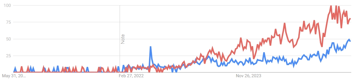
## Line Graph: Comparative Trend Analysis (May 2020–Nov 2023)
### Overview
The image depicts a line graph comparing two time-series datasets (red and blue lines) over a 3.5-year period. The graph includes a vertical "Note" marker at February 27, 2022, and shows distinct divergence between the two lines after November 2023.
### Components/Axes
- **X-axis (Time)**: Labeled with approximate dates:
- Start: May 31, 2020
- Midpoint: February 27, 2022 (marked with a vertical "Note" line)
- End: November 26, 2023
- **Y-axis (Value)**: Labeled "Value" with increments of 25 (0–100).
- **Legend**: Located in the top-right corner, associating:
- **Red line**: "Series A" (higher values)
- **Blue line**: "Series B" (lower values)
### Detailed Analysis
1. **Initial Phase (May 2020–Feb 2022)**:
- Both lines exhibit low-amplitude fluctuations (0–10 range).
- Red line peaks at ~8 on Feb 27, 2022 (coinciding with the "Note").
- Blue line remains below 5 during this period.
2. **Post-February 2022**:
- Red line begins a steady upward trend, reaching ~20 by mid-2022.
- Blue line stabilizes around 10–15 until late 2022.
3. **Late 2022–Nov 2023**:
- Red line accelerates, peaking at ~50 in mid-2023.
- Blue line shows minor fluctuations (15–25 range).
4. **Post-November 2023**:
- Red line surges sharply, exceeding 90 by late 2023.
- Blue line rises modestly to ~40, maintaining a ~50-point gap below the red line.
### Key Observations
- **Divergence Acceleration**: The gap between red and blue lines widens dramatically after November 2023.
- **Note Significance**: The Feb 27, 2022, marker aligns with the first major red line spike, suggesting a potential causal event.
- **Stability vs. Volatility**: Blue line remains relatively stable, while red line exhibits increasing volatility over time.
### Interpretation
The graph suggests a systemic shift post-February 2022, with the red line (Series A) responding disproportionately to an unspecified event (possibly policy, market, or environmental change). The sustained divergence after November 2023 implies accelerating growth or instability in Series A, while Series B remains constrained. The "Note" likely marks a pivotal moment, though the graph lacks contextual labels to confirm causality. The red line’s trajectory could indicate a feedback loop, resource depletion, or external pressure not reflected in the blue line’s behavior.