\n
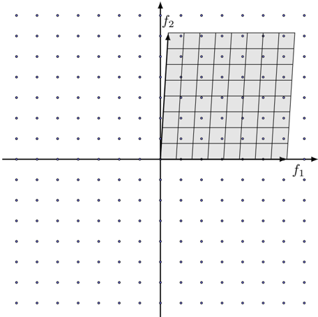
## Diagram: Pareto Front Visualization
### Overview
The image depicts a two-dimensional Pareto front visualization. It shows a coordinate system with axes labeled f1 and f2, and a shaded rectangular region representing the set of non-dominated solutions. The background is populated with dots, presumably representing other potential solutions that are dominated by those within the shaded region.
### Components/Axes
* **Axes:**
* Horizontal axis: labeled "f1"
* Vertical axis: labeled "f2"
* **Region:** A rectangular shaded area in the top-right quadrant.
* **Dots:** Numerous small dots scattered throughout the entire coordinate plane.
* **Origin:** The intersection of the two axes forms the origin (0,0).
### Detailed Analysis
The shaded rectangular region represents the Pareto front. It appears to be bounded by approximately:
* f1 ranging from roughly 0 to 10 (estimated).
* f2 ranging from roughly 0 to 8 (estimated).
The dots outside the shaded region represent solutions that are dominated – meaning there exists at least one solution within the shaded region that is better in at least one objective (f1 or f2) and no worse in any other objective.
The grid within the shaded region is composed of approximately 8 rows and 10 columns, creating roughly 80 individual cells. Each cell likely represents a specific solution within the Pareto front.
### Key Observations
* The Pareto front is a rectangular shape, suggesting a relatively simple trade-off between the two objectives (f1 and f2).
* The density of dots outside the shaded region appears to be relatively uniform, indicating that dominated solutions are distributed evenly across the solution space.
* There are no visible outliers or anomalies.
### Interpretation
This diagram illustrates the concept of Pareto optimality in a bi-objective optimization problem. The Pareto front represents the set of solutions where it is impossible to improve one objective without sacrificing another. The solutions within the shaded region are considered "non-dominated" because no other feasible solution can simultaneously improve both f1 and f2.
The rectangular shape of the Pareto front suggests a linear or near-linear trade-off between the two objectives. For example, increasing f1 might consistently decrease f2, and vice versa. The dots outside the shaded region represent suboptimal solutions that can be improved upon by moving towards the Pareto front.
This type of visualization is commonly used in multi-objective optimization to help decision-makers understand the trade-offs between different objectives and select a solution that best meets their preferences. The diagram doesn't provide specific numerical data, but rather a visual representation of the solution space and the optimal trade-offs.