## Probability Distribution Plot: T = 0.31, Instance 3
### Overview
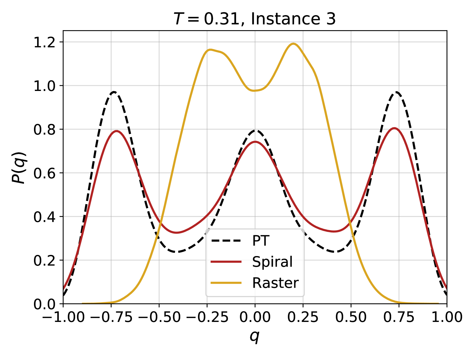
This image is a scientific line graph displaying three distinct probability distribution functions, P(q), plotted against a variable q. The plot compares the distributions generated by three different methods or models labeled "PT," "Spiral," and "Raster." The title indicates this is data from "Instance 3" at a parameter value of "T = 0.31."
### Components/Axes
* **Title:** "T = 0.31, Instance 3" (centered at the top).
* **X-Axis:**
* **Label:** "q" (centered below the axis).
* **Scale:** Linear, ranging from -1.00 to 1.00.
* **Major Ticks:** -1.00, -0.75, -0.50, -0.25, 0.00, 0.25, 0.50, 0.75, 1.00.
* **Y-Axis:**
* **Label:** "P(q)" (rotated 90 degrees, left of the axis).
* **Scale:** Linear, ranging from 0.0 to 1.2.
* **Major Ticks:** 0.0, 0.2, 0.4, 0.6, 0.8, 1.0, 1.2.
* **Legend:** Located in the bottom-right quadrant of the plot area, approximately centered horizontally between q=0.00 and q=0.50, and vertically between P(q)=0.0 and P(q)=0.4.
* **PT:** Represented by a black dashed line (`---`).
* **Spiral:** Represented by a solid red line.
* **Raster:** Represented by a solid gold/yellow line.
* **Grid:** A light gray grid is present, aligned with the major ticks on both axes.
### Detailed Analysis
The plot shows three distinct curves with different shapes and peak locations.
1. **PT (Black Dashed Line):**
* **Trend:** This is a symmetric, tri-modal distribution. It starts near zero at q=-1.00, rises to a sharp peak, falls to a local minimum, rises to a central peak, falls to another local minimum, rises to a final sharp peak, and returns to near zero at q=1.00.
* **Key Points (Approximate):**
* Left Peak: q ≈ -0.75, P(q) ≈ 0.97
* Left Trough: q ≈ -0.50, P(q) ≈ 0.23
* Central Peak: q ≈ 0.00, P(q) ≈ 0.80
* Right Trough: q ≈ 0.50, P(q) ≈ 0.23
* Right Peak: q ≈ 0.75, P(q) ≈ 0.97
2. **Spiral (Solid Red Line):**
* **Trend:** This is also a symmetric, tri-modal distribution, closely following the shape of the PT curve but with slightly lower peak amplitudes and shallower troughs. It is consistently below the PT curve at the peaks and above it in the troughs.
* **Key Points (Approximate):**
* Left Peak: q ≈ -0.75, P(q) ≈ 0.80
* Left Trough: q ≈ -0.50, P(q) ≈ 0.33
* Central Peak: q ≈ 0.00, P(q) ≈ 0.75
* Right Trough: q ≈ 0.50, P(q) ≈ 0.33
* Right Peak: q ≈ 0.75, P(q) ≈ 0.80
3. **Raster (Solid Gold Line):**
* **Trend:** This is a symmetric, bi-modal distribution with a very different profile. It is near zero at the extremes (q=-1.00 and q=1.00) and in the center (q=0.00). It features two broad, high-amplitude peaks on either side of the center.
* **Key Points (Approximate):**
* Left Peak: q ≈ -0.25, P(q) ≈ 1.17
* Central Trough: q ≈ 0.00, P(q) ≈ 0.98
* Right Peak: q ≈ 0.25, P(q) ≈ 1.20
### Key Observations
* **Symmetry:** All three distributions are symmetric about q=0.00.
* **Peak Alignment:** The PT and Spiral curves share identical peak and trough locations along the q-axis, differing only in amplitude. The Raster curve's peaks are located at different q-values (±0.25) compared to the others (±0.75, 0.00).
* **Amplitude Hierarchy:** At their respective peaks, the Raster curve reaches the highest P(q) value (~1.20), followed by PT (~0.97), and then Spiral (~0.80).
* **Distribution Shape:** PT and Spiral are tri-modal, while Raster is bi-modal. The Raster distribution concentrates its probability mass in the region between q=-0.5 and q=0.5, whereas PT and Spiral have significant probability at the more extreme q values of ±0.75.
### Interpretation
This plot likely compares the output of three different algorithms or sampling methods (PT, Spiral, Raster) for estimating a probability distribution P(q) under a specific condition (T=0.31, Instance 3). The variable `q` could represent an order parameter, a coordinate in configuration space, or a similar quantity in a physical or machine learning context.
The stark difference between the Raster distribution and the other two suggests it is modeling a fundamentally different underlying process or is subject to different constraints. The close similarity between PT and Spiral implies these two methods produce qualitatively and quantitatively similar results for this instance, with PT yielding slightly sharper features (higher peaks, lower troughs). The symmetry indicates the underlying system or problem is symmetric with respect to the sign of `q`. The parameter `T=0.31` might be a temperature or a similar control parameter influencing the shape of these distributions; different `T` values would likely produce different curve profiles.