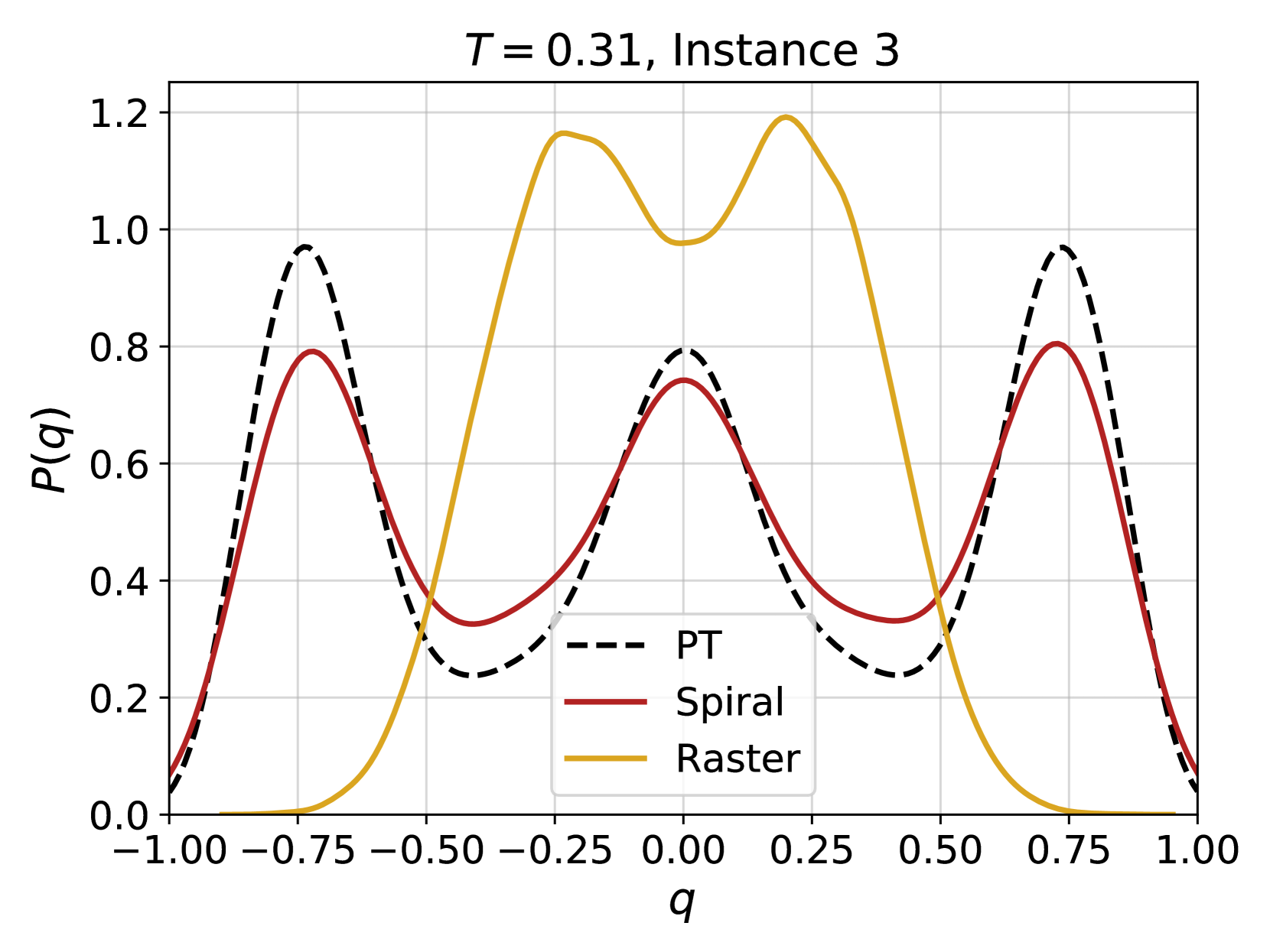
## Line Chart: P(q) vs. q for T = 0.31, Instance 3
### Overview
The image is a line chart comparing the probability distribution P(q) as a function of q for three different methods: PT (dashed black line), Spiral (solid red line), and Raster (solid gold line). The chart displays data for T = 0.31 and Instance 3. The x-axis (q) ranges from -1.00 to 1.00, and the y-axis (P(q)) ranges from 0.0 to 1.2.
### Components/Axes
* **Title:** T = 0.31, Instance 3
* **X-axis:**
* Label: q
* Scale: -1.00, -0.75, -0.50, -0.25, 0.00, 0.25, 0.50, 0.75, 1.00
* **Y-axis:**
* Label: P(q)
* Scale: 0.0, 0.2, 0.4, 0.6, 0.8, 1.0, 1.2
* **Legend:** Located in the center-right of the chart.
* PT: Dashed black line
* Spiral: Solid red line
* Raster: Solid gold line
### Detailed Analysis
* **PT (Dashed Black Line):**
* Trend: Starts at approximately 0.0 at q = -1.00, rises to a peak around 0.96 at q = -0.75, decreases to a local minimum around 0.26 at q = -0.25, rises again to a peak around 0.76 at q = 0.00, decreases to a local minimum around 0.26 at q = 0.25, rises to a peak around 0.96 at q = 0.75, and then decreases back to approximately 0.0 at q = 1.00.
* Key Points:
* (-1.00, ~0.0)
* (-0.75, ~0.96)
* (-0.25, ~0.26)
* (0.00, ~0.76)
* (0.25, ~0.26)
* (0.75, ~0.96)
* (1.00, ~0.0)
* **Spiral (Solid Red Line):**
* Trend: Starts at approximately 0.0 at q = -1.00, rises to a peak around 0.78 at q = -0.75, decreases to a local minimum around 0.34 at q = -0.25, rises again to a peak around 0.76 at q = 0.00, decreases to a local minimum around 0.34 at q = 0.25, rises to a peak around 0.78 at q = 0.75, and then decreases back to approximately 0.0 at q = 1.00.
* Key Points:
* (-1.00, ~0.0)
* (-0.75, ~0.78)
* (-0.25, ~0.34)
* (0.00, ~0.76)
* (0.25, ~0.34)
* (0.75, ~0.78)
* (1.00, ~0.0)
* **Raster (Solid Gold Line):**
* Trend: Starts at approximately 0.0 at q = -1.00, rises to a peak around 0.92 at q = -0.25, decreases to a local minimum around 0.98 at q = 0.00, rises again to a peak around 1.16 at q = 0.25, and then decreases back to approximately 0.0 at q = 1.00.
* Key Points:
* (-1.00, ~0.0)
* (-0.25, ~1.16)
* (0.00, ~0.98)
* (0.25, ~1.16)
* (1.00, ~0.0)
### Key Observations
* All three methods (PT, Spiral, and Raster) show symmetrical distributions around q = 0.00.
* The Raster method has the highest peak probability, reaching approximately 1.16 at q = -0.25 and q = 0.25.
* The PT method has sharper peaks compared to the Spiral method.
* The Spiral method has the lowest peak probability, reaching approximately 0.78 at q = -0.75 and q = 0.75.
### Interpretation
The chart compares the probability distributions P(q) obtained from three different methods (PT, Spiral, and Raster) for a specific system configuration (T = 0.31, Instance 3). The data suggests that the Raster method predicts a higher probability of finding the system in states corresponding to q = -0.25 and q = 0.25, while the Spiral method predicts a lower probability for states corresponding to q = -0.75 and q = 0.75. The PT method provides an intermediate distribution. The symmetry of the distributions around q = 0.00 indicates that the system exhibits similar behavior for positive and negative values of q. The differences in the peak heights and widths suggest that the methods capture different aspects of the system's behavior or have varying levels of accuracy.