## Line Graph: Probability Distribution at T = 0.31, Instance 3
### Overview
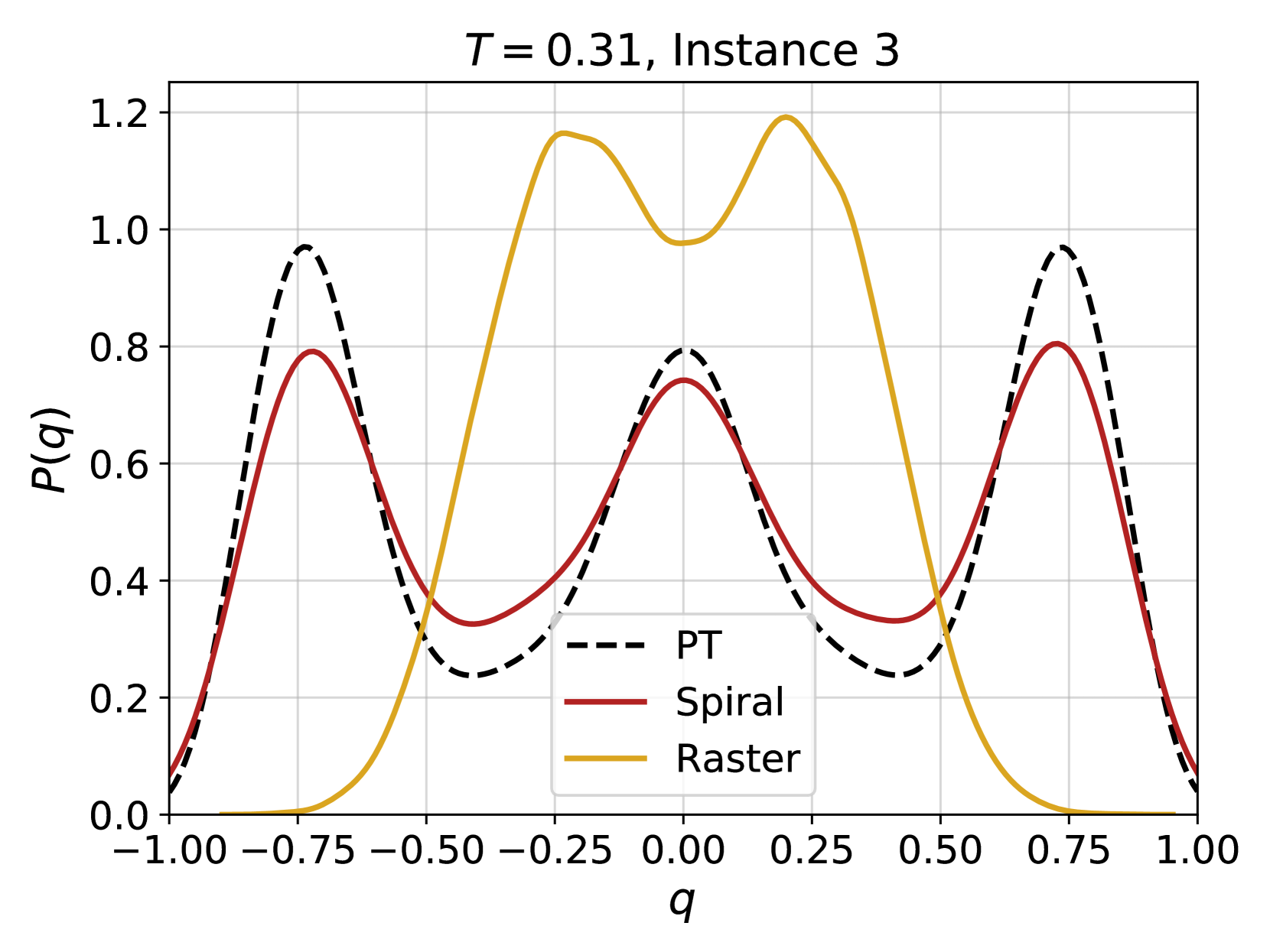
The graph depicts three probability distributions (P(q)) as functions of the variable q, ranging from -1.00 to 1.00. Three distinct lines represent different models: PT (dashed black), Spiral (solid red), and Raster (solid yellow). The y-axis (P(q)) scales from 0.0 to 1.2, with gridlines for reference.
### Components/Axes
- **X-axis (q)**: Ranges from -1.00 to 1.00 in increments of 0.25.
- **Y-axis (P(q))**: Ranges from 0.0 to 1.2 in increments of 0.2.
- **Legend**: Located in the bottom-right corner, associating:
- Dashed black line → PT
- Solid red line → Spiral
- Solid yellow line → Raster
### Detailed Analysis
1. **PT (Dashed Black)**:
- Peaks at q ≈ -0.75, 0.25, and 0.75.
- Maximum P(q) ≈ 1.0 at q ≈ -0.75.
- Symmetrical decay toward q = 0 and q = ±1.00.
2. **Spiral (Solid Red)**:
- Peaks at q ≈ -0.75, 0.25, and 0.75.
- Maximum P(q) ≈ 0.8 at q ≈ -0.75.
- Smoother curve compared to PT, with less pronounced peaks.
3. **Raster (Solid Yellow)**:
- Peaks at q ≈ -0.5, 0.0, and 0.5.
- Maximum P(q) ≈ 1.2 at q ≈ -0.5 and 0.5.
- Sharpest peaks, with a distinct central peak at q = 0.0.
### Key Observations
- **Raster** exhibits the highest probability values (up to 1.2) and the most pronounced peaks, suggesting stronger emphasis on mid-range q values (-0.5, 0.0, 0.5).
- **PT** and **Spiral** share similar peak positions but differ in magnitude, with PT consistently higher than Spiral.
- All models show periodic behavior, but Raster’s peaks are more evenly spaced and centered, while PT/Spiral peaks are offset toward the edges.
### Interpretation
The graph illustrates how three models (PT, Spiral, Raster) distribute probability across q values at a fixed temperature (T = 0.31). The Raster model’s dominance at q = ±0.5 and 0.0 suggests it prioritizes central or symmetric states, while PT and Spiral favor edge-aligned peaks (q ≈ ±0.75). The temperature parameter (T = 0.31) likely modulates these distributions, with Raster’s higher peaks indicating greater sensitivity or confidence in specific q regions. The periodic patterns across all models imply an underlying oscillatory or repetitive mechanism in the system being modeled.