\n
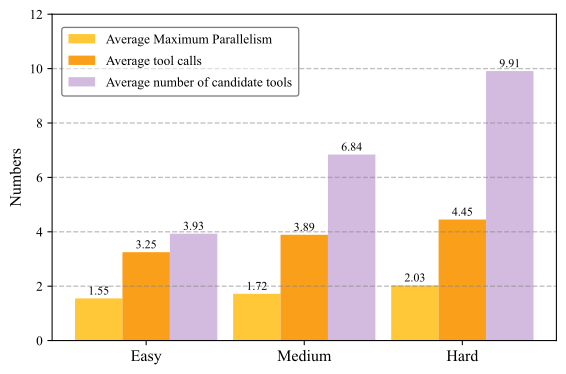
## Bar Chart: Tool Usage vs. Difficulty
### Overview
This bar chart compares the average maximum parallelism, average tool calls, and average number of candidate tools across three difficulty levels: Easy, Medium, and Hard. The chart uses stacked bars to represent the relationship between the three metrics.
### Components/Axes
* **X-axis:** Difficulty Level (Easy, Medium, Hard)
* **Y-axis:** Numbers (Scale from 0 to 10, with gridlines at 2, 4, 6, 8, and 10)
* **Legend:** Located at the top-left corner.
* Average Maximum Parallelism (Yellow)
* Average tool calls (Orange)
* Average number of candidate tools (Purple)
### Detailed Analysis
The chart consists of three groups of stacked bars, one for each difficulty level.
**Easy:**
* Average Maximum Parallelism: Approximately 1.55
* Average tool calls: Approximately 3.25
* Average number of candidate tools: Approximately 3.93
* Total Height: Approximately 8.73
**Medium:**
* Average Maximum Parallelism: Approximately 1.72
* Average tool calls: Approximately 3.89
* Average number of candidate tools: Approximately 6.84
* Total Height: Approximately 12.45
**Hard:**
* Average Maximum Parallelism: Approximately 2.03
* Average tool calls: Approximately 4.45
* Average number of candidate tools: Approximately 9.91
* Total Height: Approximately 16.39
The bars are stacked such that the yellow segment (Average Maximum Parallelism) is at the bottom, followed by the orange segment (Average tool calls), and finally the purple segment (Average number of candidate tools) on top.
### Key Observations
* All three metrics increase with difficulty level.
* The average number of candidate tools increases most significantly with difficulty.
* The average maximum parallelism is the lowest value across all difficulty levels.
* The total height of the bars (representing the sum of all three metrics) increases substantially from Easy to Hard.
### Interpretation
The data suggests that as the difficulty of a task increases, the number of tools considered and the number of tool calls also increase. This could indicate that more complex tasks require a wider range of tools and more frequent tool usage. The relatively stable average maximum parallelism suggests that the degree of parallel processing doesn't change dramatically with task difficulty, or that there are limitations to how much parallelism can be effectively utilized. The increasing trend across all metrics highlights a positive correlation between task complexity and resource utilization. The large increase in candidate tools for the "Hard" difficulty suggests a greater need for exploration and selection of appropriate tools for challenging tasks.