\n
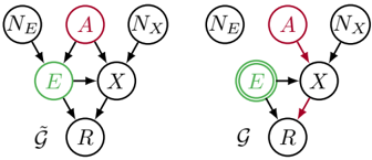
## Causal Diagram: Comparison of Two Graphical Models ($\tilde{\mathcal{G}}$ and $\mathcal{G}$)
### Overview
The image displays two side-by-side directed acyclic graphs (DAGs), labeled as $\tilde{\mathcal{G}}$ (left) and $\mathcal{G}$ (right). These are technical diagrams, likely from a field such as causal inference, statistics, or epidemiology, illustrating hypothesized relationships between variables. The diagrams share the same set of nodes but differ in the coloring of specific arrows, indicating a change in the modeled relationships or emphasis.
### Components/Axes
**Nodes (Variables):**
* **$N_E$**: A node positioned at the top-left of each diagram.
* **$A$**: A node positioned at the top-center, colored **red**.
* **$N_X$**: A node positioned at the top-right.
* **$E$**: A node positioned in the middle-left, colored **green** and enclosed in a **double circle**.
* **$X$**: A node positioned in the middle-right.
* **$R$**: A node positioned at the bottom-center.
**Edges (Relationships):**
The arrows represent directed relationships. The direction is from the tail to the head of the arrow.
**Diagram $\tilde{\mathcal{G}}$ (Left):**
* All edges are drawn in **black**.
* **Flow:** $N_E \rightarrow E$, $A \rightarrow X$, $N_X \rightarrow X$, $E \rightarrow X$, $E \rightarrow R$, $X \rightarrow R$.
**Diagram $\mathcal{G}$ (Right):**
* Two edges are colored **red**: $A \rightarrow X$ and $X \rightarrow R$.
* All other edges are **black**: $N_E \rightarrow E$, $N_X \rightarrow X$, $E \rightarrow X$, $E \rightarrow R$.
* **Flow:** Identical to $\tilde{\mathcal{G}}$ in structure, but with the two red edges highlighting a specific path.
**Labels:**
* The label $\tilde{\mathcal{G}}$ is placed below the left diagram.
* The label $\mathcal{G}$ is placed below the right diagram.
### Detailed Analysis
**Structural Comparison:**
The two diagrams are structurally identical. The set of nodes and the direction of all arrows are the same. The only visual difference is the color of two specific edges in diagram $\mathcal{G}$.
**Path Analysis:**
1. **Path from $A$ to $R$:**
* In $\tilde{\mathcal{G}}$, the path is $A \rightarrow X \rightarrow R$ (all black edges).
* In $\mathcal{G}$, the same path $A \rightarrow X \rightarrow R$ is highlighted in **red**.
2. **Other Paths:**
* A path exists from $E$ to $R$ ($E \rightarrow R$) in both diagrams.
* $E$ also influences $R$ indirectly via $X$ ($E \rightarrow X \rightarrow R$).
* $N_E$ and $N_X$ appear to be exogenous noise or error terms influencing $E$ and $X$, respectively.
**Node Significance:**
* The **double circle** around node $E$ is a standard notation in graphical models to denote a **mediator** or a variable of special interest (e.g., an exposure or intermediate variable).
* The **red color** of node $A$ likely marks it as the primary **treatment** or **intervention** variable.
### Key Observations
1. **Identical Topology:** The core finding is that $\tilde{\mathcal{G}}$ and $\mathcal{G}$ represent the same causal structure. The difference is purely presentational.
2. **Highlighted Path:** The red edges in $\mathcal{G}$ explicitly isolate and emphasize the direct causal pathway from the treatment ($A$) to the final outcome ($R$) via the intermediate variable $X$.
3. **Role of $E$:** Variable $E$ (highlighted green and double-circled) is a common cause of both $X$ and $R$. This makes it a potential **confounder** for the relationship between $X$ and $R$, and its position suggests it is a key variable being adjusted for or studied.
4. **Exogenous Variables:** $N_E$ and $N_X$ are parents only to $E$ and $X$ respectively, with no outgoing arrows to other variables in the system, consistent with them representing independent noise.
### Interpretation
These diagrams are used to reason about causal effects. The structure suggests a model where:
* The ultimate outcome of interest is $R$.
* The treatment $A$ affects $R$ solely through its effect on $X$ (the path $A \rightarrow X \rightarrow R$). There is no direct arrow from $A$ to $R$.
* The variable $E$ confounds the relationship between $X$ and $R$ because it influences both. Any analysis aiming to estimate the effect of $X$ on $R$ would need to account for $E$.
* The transition from $\tilde{\mathcal{G}}$ to $\mathcal{G}$ likely represents a shift in analytical focus. $\tilde{\mathcal{G}}$ shows the full system. $\mathcal{G}$ then highlights the specific causal chain of interest: how the treatment $A$ propagates through the system to influence $R$ via $X$. This highlighted path ($A \rightarrow X \rightarrow R$) is often the target for estimation in mediation analysis or when studying indirect effects.
**In essence, the image communicates:** "Here is our full causal model ($\tilde{\mathcal{G}}$). Within it, we are specifically interested in this direct pathway from treatment to outcome ($\mathcal{G}$), while acknowledging the confounding role of variable $E$."