## Diagram: Causal Diagrams
### Overview
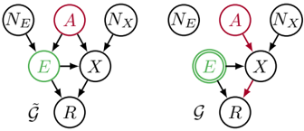
The image presents two causal diagrams illustrating relationships between variables. The left diagram, labeled with a tilde over a G (approximately "G-tilde"), shows a basic causal structure. The right diagram, labeled "G", highlights specific causal paths with color-coding.
### Components/Axes
**Left Diagram (G-tilde):**
* Nodes (from top to bottom, left to right):
* $N_E$ (black outline, black text) - Top-left
* $A$ (red outline, red text) - Top-center
* $N_X$ (black outline, black text) - Top-right
* $E$ (green outline, green text) - Center-left
* $X$ (black outline, black text) - Center-right
* $\tilde{G}$ (black text) - Bottom-left
* $R$ (black outline, black text) - Bottom-center
* Edges:
* $N_E$ -> $E$ (black arrow)
* $A$ -> $E$ (black arrow)
* $N_X$ -> $X$ (black arrow)
* $E$ -> $X$ (black arrow)
* $E$ -> $R$ (black arrow)
* $X$ -> $R$ (black arrow)
**Right Diagram (G):**
* Nodes (from top to bottom, left to right):
* $N_E$ (black outline, black text) - Top-left
* $A$ (red outline, red text) - Top-center
* $N_X$ (black outline, black text) - Top-right
* $E$ (green outline, green text, double circle) - Center-left
* $X$ (black outline, black text) - Center-right
* $G$ (black text) - Bottom-left
* $R$ (black outline, black text) - Bottom-center
* Edges:
* $N_E$ -> $E$ (black arrow)
* $A$ -> $X$ (red arrow)
* $N_X$ -> $X$ (black arrow)
* $E$ -> $X$ (black arrow)
* $E$ -> $R$ (black arrow)
* $X$ -> $R$ (red arrow)
### Detailed Analysis or ### Content Details
**Left Diagram (G-tilde):**
The diagram shows that $E$ is influenced by $N_E$ and $A$. $X$ is influenced by $N_X$ and $E$. Both $E$ and $X$ influence $R$.
**Right Diagram (G):**
The diagram shows that $E$ is influenced by $N_E$ and $A$. $X$ is influenced by $N_X$, $A$ and $E$. Both $E$ and $X$ influence $R$. The edges $A$ -> $X$ and $X$ -> $R$ are highlighted in red. The node $E$ is highlighted with a double green circle.
### Key Observations
* The two diagrams share a similar structure but differ in the highlighting of specific causal paths.
* In the right diagram, the red arrows indicate a specific causal pathway of interest.
* The double circle around $E$ in the right diagram may indicate a special property or focus on this variable.
### Interpretation
The diagrams likely represent different models or perspectives on the causal relationships between the variables. The left diagram (G-tilde) shows a general causal structure, while the right diagram (G) emphasizes the influence of $A$ on $X$ and $X$ on $R$, possibly indicating a specific intervention or analysis focused on these relationships. The highlighting of $E$ in the right diagram suggests that its role is particularly important in the context of the highlighted causal paths.