\n
## Diagram: Causal Network Comparison
### Overview
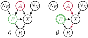
The image presents two diagrams depicting causal relationships between variables. Both diagrams share the same variables but differ in the direction of one causal link. The diagrams are positioned side-by-side for comparison. The left diagram is labeled with “g̃” and the right diagram with “g”.
### Components/Axes
The diagrams consist of nodes representing variables, connected by directed arrows indicating causal relationships. The variables are:
* N<sub>E</sub> (Black circle, top-left)
* A (Red circle, top-center)
* N<sub>X</sub> (Black circle, top-right)
* E (Green circle, center-left)
* X (Black circle, center)
* R (Black circle, bottom)
The arrows represent the following relationships:
* N<sub>E</sub> → E
* A → E
* N<sub>X</sub> → X
* A → X
* X → R
In the left diagram (g̃), there is also a link from E → X. In the right diagram (g), there is a link from X → R.
### Detailed Analysis or Content Details
**Diagram 1 (g̃):**
* N<sub>E</sub> causes E.
* A causes E.
* N<sub>X</sub> causes X.
* A causes X.
* E causes X.
* X causes R.
**Diagram 2 (g):**
* N<sub>E</sub> causes E.
* A causes E.
* N<sub>X</sub> causes X.
* A causes X.
* X causes R.
The key difference is the presence of the E → X link in the left diagram (g̃) and the absence of this link in the right diagram (g).
### Key Observations
The diagrams illustrate two different causal models. The left model (g̃) includes a direct causal effect of E on X, while the right model (g) does not. The labels “g̃” and “g” suggest these are two different models being compared.
### Interpretation
The diagrams likely represent two competing hypotheses about the causal relationships between the variables. The presence or absence of the E → X link is the critical distinction between the two models. This difference could have implications for understanding the effects of interventions on these variables. For example, if the true causal structure is represented by g̃, then intervening on E would be expected to have a direct effect on X, whereas in model g, any effect of E on X would be mediated through other variables. The diagrams are a visual representation of structural causal models, used in fields like statistics, machine learning, and epidemiology to reason about cause and effect. The use of different labels (g̃ and g) suggests that one model might be a modification or refinement of the other.