## Dual-Axis Line Chart: Training Metrics Over Steps
### Overview
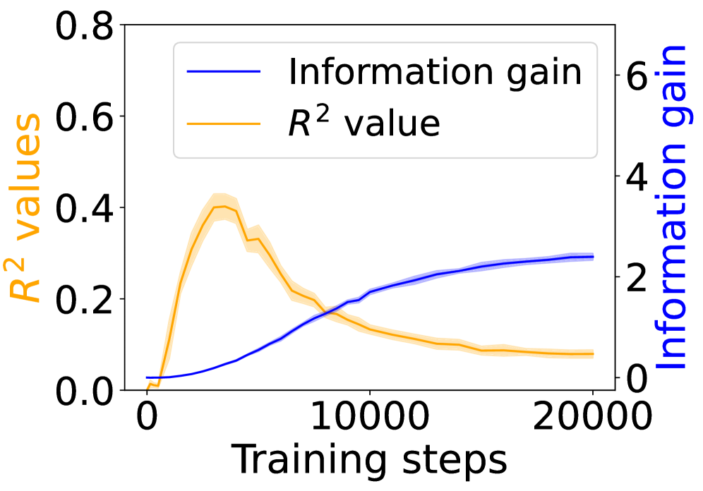
The image displays a dual-axis line chart plotting two different metrics against the number of training steps. The chart compares the progression of "Information gain" and "R² value" over a training period of 20,000 steps. The two metrics are measured on separate y-axes due to their different scales.
### Components/Axes
* **X-Axis (Bottom):**
* **Label:** "Training steps"
* **Scale:** Linear, from 0 to 20,000.
* **Major Tick Marks:** 0, 10000, 20000.
* **Primary Y-Axis (Left):**
* **Label:** "R² values" (text colored orange).
* **Scale:** Linear, from 0.0 to 0.8.
* **Major Tick Marks:** 0.0, 0.2, 0.4, 0.6, 0.8.
* **Secondary Y-Axis (Right):**
* **Label:** "Information gain" (text colored blue).
* **Scale:** Linear, from 0 to 6.
* **Major Tick Marks:** 0, 2, 4, 6.
* **Legend:**
* **Position:** Top-left corner, inside the plot area.
* **Entry 1:** A blue line labeled "Information gain".
* **Entry 2:** An orange line labeled "R² value".
* **Data Series:**
* **Blue Line ("Information gain"):** A solid blue line with a light blue shaded region around it, representing a confidence interval or standard deviation.
* **Orange Line ("R² value"):** A solid orange line with a light orange shaded region around it, representing a confidence interval or standard deviation.
### Detailed Analysis
**Trend Verification & Data Points:**
1. **Information Gain (Blue Line, Right Axis):**
* **Trend:** Shows a steady, monotonic increase that begins to plateau in the later stages of training.
* **Data Points (Approximate):**
* Step 0: ~0.1
* Step 5000: ~0.8
* Step 10000: ~1.8
* Step 15000: ~2.3
* Step 20000: ~2.5 (plateauing)
2. **R² Value (Orange Line, Left Axis):**
* **Trend:** Shows a rapid initial increase to a peak, followed by a gradual decline.
* **Data Points (Approximate):**
* Step 0: ~0.0
* Step 2500: ~0.25
* Step 5000 (Peak): ~0.40
* Step 7500: ~0.25
* Step 10000: ~0.15
* Step 15000: ~0.10
* Step 20000: ~0.08
**Spatial Grounding & Cross-Reference:**
* The legend is positioned in the top-left quadrant of the chart area.
* The blue line corresponds to the right-hand "Information gain" axis. Its values are read against the scale from 0 to 6.
* The orange line corresponds to the left-hand "R² values" axis. Its values are read against the scale from 0.0 to 0.8.
* The two lines intersect at approximately step 8,000. At this point, the R² value is ~0.2 and the Information gain is ~1.5.
### Key Observations
1. **Divergent Trends:** The two metrics exhibit fundamentally different behaviors over the training period. Information gain consistently improves, while R² value peaks early and then deteriorates.
2. **Peak Performance:** The model's R² value, a measure of goodness-of-fit, reaches its maximum performance relatively early in training (around 5,000 steps).
3. **Plateau vs. Decline:** Information gain appears to approach an asymptote (plateau) after 15,000 steps, suggesting diminishing returns. In contrast, the R² value continues a slow decline.
4. **Uncertainty Bands:** Both lines have shaded confidence bands, indicating variability in the measurements. The band for the R² value appears slightly wider around its peak.
### Interpretation
This chart illustrates a potential trade-off or decoupling between two model evaluation metrics during training.
* **What the data suggests:** The steady rise in "Information gain" implies the model is continuously learning and extracting more information from the data as training progresses. However, the early peak and subsequent decline in "R² value" suggests that while the model is gaining information, its ability to explain the variance in the training data (in a linear regression sense) worsens after a certain point.
* **How elements relate:** The inverse relationship after the ~5,000-step mark is notable. It could indicate the onset of overfitting, where the model begins to fit noise in the training data, harming its general explanatory power (R²) even as it memorizes more specific information (gain). Alternatively, it might reflect a shift in the model's internal representations that is beneficial for one metric but detrimental to the other.
* **Notable anomalies:** The most significant feature is the sharp peak in R² value. This suggests an optimal point for model fit occurred early, and extended training beyond this point may be counterproductive if R² is the primary metric of concern. The continued rise in information gain, however, might be desirable for other objectives, such as representation learning or performance on a downstream task not measured by R².
**Conclusion:** The chart provides a technical narrative that "more training" is not uniformly better across all metrics. The choice of when to stop training (early stopping) depends critically on which metric—explanatory power (R²) or information acquisition—is prioritized for the specific application.