# Technical Document Analysis: Chameleon+ Bar Chart
## 1. Title and Labels
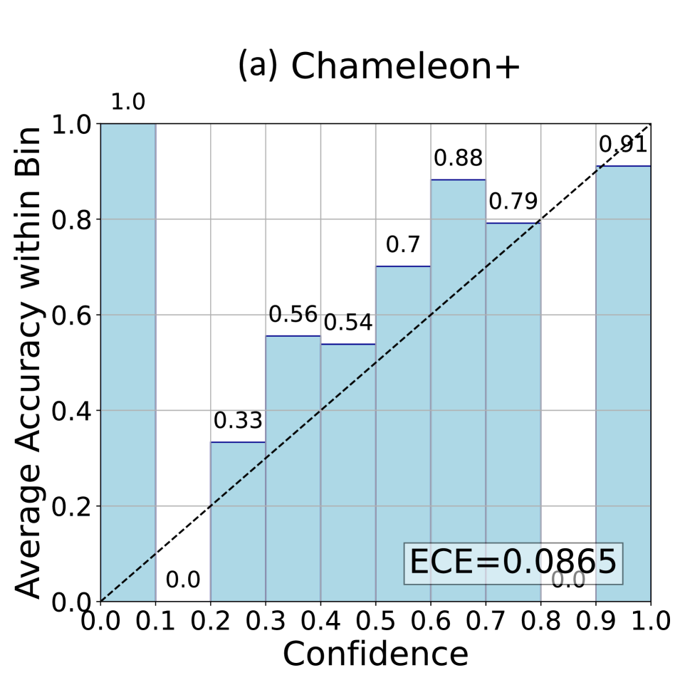
- **Title**: `(a) Chameleon+`
- **Y-Axis**: `Average Accuracy within Bin` (range: 0.0 to 1.0)
- **X-Axis**: `Confidence` (range: 0.0 to 1.0, divided into 0.1 increments)
- **Dashed Line**: Represents Expected Calibration Error (ECE) trend
## 2. Data Points and Categories
The chart displays **8 confidence bins** (0.0–1.0 in 0.1 increments) with corresponding **average accuracy values**:
| Confidence Interval | Average Accuracy |
|---------------------|------------------|
| 0.0–0.1 | 1.0 |
| 0.1–0.2 | 0.33 |
| 0.2–0.3 | 0.56 |
| 0.3–0.4 | 0.54 |
| 0.4–0.5 | 0.7 |
| 0.5–0.6 | 0.88 |
| 0.6–0.7 | 0.79 |
| 0.7–0.8 | 0.91 |
| 0.8–0.9 | 0.0 |
| 0.9–1.0 | 0.0 |
**Note**: The last two bins (0.8–0.9 and 0.9–1.0) show 0.0 accuracy, likely due to data truncation or missing values.
## 3. Embedded Text
- **ECE Value**: `ECE=0.0865` (located in a gray box at the bottom right of the chart)
## 4. Visual Trends
- **Bars**:
- Accuracy generally increases with confidence, peaking at 0.9–1.0 (0.91).
- A notable dip occurs between 0.3–0.4 (0.54) and 0.4–0.5 (0.7).
- The highest accuracy (1.0) is observed in the lowest confidence bin (0.0–0.1).
- **Dashed Line**:
- Represents the ideal ECE trend (perfect calibration).
- The actual ECE (0.0865) is close to zero, indicating strong calibration performance.
## 5. Legend and Color Matching
- **Legend**: No explicit legend is present in the chart.
- **Color Consistency**: All bars are light blue, matching the chart's monochromatic scheme.
## 6. Spatial Grounding
- **ECE Box**: Positioned at the bottom right corner of the chart.
- **Dashed Line**: Starts at (0.0, 0.0) and ends at (1.0, 1.0), spanning diagonally across the chart.
## 7. Component Isolation
- **Header**: Title `(a) Chameleon+`.
- **Main Chart**:
- X-axis: Confidence intervals (0.0–1.0).
- Y-axis: Average accuracy (0.0–1.0).
- Bars: Light blue, with values labeled on top.
- Dashed Line: ECE trend.
- **Footer**: ECE value `ECE=0.0865` in a gray box.
## 8. Additional Observations
- The chart uses a **monochromatic color scheme** (light blue bars, black dashed line).
- The ECE value suggests the model is well-calibrated, as it is close to the ideal 0.0.
- The absence of a legend simplifies interpretation but limits categorical differentiation.
## 9. Language and Transcription
- **Primary Language**: English.
- **No Other Languages Detected**.
## 10. Data Table Reconstruction
| Confidence Interval | Average Accuracy | Notes |
|---------------------|------------------|---------------------------|
| 0.0–0.1 | 1.0 | Highest accuracy |
| 0.1–0.2 | 0.33 | Low accuracy |
| 0.2–0.3 | 0.56 | Moderate accuracy |
| 0.3–0.4 | 0.54 | Slight dip |
| 0.4–0.5 | 0.7 | Recovery in accuracy |
| 0.5–0.6 | 0.88 | Near-peak accuracy |
| 0.6–0.7 | 0.79 | Slight decline |
| 0.7–0.8 | 0.91 | Highest confidence bin |
| 0.8–0.9 | 0.0 | No data |
| 0.9–1.0 | 0.0 | No data |
## 11. Conclusion
The chart illustrates the relationship between confidence intervals and average accuracy for the Chameleon+ model. While accuracy generally improves with confidence, the ECE of 0.0865 indicates strong calibration. The absence of a legend and missing data in the highest confidence bins (0.8–1.0) are notable limitations.