\n
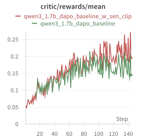
## Line Chart: Critic/Rewards/Mean Over Training Steps
### Overview
This image displays a line chart comparing the mean critic reward values over training steps for two different model configurations. The chart tracks performance from step 0 to approximately step 145. The primary visual takeaway is that both models show an upward trend in mean reward, but one configuration consistently achieves higher values after an initial period of similar performance.
### Components/Axes
* **Chart Title:** `critic/rewards/mean` (Top-center)
* **Legend:** Positioned directly below the title.
* **Red Line:** `qwen3_1.7b_dapo_baseline_w_sen_clip`
* **Green Line:** `qwen3_1.7b_dapo_baseline`
* **X-Axis:**
* **Label:** `Step` (Bottom-right)
* **Scale:** Linear, from 0 to ~145.
* **Major Tick Marks:** 0, 20, 40, 60, 80, 100, 120, 140.
* **Y-Axis:**
* **Scale:** Linear, from 0.00 to ~0.27.
* **Major Tick Marks:** 0, 0.05, 0.10, 0.15, 0.20, 0.25.
### Detailed Analysis
**Trend Verification & Data Points:**
1. **General Trend (Both Lines):** Both data series exhibit a clear upward trend from left to right, indicating that the mean critic reward increases as training steps progress. The lines are highly volatile, showing significant step-to-step fluctuation.
2. **Red Line (`qwen3_1.7b_dapo_baseline_w_sen_clip`):**
* **Trend:** Slopes upward with high volatility. It generally maintains a position above the green line after approximately step 40.
* **Key Points (Approximate):**
* Start (Step 0): ~0.05
* Step 20: ~0.10
* Step 60: ~0.18
* Step 100: ~0.22
* Step 140: Peaks near ~0.27, ends near ~0.20.
3. **Green Line (`qwen3_1.7b_dapo_baseline`):**
* **Trend:** Also slopes upward with high volatility. It tracks closely with the red line until around step 40, after which it generally falls below the red line.
* **Key Points (Approximate):**
* Start (Step 0): ~0.05
* Step 20: ~0.10
* Step 60: ~0.15
* Step 100: ~0.18
* Step 140: Peaks near ~0.20, ends near ~0.15.
**Spatial Grounding:** The legend is placed at the top-center of the chart area. The red line is visually dominant in the upper region of the plot for the latter two-thirds of the x-axis range.
### Key Observations
* **Performance Divergence:** A clear performance gap emerges around step 40. The model with the `_w_sen_clip` suffix (red line) begins to achieve and sustain higher mean reward values than the baseline model (green line).
* **Volatility:** Both models show high variance in their reward signals from step to step, which is common in reinforcement learning training curves.
* **Peak Values:** The red line reaches a higher maximum value (~0.27) compared to the green line (~0.20).
* **Final Values:** At the last visible data point (~step 145), the red line (~0.20) remains above the green line (~0.15).
### Interpretation
This chart demonstrates the comparative training progress of two related AI models, likely in a reinforcement learning from human feedback (RLHF) or similar context, where "critic/rewards/mean" is a key performance metric.
* **What the data suggests:** The addition of the component or technique abbreviated as "sen_clip" to the baseline `qwen3_1.7b_dapo` model leads to a measurable improvement in the mean reward signal generated by the critic network during training. This improvement becomes significant after an initial alignment phase (~40 steps).
* **How elements relate:** The x-axis (Step) represents training progression. The upward trend of both lines indicates successful learning. The divergence between the red and green lines isolates the positive impact of the "sen_clip" modification.
* **Notable Anomalies/Patterns:** The high volatility is not an anomaly but a characteristic of the training process. The most notable pattern is the consistent separation of the two lines after step 40, which provides strong visual evidence for the efficacy of the tested modification. The fact that both lines start at the same point confirms a controlled comparison from the same initialization.
**Language Declaration:** All text in the image is in English.