## Scatter Plots with Error Bars and Trend Lines: Log-Log Error Analysis
### Overview
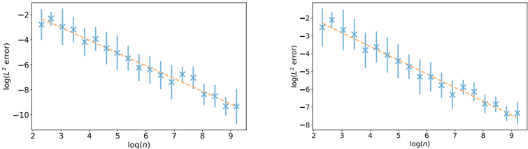
The image contains two side-by-side scatter plots on a white background. Both plots display the same type of data: the logarithm of the L² error (y-axis) plotted against the logarithm of a variable `n` (x-axis). Each plot contains a single data series represented by blue 'x' markers with vertical error bars, and an orange dashed trend line. The plots appear to compare the error convergence behavior under two different conditions or for two different methods.
### Components/Axes
**Common Elements (Both Plots):**
* **Chart Type:** Scatter plot with error bars and a fitted trend line.
* **X-Axis:**
* **Label:** `log(n)`
* **Scale:** Linear scale from approximately 2 to 9.
* **Major Ticks:** 2, 3, 4, 5, 6, 7, 8, 9.
* **Y-Axis:**
* **Label:** `log(L² error)`
* **Scale:** Linear scale, but the range differs between the two plots.
* **Data Series:**
* **Marker:** Blue 'x' (cross).
* **Error Bars:** Vertical blue lines extending above and below each data point, indicating uncertainty or variance in the `log(L² error)` measurement.
* **Trend Line:** An orange dashed line, suggesting a linear fit to the data points in the log-log space.
* **Legend:** No explicit legend is present in either plot. The single data series and trend line are implied by their consistent visual representation.
**Left Plot Specifics:**
* **Y-Axis Range:** Approximately -2 (top) to -10 (bottom).
* **Data Point Placement:** Data points are distributed from `log(n) ≈ 2.2` to `log(n) ≈ 9.2`. The corresponding `log(L² error)` values range from approximately -2.5 to -9.5.
* **Trend Line Slope:** The orange dashed line has a negative slope, indicating that `log(L² error)` decreases as `log(n)` increases.
**Right Plot Specifics:**
* **Y-Axis Range:** Approximately -2 (top) to -8 (bottom). Note: This is a narrower range than the left plot.
* **Data Point Placement:** Data points are distributed from `log(n) ≈ 2.2` to `log(n) ≈ 9.2`. The corresponding `log(L² error)` values range from approximately -2.5 to -7.5.
* **Trend Line Slope:** The orange dashed line also has a negative slope, but it appears less steep than the trend line in the left plot.
### Detailed Analysis
**Left Plot Data & Trend:**
* **Trend Verification:** The data series shows a clear, consistent downward trend. As `log(n)` increases, `log(L² error)` decreases linearly.
* **Approximate Data Points (log(n), log(L² error)):**
* (2.2, -2.5), (2.8, -2.2), (3.2, -3.0), (3.8, -3.2), (4.2, -3.8), (4.8, -4.2), (5.2, -4.8), (5.8, -5.2), (6.2, -5.8), (6.8, -6.2), (7.2, -6.8), (7.8, -7.2), (8.2, -7.8), (8.8, -8.2), (9.2, -9.0).
* **Error Bars:** The length of the error bars appears relatively consistent across the range of `log(n)`, though they may be slightly larger for mid-range values (e.g., around `log(n)=5-7`).
**Right Plot Data & Trend:**
* **Trend Verification:** The data series also shows a clear downward trend, linear in log-log space.
* **Approximate Data Points (log(n), log(L² error)):**
* (2.2, -2.5), (2.8, -2.0), (3.2, -2.8), (3.8, -3.0), (4.2, -3.5), (4.8, -3.8), (5.2, -4.5), (5.8, -4.8), (6.2, -5.2), (6.8, -5.5), (7.2, -6.0), (7.8, -6.2), (8.2, -6.8), (8.8, -7.0), (9.2, -7.5).
* **Error Bars:** The error bars in this plot are noticeably larger, especially for lower values of `log(n)` (e.g., at `log(n)=2.2, 3.2, 4.2`). Their length seems to decrease somewhat as `log(n)` increases.
### Key Observations
1. **Power-Law Relationship:** The linear trend on a log-log plot strongly suggests a power-law relationship between the L² error and `n`: `L² error ∝ n^k`, where `k` is the slope of the trend line.
2. **Different Convergence Rates:** The slope of the trend line in the left plot is steeper (more negative) than in the right plot. This indicates that the error decreases more rapidly with increasing `n` in the scenario represented by the left plot.
3. **Uncertainty Comparison:** The error bars (representing uncertainty/variance) are significantly larger in the right plot, particularly for smaller `n`. This suggests the method or condition in the right plot is less stable or has higher variability.
4. **Consistent Range:** Both plots cover the same range of `log(n)` (approx. 2 to 9), allowing for direct comparison of the error behavior over the same scale of `n`.
### Interpretation
These plots are characteristic of numerical analysis or computational experiments, likely evaluating the convergence of an approximation method (e.g., a numerical solver, a machine learning model, or a simulation). The variable `n` typically represents a measure of problem size, resolution, or number of samples.
* **What the data suggests:** The left plot demonstrates a method with a **faster convergence rate** (steeper slope) and **lower variance** (smaller error bars). The right plot shows a method that converges more slowly and exhibits greater uncertainty in its error estimate, especially for coarse resolutions (low `n`).
* **Relationship between elements:** The `log(n)` axis is the independent control variable. The `log(L² error)` is the measured outcome. The trend line quantifies the asymptotic convergence rate. The error bars provide crucial context about the reliability of each data point.
* **Notable anomalies:** There are no extreme outliers deviating from the overall linear trend in either plot. The primary "anomaly" is the systematic difference in slope and error bar magnitude between the two plots, which is the key finding of the comparison.
* **Why it matters:** In computational science, a steeper convergence slope is highly desirable as it means achieving a desired accuracy requires a smaller `n` (less computational cost). Lower variance is also critical for predictable and reliable results. This visual comparison would be used to argue for the superiority of the method/condition shown in the left plot over that in the right plot.