# Technical Data Extraction: Performance Comparison Chart
## 1. Image Overview
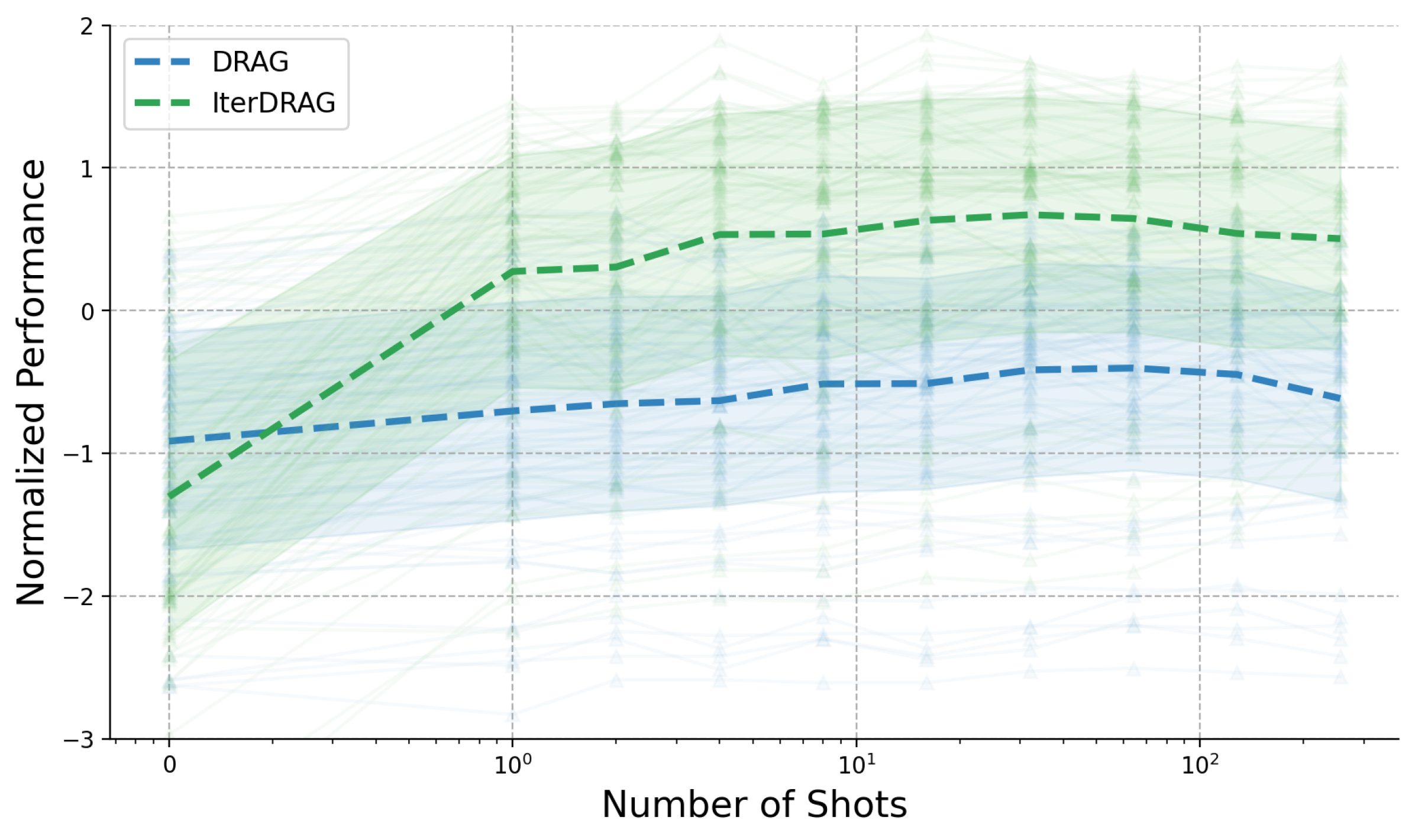
This image is a line graph comparing the performance of two methods, **DRAG** and **IterDRAG**, across an increasing number of "shots." The chart includes thick dashed lines representing the mean performance and numerous faint lines with triangular markers representing individual trials or data subsets, indicating the variance and distribution of the results.
## 2. Component Isolation
### Header / Legend
- **Location:** Top-left corner (approx. [x=0.1, y=0.9] in normalized coordinates).
- **Legend Items:**
- **DRAG:** Represented by a thick dashed line and associated faint lines.
- **IterDRAG:** Represented by a thick dashed line and associated faint lines.
### Axes
- **X-Axis (Horizontal):** Labeled "shots". Values range from 0 to 10.
- **Y-Axis (Vertical):** Labeled "Performance" (or similar metric). Values range from 0.0 to 1.0.
## 3. Data Trends
- **DRAG:** Shows a steady increase in performance as the number of shots increases, starting near 0.4 and plateauing towards 0.8.
- **IterDRAG:** Exhibits a steeper initial improvement compared to DRAG, reaching higher performance levels (approaching 0.9) with fewer shots.
- **Variance:** Both methods show significant variance in individual trials, as indicated by the spread of the faint lines, though the mean (dashed line) provides a clear trend for each.