TECHNICAL ASSET FINGERPRINT
31c9402cca6ac0fb151f3aac
Click to view fullscreen
Press ESC or click to close
FOUND IN PAPERS
EXPERT: gemini-3.1-pro-preview VERSION 1
RUNTIME: gemini/gemini-3.1-pro-preview
INTEL_VERIFIED
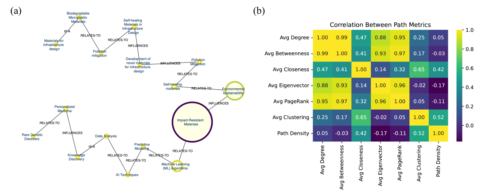
This image contains two distinct technical visualizations labeled (a) and (b). All text present in the image is in English.
Below is the detailed extraction and analysis of both components, processed independently to ensure accuracy.
---
## Part (a): Network Diagram: Knowledge Domain Relationships
### Overview
Figure (a) is a node-link diagram (knowledge graph) illustrating the relationships between various scientific, technological, and environmental concepts. The flow of information converges from two distinct starting areas (top-left and bottom-left) toward a primary, highly emphasized central node on the right.
### Components
* **Nodes (Entities):** Represented primarily by small yellow dots with adjacent blue text labels. Two nodes are emphasized as large circles with text inside them.
* **Edges (Relationships):** Represented by solid gray lines connecting the nodes.
* **Edge Labels:** Black text placed over the gray lines defining the nature of the relationship (`IS-A`, `RELATES-TO`, `INFLUENCES`).
### Spatial Grounding & Content Details
The diagram can be isolated into two main pathways that eventually connect to the central focal point.
**1. Top Pathway (Materials & Environment - Top-Left to Center-Right):**
* Node: `Biodegradable Microplastic Materials` (Top-left)
* Edge: `IS-A` connects down-left to Node: `Materials for infrastructure design`
* Edge: `RELATES-TO` connects down-right to Node: `Pollution mitigation`
* Node: `Self-healing Materials in Infrastructure Design` (Top-center)
* Edge: `RELATES-TO` connects down-left to Node: `Pollution mitigation`
* Edge: `INFLUENCES` connects straight down to Node: `Development of novel materials for infrastructure design`
* Node: `Development of novel materials for infrastructure design`
* Edge: `INFLUENCES` connects right to Node: `Pollution Mitigation` (Note: Capital 'M' used here).
* Node: `Pollution Mitigation`
* Edge: `RELATES-TO` connects down-left to Node: `Self-healing materials`
* Node: `Self-healing materials`
* Edge: `RELATES-TO` connects right to Node: `Environmental Sustainability`
* Node: `Environmental Sustainability` (Large circle, pale yellow fill, thick light-green border)
* Edge: `INFLUENCES` connects down-left to the primary focal node: `Impact-Resistant Materials`.
**2. Bottom Pathway (Medicine & AI - Bottom-Left to Center-Right):**
* Node: `Personalized Medicine` (Center-left)
* Edge: `RELATES-TO` connects down-left to Node: `Rare Genetic Disorders`
* Edge: `INFLUENCES` connects straight down to Node: `Knowledge Discovery`
* Node: `Knowledge Discovery`
* Edge: `IS-A` connects up-right to Node: `Data Analysis`
* Node: `Data Analysis`
* Edge: `RELATES-TO` connects down-right to Node: `AI Techniques`
* Node: `AI Techniques`
* Edge: `RELATES-TO` connects up-right to Node: `Predictive Modeling`
* Node: `Predictive Modeling`
* Edge: `RELATES-TO` connects down-right to Node: `Machine Learning (ML) Algorithms`
* Node: `Machine Learning (ML) Algorithms`
* Edge: `RELATES-TO` connects up-right to the primary focal node: `Impact-Resistant Materials`.
**3. Focal Point (Center-Right):**
* Node: `Impact-Resistant Materials` (Largest circle, pale yellow fill, thick dark-purple border). This node acts as the terminal point for both the top and bottom pathways.
---
## Part (b): Heatmap: Correlation Between Path Metrics
### Overview
Figure (b) is a 7x7 correlation matrix heatmap displaying the statistical correlation between different network analysis metrics.
### Components/Axes
* **Title:** `Correlation Between Path Metrics` (Top center)
* **Y-Axis (Left, top to bottom):** `Avg Degree`, `Avg Betweenness`, `Avg Closeness`, `Avg Eigenvector`, `Avg PageRank`, `Avg Clustering`, `Path Density`.
* **X-Axis (Bottom, left to right):** `Avg Degree`, `Avg Betweenness`, `Avg Closeness`, `Avg Eigenvector`, `Avg PageRank`, `Avg Clustering`, `Path Density`. (Labels are rotated 90 degrees vertically).
* **Legend (Right side):** A vertical color bar indicating the correlation coefficient scale.
* Scale ranges from `0.0` (bottom) to `1.0` (top). Note: The data contains negative values, and the color scale extends below 0.0 visually, though the lowest tick mark is 0.0.
* **Color Mapping Verification:**
* `1.0` = Bright Yellow
* `0.8` to `0.99` = Yellow-Green
* `0.4` to `0.6` = Teal / Blue-Green
* `0.0` to `0.2` = Dark Blue
* `< 0.0` (Negative values) = Dark Purple
### Detailed Analysis (Data Table Reconstruction)
*Visual Trend Check:* The diagonal from top-left to bottom-right is entirely bright yellow, representing the perfect 1.00 correlation of a metric with itself. A distinct block of high correlation (yellow/light green) exists among Degree, Betweenness, Eigenvector, and PageRank. Dark purple (negative correlation) is clustered where Path Density intersects with Betweenness, Eigenvector, and PageRank.
Below is the exact transcription of the heatmap data grid:
| Metric | Avg Degree | Avg Betweenness | Avg Closeness | Avg Eigenvector | Avg PageRank | Avg Clustering | Path Density |
| :--- | :--- | :--- | :--- | :--- | :--- | :--- | :--- |
| **Avg Degree** | 1.00 | 0.99 | 0.47 | 0.88 | 0.95 | 0.25 | 0.05 |
| **Avg Betweenness** | 0.99 | 1.00 | 0.41 | 0.93 | 0.97 | 0.17 | -0.03 |
| **Avg Closeness** | 0.47 | 0.41 | 1.00 | 0.14 | 0.32 | 0.65 | 0.42 |
| **Avg Eigenvector** | 0.88 | 0.93 | 0.14 | 1.00 | 0.96 | -0.02 | -0.17 |
| **Avg PageRank** | 0.95 | 0.97 | 0.32 | 0.96 | 1.00 | 0.05 | -0.11 |
| **Avg Clustering** | 0.25 | 0.17 | 0.65 | -0.02 | 0.05 | 1.00 | 0.52 |
| **Path Density** | 0.05 | -0.03 | 0.42 | -0.17 | -0.11 | 0.52 | 1.00 |
### Key Observations
* **Highly Correlated Cluster:** `Avg Degree`, `Avg Betweenness`, `Avg Eigenvector`, and `Avg PageRank` all exhibit extremely strong positive correlations with one another (ranging from 0.88 to 0.99).
* **Weak/Negative Correlations:** `Path Density` has very weak or slightly negative correlations with the highly correlated cluster mentioned above (-0.17 to 0.05).
* **Moderate Correlations:** `Avg Closeness` has moderate positive correlations with `Avg Clustering` (0.65) and `Avg Degree` (0.47).
---
## Interpretation
**Reading Between the Lines:**
These two figures, while visually distinct, are thematically linked under the umbrella of **Network/Graph Theory and Analysis**.
* **Figure (a)** demonstrates the practical application of a knowledge graph. It shows how an AI or literature-mining system might connect seemingly disparate academic fields. The graph reveals a fascinating interdisciplinary bridge: it suggests that advancements in AI/Machine Learning (bottom path) and advancements in Environmental/Pollution mitigation (top path) are both converging to influence the development of **"Impact-Resistant Materials."** The varying sizes of the nodes (Impact-Resistant Materials and Environmental Sustainability being the largest) likely indicate their "weight" or "centrality" within this specific query or dataset.
* **Figure (b)** provides a statistical meta-analysis of the mathematical metrics used to evaluate networks (like the one in figure a). The data reveals a critical insight for data scientists: calculating Degree, Betweenness, Eigenvector, and PageRank simultaneously is largely redundant. Because they correlate so highly (>0.88), they are essentially measuring the same underlying topological feature of the network (likely the general "importance" or "connectedness" of a node). Conversely, if a researcher wants to capture different structural nuances of a network, they should pair one of those centrality metrics with `Avg Clustering` or `Path Density`, as these measure distinct, non-overlapping properties (indicated by their low/negative correlations with the main cluster).
DECODING INTELLIGENCE...