TECHNICAL ASSET FINGERPRINT
31c9402cca6ac0fb151f3aac
Click to view fullscreen
Press ESC or click to close
FOUND IN PAPERS
EXPERT: healer-alpha-free VERSION 1
RUNTIME: free/openrouter/healer-alpha
INTEL_VERIFIED
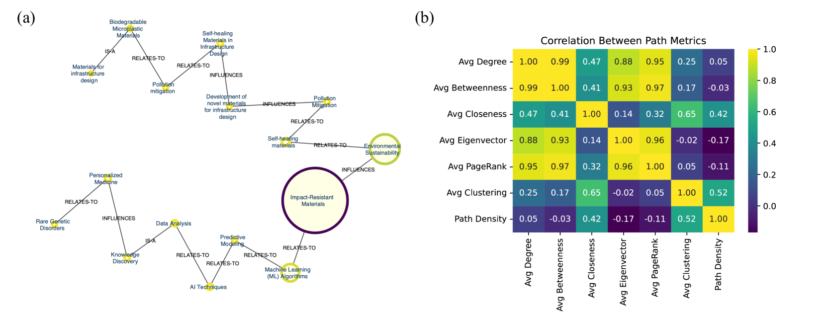
## [Combined Figure]: Knowledge Graph and Correlation Heatmap
### Overview
The image is a composite figure containing two distinct technical visualizations labeled (a) and (b). Part (a) is a knowledge graph or concept map illustrating relationships between concepts in materials science, sustainability, and data analysis. Part (b) is a correlation heatmap displaying the statistical relationships between seven different network path metrics. The overall purpose appears to be demonstrating conceptual connections and quantitative relationships within a research domain, likely related to network analysis of materials or sustainability systems.
### Components/Axes
**Part (a) - Knowledge Graph:**
* **Central Node:** "Impact-Resistant Materials" (large, purple-outlined circle, positioned right-of-center).
* **Connected Nodes (with relationship labels):**
* "Self-healing Materials" (connected via "RELATES-TO")
* "Environmental Sustainability" (connected via "INFLUENCES")
* "Machine Learning (ML) Algorithms" (connected via "RELATES-TO")
* **Secondary Nodes & Relationships (forming two main branches):**
* **Top-Left Branch (Materials/Sustainability):**
* "Self-healing Materials in Infrastructure Design" (connected to "Self-healing Materials" via "RELATES-TO")
* "Development of novel materials for infrastructure design" (connected to "Self-healing Materials in Infrastructure Design" via "INFLUENCES")
* "Pollution Mitigation" (connected to "Development of novel materials..." via "INFLUENCES" and to "Environmental Sustainability" via "RELATES-TO")
* "Materials for infrastructure design" (connected to "Biodegradable Microplastic Materials" via "IS-A")
* "Biodegradable Microplastic Materials" (connected to "Pollution mitigation" via "RELATES-TO")
* **Bottom-Left Branch (Data/AI):**
* "Predictive Modelling" (connected to "Machine Learning (ML) Algorithms" via "RELATES-TO")
* "AI Techniques" (connected to "Predictive Modelling" via "RELATES-TO")
* "Data Analysis" (connected to "AI Techniques" via "RELATES-TO" and to "Knowledge Discovery" via "IS-A")
* "Knowledge Discovery" (connected to "Personalized Medicine" via "INFLUENCES")
* "Personalized Medicine" (connected to "Rare Genetic Disorders" via "RELATES-TO")
**Part (b) - Correlation Heatmap:**
* **Title:** "Correlation Between Path Metrics"
* **Axes (Identical for rows and columns):**
1. Avg Degree
2. Avg Betweenness
3. Avg Closeness
4. Avg Eigenvector
5. Avg PageRank
6. Avg Clustering
7. Path Density
* **Legend/Color Scale:** A vertical bar on the right side. The scale runs from **1.0 (bright yellow)** at the top, through green and teal, to **0.0 (dark purple)**, and down to **-0.17 (very dark purple/black)** at the bottom. The scale is labeled at 0.0, 0.2, 0.4, 0.6, 0.8, and 1.0.
* **Data Matrix:** A 7x7 grid of colored cells, each containing a numerical correlation coefficient.
### Detailed Analysis
**Part (a) - Knowledge Graph Content Details:**
The graph maps a network of interdisciplinary concepts. The central hub is "Impact-Resistant Materials." One major branch connects this to themes of sustainable infrastructure (self-healing materials, pollution mitigation, biodegradable materials). Another major branch connects it to data-driven methodologies (machine learning, predictive modeling, AI, data analysis, knowledge discovery), which further links to applications in personalized medicine. The relationships are explicitly labeled as "RELATES-TO," "INFLUENCES," or "IS-A."
**Part (b) - Correlation Heatmap Data Points:**
The following correlation coefficients are extracted from the matrix. Values are read directly from the cells. The color of each cell corresponds to the value according to the legend (yellow = high positive, purple = low/negative).
| Metric 1 (Row) | Metric 2 (Column) | Correlation Value | Visual Trend (Color) |
| :--- | :--- | :--- | :--- |
| **Avg Degree** | Avg Betweenness | 0.99 | Bright Yellow |
| **Avg Degree** | Avg Closeness | 0.47 | Green-Teal |
| **Avg Degree** | Avg Eigenvector | 0.88 | Yellow-Green |
| **Avg Degree** | Avg PageRank | 0.95 | Bright Yellow |
| **Avg Degree** | Avg Clustering | 0.25 | Teal |
| **Avg Degree** | Path Density | 0.05 | Dark Purple |
| **Avg Betweenness** | Avg Closeness | 0.41 | Green |
| **Avg Betweenness** | Avg Eigenvector | 0.93 | Bright Yellow |
| **Avg Betweenness** | Avg PageRank | 0.97 | Bright Yellow |
| **Avg Betweenness** | Avg Clustering | 0.17 | Dark Teal |
| **Avg Betweenness** | Path Density | -0.03 | Very Dark Purple |
| **Avg Closeness** | Avg Eigenvector | 0.14 | Dark Teal |
| **Avg Closeness** | Avg PageRank | 0.32 | Teal |
| **Avg Closeness** | Avg Clustering | 0.65 | Light Green |
| **Avg Closeness** | Path Density | 0.42 | Green |
| **Avg Eigenvector** | Avg PageRank | 0.96 | Bright Yellow |
| **Avg Eigenvector** | Avg Clustering | -0.02 | Very Dark Purple |
| **Avg Eigenvector** | Path Density | -0.17 | Very Dark Purple (lowest) |
| **Avg PageRank** | Avg Clustering | 0.05 | Dark Purple |
| **Avg PageRank** | Path Density | -0.11 | Very Dark Purple |
| **Avg Clustering** | Path Density | 0.52 | Green |
*Note: The matrix is symmetric, so only the upper triangle is listed. The diagonal (a metric correlated with itself) is always 1.00 (bright yellow).*
### Key Observations
**Knowledge Graph (a):**
* The graph has a clear hub-and-spoke structure with "Impact-Resistant Materials" as the primary hub.
* Two distinct thematic clusters emerge: one focused on **materials and environmental sustainability**, and another on **data science and AI techniques**.
* "Environmental Sustainability" and "Machine Learning (ML) Algorithms" act as secondary hubs, connecting the central concept to broader fields.
**Correlation Heatmap (b):**
* **Strong Positive Correlations (>0.85):** There is a very strong cluster of high positive correlations between **Avg Degree, Avg Betweenness, Avg Eigenvector, and Avg PageRank**. These four metrics are highly interrelated (all pairwise correlations ≥ 0.88).
* **Moderate Positive Correlations:** **Avg Closeness** shows moderate positive correlation with **Avg Clustering (0.65)** and **Path Density (0.42)**.
* **Weak or Negative Correlations:** **Path Density** and **Avg Clustering** show very weak or negative correlations with the core group of four metrics (Degree, Betweenness, Eigenvector, PageRank). The strongest negative correlation in the table is between **Avg Eigenvector and Path Density (-0.17)**.
* **Avg Clustering** is somewhat isolated, showing its strongest link with **Avg Closeness (0.65)** and weak links to most other metrics.
### Interpretation
**What the data suggests:**
This composite figure likely comes from a study analyzing a network (e.g., a citation network, a material property network, or a sustainability project network). Part (a) provides the conceptual framework, showing that the research sits at the intersection of advanced materials, sustainability, and data-driven methods. Part (b) provides quantitative analysis of the network's structure.
The heatmap reveals that traditional centrality measures (Degree, Betweenness, Eigenvector, PageRank) are largely redundant for this specific network—they tell a very similar story about node importance. A researcher could likely use just one of these four without losing much information. In contrast, **Avg Closeness**, **Avg Clustering**, and **Path Density** capture different, complementary aspects of the network structure. The negative correlation between Eigenvector centrality and Path Density is particularly interesting; it suggests that nodes which are important based on their connections to other important nodes (high Eigenvector) tend to exist in regions of the network that are less densely connected overall (low Path Density).
**How elements relate:**
The knowledge graph (a) defines the *what*—the conceptual entities and their hypothesized relationships. The correlation matrix (b) analyzes the *how*—the statistical properties of the underlying network formed by these or similar concepts. The strong correlations in (b) validate that certain structural properties of the network co-occur, which might reflect the real-world interdependencies suggested by the links in (a). For example, the cluster of highly correlated centralities might correspond to the well-connected "hub" concepts visible in the graph.
**Notable Anomalies:**
The most notable anomaly is the stark divide between the tightly correlated group of four centrality metrics and the other three metrics. This is not always the case in network analysis and is a key finding for this specific dataset. It indicates that the network has a particular structure where global importance (PageRank, Eigenvector) is tightly coupled with local connectivity (Degree) and brokerage potential (Betweenness).
DECODING INTELLIGENCE...