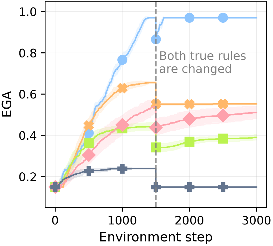
## Line Chart: EGA vs. Environment Step
### Overview
The image is a line chart that plots EGA (likely an acronym for a performance metric) against the Environment step. There are five distinct data series, each represented by a different colored line with unique markers. A vertical dashed line indicates a point where "Both true rules are changed." The chart illustrates how EGA changes over time (environment steps) for each series, with a clear shift in behavior after the rule change.
### Components/Axes
* **Y-axis (Vertical):** Labeled "EGA," ranging from 0.0 to 1.0 in increments of 0.2.
* **X-axis (Horizontal):** Labeled "Environment step," ranging from 0 to 3000 in increments of 1000.
* **Data Series:** Five distinct data series, each with a unique color and marker:
* Blue line with circle markers
* Orange line with cross markers
* Pink line with diamond markers
* Green line with square markers
* Dark Blue/Gray line with plus markers
* **Vertical Dashed Line:** Located at approximately x = 1500, labeled "Both true rules are changed."
* **Shaded Regions:** Each line has a shaded region around it, indicating uncertainty or variance.
### Detailed Analysis
**Blue Line (Circles):**
* **Trend:** The blue line shows a rapid increase in EGA from approximately 0.15 to 0.9 between environment steps 0 and 1500. After the vertical line (rule change), the EGA plateaus at approximately 0.98.
* **Data Points:**
* (0, ~0.15)
* (750, ~0.75)
* (1500, ~0.9)
* (2250, ~0.98)
* (3000, ~0.98)
**Orange Line (Crosses):**
* **Trend:** The orange line shows a steady increase in EGA from approximately 0.15 to 0.65 between environment steps 0 and 1500. After the rule change, the EGA remains relatively constant at approximately 0.55.
* **Data Points:**
* (0, ~0.15)
* (750, ~0.45)
* (1500, ~0.65)
* (2250, ~0.55)
* (3000, ~0.55)
**Pink Line (Diamonds):**
* **Trend:** The pink line shows a gradual increase in EGA from approximately 0.15 to 0.5 between environment steps 0 and 1500. After the rule change, the EGA remains relatively constant at approximately 0.5.
* **Data Points:**
* (0, ~0.15)
* (750, ~0.3)
* (1500, ~0.45)
* (2250, ~0.5)
* (3000, ~0.5)
**Green Line (Squares):**
* **Trend:** The green line shows a gradual increase in EGA from approximately 0.15 to 0.45 between environment steps 0 and 1500. After the rule change, the EGA remains relatively constant at approximately 0.38.
* **Data Points:**
* (0, ~0.15)
* (750, ~0.38)
* (1500, ~0.45)
* (2250, ~0.38)
* (3000, ~0.38)
**Dark Blue/Gray Line (Plus Signs):**
* **Trend:** The dark blue/gray line shows a slight increase in EGA from approximately 0.15 to 0.25 between environment steps 0 and 1500. After the rule change, the EGA drops to approximately 0.15 and remains constant.
* **Data Points:**
* (0, ~0.15)
* (750, ~0.23)
* (1500, ~0.25)
* (2250, ~0.15)
* (3000, ~0.15)
### Key Observations
* All data series start at approximately the same EGA value (~0.15) at the beginning of the environment steps.
* The vertical line at Environment step 1500, indicating a change in "Both true rules," has a noticeable impact on all data series. The blue line plateaus, the orange and pink lines stabilize, the green line stabilizes, and the dark blue/gray line drops.
* The blue line achieves the highest EGA value, reaching nearly 1.0.
* The dark blue/gray line performs the worst, with the lowest EGA value throughout the experiment.
### Interpretation
The chart demonstrates the impact of changing "Both true rules" on the EGA performance of five different strategies or algorithms. Before the rule change, all strategies show some level of improvement in EGA as the environment steps increase. However, the rule change at step 1500 significantly alters the performance trajectory of each strategy.
The blue line, representing one strategy, benefits the most from the rule change, quickly reaching and maintaining a high EGA value. The other strategies (orange, pink, and green) show a stabilization or slight decrease in EGA after the rule change, suggesting that the new rules do not favor these strategies as much. The dark blue/gray line shows a clear negative impact from the rule change, indicating that this strategy is particularly sensitive to the change in rules.
The shaded regions around each line likely represent the variance or uncertainty in the EGA values for each strategy. The narrower the shaded region, the more consistent the performance of that strategy.
Overall, the chart suggests that the choice of strategy is highly dependent on the specific rules of the environment. The rule change highlights the robustness and adaptability of the blue strategy compared to the others.