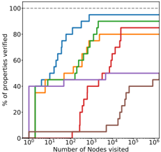
## Chart: Properties Verified vs. Nodes Visited
### Overview
The image is a step-plot chart showing the percentage of properties verified against the number of nodes visited. There are multiple data series, each represented by a different colored line, indicating different algorithms or configurations. The x-axis is logarithmic.
### Components/Axes
* **Y-axis:** "% of properties verified", ranging from 0 to 100.
* Axis markers: 0, 20, 40, 60, 80, 100
* **X-axis:** "Number of Nodes visited", logarithmic scale.
* Axis markers: 10^0, 10^1, 10^2, 10^3, 10^4, 10^5, 10^6
* **Horizontal dashed line:** At 100% properties verified.
* **Data Series:** Multiple step-plot lines, each representing a different algorithm or configuration.
### Detailed Analysis
Here's a breakdown of each data series, noting the color and approximate values:
* **Blue Line:** This line rises sharply early on, reaching approximately 40% verification at 10^0 nodes visited. It continues to rise, reaching approximately 70% at 10^1 nodes, 90% at 10^2 nodes, and nearly 100% at 10^3 nodes.
* **Green Line:** Starts at approximately 5% verification at 10^0 nodes. Rises to approximately 40% at 10^1 nodes, 60% at 10^2 nodes, 90% at 10^3 nodes, and plateaus around 90% after 10^3 nodes.
* **Orange Line:** Starts at approximately 35% verification at 10^0 nodes. Rises to approximately 50% at 10^1 nodes, 60% at 10^2 nodes, 80% at 10^3 nodes, and plateaus around 85% after 10^3 nodes.
* **Red Line:** Starts at approximately 5% verification at 10^0 nodes. Rises to approximately 10% at 10^2 nodes, 40% at 10^3 nodes, 70% at 10^4 nodes, and plateaus around 80% after 10^4 nodes.
* **Purple Line:** Starts at approximately 40% verification at 10^0 nodes. Rises to approximately 45% at 10^1 nodes, 45% at 10^2 nodes, 50% at 10^3 nodes, and plateaus around 50% after 10^3 nodes.
* **Brown Line:** Starts at approximately 0% verification at 10^0 nodes. Rises to approximately 5% at 10^3 nodes, 20% at 10^4 nodes, 40% at 10^5 nodes, and plateaus around 45% after 10^5 nodes.
### Key Observations
* The Blue line achieves the highest verification percentage with the fewest nodes visited.
* The Brown line is the slowest to verify properties, requiring significantly more nodes visited.
* Most lines plateau after a certain number of nodes visited, indicating diminishing returns.
* The X-axis is logarithmic, meaning each increment represents a tenfold increase in nodes visited.
### Interpretation
The chart compares the efficiency of different algorithms or configurations in verifying properties. The x-axis represents the computational cost (number of nodes visited), and the y-axis represents the effectiveness (percentage of properties verified). The Blue line represents the most efficient algorithm, achieving high verification with low computational cost. The Brown line represents the least efficient algorithm. The plateaus in the lines suggest that after a certain point, increasing the number of nodes visited does not significantly improve the verification percentage, indicating a limit to the algorithm's effectiveness. The chart is useful for selecting the most efficient algorithm for property verification based on the trade-off between computational cost and verification percentage.