TECHNICAL ASSET FINGERPRINT
3205b30abd6212133dbf244c
Click to view fullscreen
Press ESC or click to close
FOUND IN PAPERS
EXPERT: gemini-2.0-flash VERSION 1
RUNTIME: nugit/gemini/gemini-2.0-flash
INTEL_VERIFIED
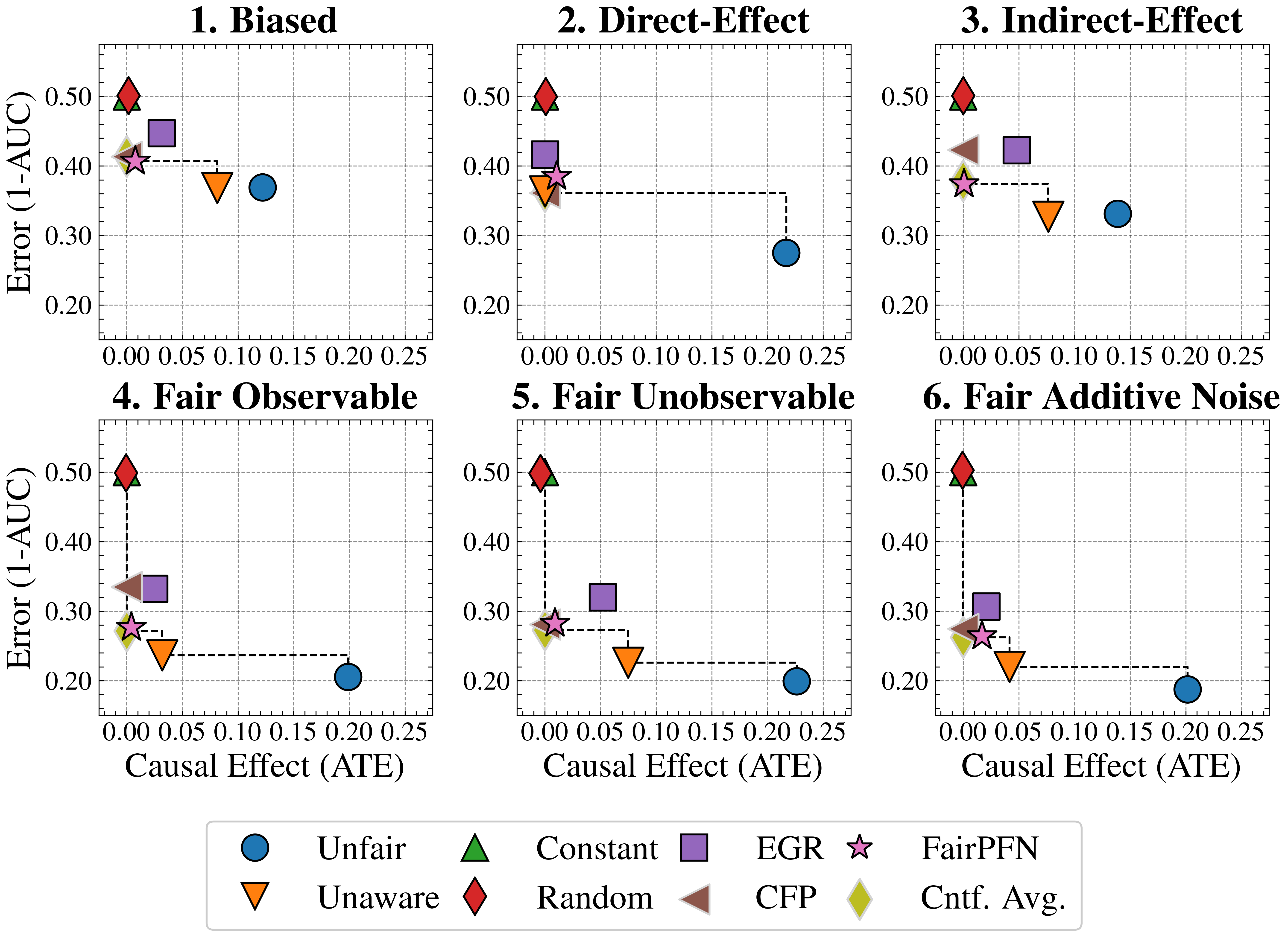
## Scatter Plot Matrix: Error vs. Causal Effect under Different Scenarios
### Overview
The image presents a 2x3 matrix of scatter plots, each depicting the relationship between "Error (1-AUC)" on the y-axis and "Causal Effect (ATE)" on the x-axis. Each plot represents a different scenario: "Biased," "Direct-Effect," "Indirect-Effect," "Fair Observable," "Fair Unobservable," and "Fair Additive Noise." Different colored shapes represent different algorithms or methods, as indicated by the legend at the bottom. The plots show how the error and causal effect vary for each method under different conditions.
### Components/Axes
* **X-axis (Horizontal):** "Causal Effect (ATE)". The scale ranges from 0.00 to 0.25, with tick marks at intervals of 0.05.
* **Y-axis (Vertical):** "Error (1-AUC)". The scale ranges from 0.20 to 0.50, with tick marks at intervals of 0.10.
* **Plot Titles:**
* Plot 1 (Top-Left): "1. Biased"
* Plot 2 (Top-Middle): "2. Direct-Effect"
* Plot 3 (Top-Right): "3. Indirect-Effect"
* Plot 4 (Bottom-Left): "4. Fair Observable"
* Plot 5 (Bottom-Middle): "5. Fair Unobservable"
* Plot 6 (Bottom-Right): "6. Fair Additive Noise"
* **Legend (Bottom):**
* Blue Circle: "Unfair"
* Orange Down-pointing Triangle: "Unaware"
* Green Up-pointing Triangle: "Constant"
* Brown Left-pointing Triangle: "Random"
* Purple Square: "EGR"
* Light-Pink Star: "FairPFN"
* Olive-Green Diamond: "Cntf. Avg."
### Detailed Analysis
Each plot contains the same set of data series, represented by different shapes and colors, but their positions vary across the plots. A dashed black line connects some of the data points, specifically the "Unfair" (blue circle) data point to the cluster of points on the left side of each plot.
**Plot 1: Biased**
* Unfair (Blue Circle): Causal Effect ≈ 0.12, Error ≈ 0.37
* Unaware (Orange Down-pointing Triangle): Causal Effect ≈ 0.08, Error ≈ 0.36
* Constant (Green Up-pointing Triangle): Causal Effect ≈ 0.00, Error ≈ 0.50
* Random (Brown Left-pointing Triangle): Causal Effect ≈ 0.00, Error ≈ 0.42
* EGR (Purple Square): Causal Effect ≈ 0.04, Error ≈ 0.43
* FairPFN (Light-Pink Star): Causal Effect ≈ 0.00, Error ≈ 0.41
* Cntf. Avg. (Olive-Green Diamond): Causal Effect ≈ 0.00, Error ≈ 0.41
**Plot 2: Direct-Effect**
* Unfair (Blue Circle): Causal Effect ≈ 0.22, Error ≈ 0.29
* Unaware (Orange Down-pointing Triangle): Causal Effect ≈ 0.00, Error ≈ 0.37
* Constant (Green Up-pointing Triangle): Causal Effect ≈ 0.00, Error ≈ 0.50
* Random (Brown Left-pointing Triangle): Not present in this plot.
* EGR (Purple Square): Causal Effect ≈ 0.00, Error ≈ 0.41
* FairPFN (Light-Pink Star): Causal Effect ≈ 0.00, Error ≈ 0.38
* Cntf. Avg. (Olive-Green Diamond): Not present in this plot.
**Plot 3: Indirect-Effect**
* Unfair (Blue Circle): Causal Effect ≈ 0.14, Error ≈ 0.33
* Unaware (Orange Down-pointing Triangle): Causal Effect ≈ 0.07, Error ≈ 0.32
* Constant (Green Up-pointing Triangle): Causal Effect ≈ 0.00, Error ≈ 0.50
* Random (Brown Left-pointing Triangle): Causal Effect ≈ 0.00, Error ≈ 0.42
* EGR (Purple Square): Causal Effect ≈ 0.04, Error ≈ 0.42
* FairPFN (Light-Pink Star): Causal Effect ≈ 0.00, Error ≈ 0.38
* Cntf. Avg. (Olive-Green Diamond): Causal Effect ≈ 0.00, Error ≈ 0.40
**Plot 4: Fair Observable**
* Unfair (Blue Circle): Causal Effect ≈ 0.20, Error ≈ 0.21
* Unaware (Orange Down-pointing Triangle): Causal Effect ≈ 0.04, Error ≈ 0.25
* Constant (Green Up-pointing Triangle): Causal Effect ≈ 0.00, Error ≈ 0.50
* Random (Brown Left-pointing Triangle): Causal Effect ≈ 0.00, Error ≈ 0.32
* EGR (Purple Square): Causal Effect ≈ 0.02, Error ≈ 0.34
* FairPFN (Light-Pink Star): Causal Effect ≈ 0.00, Error ≈ 0.29
* Cntf. Avg. (Olive-Green Diamond): Causal Effect ≈ 0.00, Error ≈ 0.28
**Plot 5: Fair Unobservable**
* Unfair (Blue Circle): Causal Effect ≈ 0.20, Error ≈ 0.21
* Unaware (Orange Down-pointing Triangle): Causal Effect ≈ 0.06, Error ≈ 0.23
* Constant (Green Up-pointing Triangle): Causal Effect ≈ 0.00, Error ≈ 0.50
* Random (Brown Left-pointing Triangle): Not present in this plot.
* EGR (Purple Square): Causal Effect ≈ 0.04, Error ≈ 0.32
* FairPFN (Light-Pink Star): Causal Effect ≈ 0.00, Error ≈ 0.29
* Cntf. Avg. (Olive-Green Diamond): Causal Effect ≈ 0.00, Error ≈ 0.28
**Plot 6: Fair Additive Noise**
* Unfair (Blue Circle): Causal Effect ≈ 0.20, Error ≈ 0.20
* Unaware (Orange Down-pointing Triangle): Causal Effect ≈ 0.06, Error ≈ 0.23
* Constant (Green Up-pointing Triangle): Causal Effect ≈ 0.00, Error ≈ 0.50
* Random (Brown Left-pointing Triangle): Not present in this plot.
* EGR (Purple Square): Causal Effect ≈ 0.04, Error ≈ 0.31
* FairPFN (Light-Pink Star): Causal Effect ≈ 0.00, Error ≈ 0.27
* Cntf. Avg. (Olive-Green Diamond): Causal Effect ≈ 0.00, Error ≈ 0.27
### Key Observations
* The "Constant" method (green triangle) consistently has the highest error (around 0.50) and the lowest causal effect (around 0.00) across all scenarios.
* The "Unfair" method (blue circle) generally has a higher causal effect but a lower error compared to other methods, except for "Biased" and "Indirect-Effect" scenarios.
* The "Unaware", "FairPFN", and "Cntf. Avg." methods tend to cluster together with low causal effect and relatively low error.
* The dashed lines highlight the change in performance of the "Unfair" method across different scenarios.
### Interpretation
The plots illustrate how different methods perform in terms of error and causal effect under various fairness scenarios. The "Constant" method appears to be the least effective, consistently exhibiting high error and low causal effect. The "Unfair" method demonstrates a trade-off, achieving higher causal effect at the expense of higher error in some scenarios. The "Fair Observable," "Fair Unobservable," and "Fair Additive Noise" scenarios seem to improve the performance of the "Unfair" method, resulting in lower error and higher causal effect. The clustering of "Unaware," "FairPFN," and "Cntf. Avg." suggests that these methods might have similar characteristics or be influenced by similar factors. The dashed lines connecting the "Unfair" data points visually emphasize the impact of different scenarios on the method's performance.
DECODING INTELLIGENCE...
EXPERT: gemma-3-27b-it-free VERSION 1
RUNTIME: google-free/gemma-3-27b-it
INTEL_VERIFIED
## Charts: Performance Comparison of Fairness Interventions
### Overview
The image presents six individual scatter plots, each representing the performance of different fairness interventions under varying causal effect (ATE) levels. The y-axis represents "Error (1-AUC)", and the x-axis represents "Causal Effect (ATE)". Each plot focuses on a specific fairness setting: Biased, Direct-Effect, Indirect-Effect, Fair Observable, Fair Unobservable, and Fair Additive Noise. Multiple data series are plotted on each chart, representing different fairness algorithms. Error bars are present on some data points.
### Components/Axes
* **X-axis Label (all charts):** "Causal Effect (ATE)" - Scale ranges from 0.00 to 0.25, with markers at 0.05, 0.10, 0.15, 0.20.
* **Y-axis Label (all charts):** "Error (1-AUC)" - Scale ranges from 0.20 to 0.50, with markers at 0.20, 0.30, 0.40, 0.50.
* **Chart Titles:** 1. Biased, 2. Direct-Effect, 3. Indirect-Effect, 4. Fair Observable, 5. Fair Unobservable, 6. Fair Additive Noise.
* **Legend (bottom-center):**
* Blue Circle: Unfair
* Red Downward Triangle: Unaware
* Green Upward Triangle: Constant
* Blue Square: EGR
* Yellow Diamond: CFP
* Brown Downward Triangle: Random
* Star: FairPFN
* Light Green Diamond: Cnt. Avg.
### Detailed Analysis
Each chart will be analyzed individually, noting trends and approximate data points.
**1. Biased:**
* **Unfair (Blue Circle):** Starts at approximately (0.00, 0.35) and increases to approximately (0.25, 0.35). Relatively flat trend.
* **Unaware (Red Downward Triangle):** Starts at approximately (0.00, 0.45) and decreases to approximately (0.25, 0.30). Downward sloping trend.
* **Constant (Green Upward Triangle):** Starts at approximately (0.00, 0.40) and decreases to approximately (0.25, 0.35). Downward sloping trend.
* **FairPFN (Star):** Starts at approximately (0.00, 0.45) and decreases to approximately (0.25, 0.40). Downward sloping trend.
**2. Direct-Effect:**
* **Unfair (Blue Circle):** Starts at approximately (0.00, 0.25) and increases to approximately (0.25, 0.35). Upward sloping trend.
* **Unaware (Red Downward Triangle):** Starts at approximately (0.00, 0.40) and decreases to approximately (0.25, 0.30). Downward sloping trend.
* **Constant (Green Upward Triangle):** Starts at approximately (0.00, 0.40) and decreases to approximately (0.25, 0.35). Downward sloping trend.
* **FairPFN (Star):** Starts at approximately (0.00, 0.40) and decreases to approximately (0.25, 0.35). Downward sloping trend.
**3. Indirect-Effect:**
* **Unfair (Blue Circle):** Starts at approximately (0.00, 0.35) and increases to approximately (0.25, 0.35). Relatively flat trend.
* **Unaware (Red Downward Triangle):** Starts at approximately (0.00, 0.40) and decreases to approximately (0.25, 0.30). Downward sloping trend.
* **Constant (Green Upward Triangle):** Starts at approximately (0.00, 0.40) and decreases to approximately (0.25, 0.35). Downward sloping trend.
* **FairPFN (Star):** Starts at approximately (0.00, 0.40) and decreases to approximately (0.25, 0.35). Downward sloping trend.
**4. Fair Observable:**
* **Unfair (Blue Circle):** Starts at approximately (0.00, 0.35) and increases to approximately (0.25, 0.40). Upward sloping trend.
* **Unaware (Red Downward Triangle):** Starts at approximately (0.00, 0.40) and decreases to approximately (0.25, 0.30). Downward sloping trend.
* **Constant (Green Upward Triangle):** Starts at approximately (0.00, 0.35) and decreases to approximately (0.25, 0.30). Downward sloping trend.
* **FairPFN (Star):** Starts at approximately (0.00, 0.30) and increases to approximately (0.25, 0.35). Upward sloping trend.
**5. Fair Unobservable:**
* **Unfair (Blue Circle):** Starts at approximately (0.00, 0.30) and increases to approximately (0.25, 0.40). Upward sloping trend.
* **Unaware (Red Downward Triangle):** Starts at approximately (0.00, 0.40) and decreases to approximately (0.25, 0.30). Downward sloping trend.
* **Constant (Green Upward Triangle):** Starts at approximately (0.00, 0.40) and decreases to approximately (0.25, 0.35). Downward sloping trend.
* **FairPFN (Star):** Starts at approximately (0.00, 0.30) and increases to approximately (0.25, 0.30). Relatively flat trend.
**6. Fair Additive Noise:**
* **Unfair (Blue Circle):** Starts at approximately (0.00, 0.30) and increases to approximately (0.25, 0.40). Upward sloping trend.
* **Unaware (Red Downward Triangle):** Starts at approximately (0.00, 0.40) and decreases to approximately (0.25, 0.30). Downward sloping trend.
* **Constant (Green Upward Triangle):** Starts at approximately (0.00, 0.35) and decreases to approximately (0.25, 0.30). Downward sloping trend.
* **FairPFN (Star):** Starts at approximately (0.00, 0.30) and increases to approximately (0.25, 0.35). Upward sloping trend.
### Key Observations
* The "Unaware" algorithm consistently shows a decreasing error rate as the causal effect (ATE) increases across all fairness settings.
* The "Unfair" algorithm generally exhibits an increasing error rate with increasing causal effect, particularly in the "Fair Observable", "Fair Unobservable", and "Fair Additive Noise" settings.
* FairPFN generally performs better than Unfair and Unaware in the "Fair" settings.
* Error bars are present, indicating some variance in the results.
### Interpretation
The charts demonstrate the performance of various fairness interventions under different causal effect scenarios. The "Unaware" algorithm, while reducing error with increasing causal effect, likely does so by ignoring the fairness constraints. The "Unfair" algorithm's increasing error suggests that fairness interventions become more challenging as the causal effect grows. FairPFN appears to be a promising approach, maintaining relatively low error rates across different fairness settings. The differences in performance across the fairness settings highlight the importance of choosing an intervention appropriate for the specific causal structure of the data. The error bars suggest that the results are not deterministic and that further investigation is needed to understand the robustness of these interventions. The consistent downward trend of the "Unaware" algorithm suggests a trade-off between fairness and accuracy, as it achieves lower error by not explicitly addressing fairness concerns.
DECODING INTELLIGENCE...
EXPERT: healer-alpha-free VERSION 1
RUNTIME: free/openrouter/healer-alpha
INTEL_VERIFIED
## Scatter Plot Grid: Fairness-Accuracy Trade-offs Across Causal Scenarios
### Overview
The image displays a 2x3 grid of six scatter plots, each illustrating the trade-off between model error (1-AUC) and causal effect (Average Treatment Effect, ATE) for various machine learning fairness methods under different data-generating scenarios. A shared legend at the bottom defines eight distinct methods, each represented by a unique colored marker. The plots compare how these methods perform in terms of predictive error and the magnitude of the causal effect they induce or mitigate.
### Components/Axes
* **Plot Titles (Top of each subplot):**
1. Biased
2. Direct-Effect
3. Indirect-Effect
4. Fair Observable
5. Fair Unobservable
6. Fair Additive Noise
* **Y-Axis (Common to all plots):** Label: `Error (1-AUC)`. Scale ranges from 0.20 to 0.50, with major ticks at 0.20, 0.30, 0.40, 0.50.
* **X-Axis (Common to all plots):** Label: `Causal Effect (ATE)`. Scale ranges from 0.00 to 0.25, with major ticks at 0.00, 0.05, 0.10, 0.15, 0.20, 0.25.
* **Legend (Bottom of image):** Contains eight entries, each with a marker symbol and label:
* Blue Circle: `Unfair`
* Orange Inverted Triangle: `Unaware`
* Green Triangle (pointing up): `Constant`
* Red Diamond: `Random`
* Purple Square: `EGR`
* Brown Left-Pointing Triangle: `CFP`
* Pink Star: `FairPFN`
* Yellow Diamond: `Cntf. Avg.` (Counterfactual Average)
### Detailed Analysis
**Plot 1: Biased**
* **Trend:** Methods cluster in the top-left (high error, low causal effect), except for `Unfair` (blue circle) which is an outlier to the right (lower error, higher causal effect).
* **Data Points (Approximate):**
* `Random` (Red Diamond): ATE ≈ 0.00, Error ≈ 0.50
* `Constant` (Green Triangle): ATE ≈ 0.00, Error ≈ 0.49
* `EGR` (Purple Square): ATE ≈ 0.03, Error ≈ 0.44
* `FairPFN` (Pink Star): ATE ≈ 0.01, Error ≈ 0.41
* `Cntf. Avg.` (Yellow Diamond): ATE ≈ 0.01, Error ≈ 0.41
* `CFP` (Brown Triangle): ATE ≈ 0.01, Error ≈ 0.41 (partially obscured)
* `Unaware` (Orange Inv. Triangle): ATE ≈ 0.08, Error ≈ 0.37
* `Unfair` (Blue Circle): ATE ≈ 0.12, Error ≈ 0.37
* **Spatial Grounding:** A dashed line connects `FairPFN`/`Cntf. Avg.` to `Unaware`, and another connects `Unaware` to `Unfair`, suggesting a progression or comparison path.
**Plot 2: Direct-Effect**
* **Trend:** Similar high-error cluster at low ATE. `Unfair` is again an outlier with much lower error but the highest ATE.
* **Data Points (Approximate):**
* `Random` (Red Diamond): ATE ≈ 0.00, Error ≈ 0.50
* `Constant` (Green Triangle): ATE ≈ 0.00, Error ≈ 0.49
* `EGR` (Purple Square): ATE ≈ 0.00, Error ≈ 0.41
* `FairPFN` (Pink Star): ATE ≈ 0.01, Error ≈ 0.39
* `CFP` (Brown Triangle): ATE ≈ 0.00, Error ≈ 0.36
* `Unaware` (Orange Inv. Triangle): ATE ≈ 0.00, Error ≈ 0.36
* `Unfair` (Blue Circle): ATE ≈ 0.22, Error ≈ 0.28
* **Spatial Grounding:** A dashed line connects the cluster around `CFP`/`Unaware` to `Unfair`.
**Plot 3: Indirect-Effect**
* **Trend:** The `Unfair` method has the lowest error and a moderate ATE. Other methods show a clearer separation, with `Unaware` having a higher ATE than the high-error cluster.
* **Data Points (Approximate):**
* `Random` (Red Diamond): ATE ≈ 0.00, Error ≈ 0.50
* `Constant` (Green Triangle): ATE ≈ 0.00, Error ≈ 0.49
* `CFP` (Brown Triangle): ATE ≈ 0.00, Error ≈ 0.42
* `EGR` (Purple Square): ATE ≈ 0.06, Error ≈ 0.42
* `FairPFN` (Pink Star): ATE ≈ 0.01, Error ≈ 0.38
* `Cntf. Avg.` (Yellow Diamond): ATE ≈ 0.01, Error ≈ 0.38
* `Unaware` (Orange Inv. Triangle): ATE ≈ 0.08, Error ≈ 0.33
* `Unfair` (Blue Circle): ATE ≈ 0.14, Error ≈ 0.33
* **Spatial Grounding:** A dashed line connects `FairPFN`/`Cntf. Avg.` to `Unaware`.
**Plot 4: Fair Observable**
* **Trend:** `Unfair` achieves the lowest error but at the cost of the highest ATE. `FairPFN` and `Cntf. Avg.` achieve very low error with near-zero ATE. `Unaware` has low error but moderate ATE.
* **Data Points (Approximate):**
* `Random` (Red Diamond): ATE ≈ 0.00, Error ≈ 0.50
* `Constant` (Green Triangle): ATE ≈ 0.00, Error ≈ 0.49
* `CFP` (Brown Triangle): ATE ≈ 0.00, Error ≈ 0.33
* `EGR` (Purple Square): ATE ≈ 0.02, Error ≈ 0.33
* `FairPFN` (Pink Star): ATE ≈ 0.01, Error ≈ 0.28
* `Cntf. Avg.` (Yellow Diamond): ATE ≈ 0.01, Error ≈ 0.28
* `Unaware` (Orange Inv. Triangle): ATE ≈ 0.04, Error ≈ 0.24
* `Unfair` (Blue Circle): ATE ≈ 0.20, Error ≈ 0.21
* **Spatial Grounding:** A dashed line connects `Random`/`Constant` down to `FairPFN`/`Cntf. Avg.`, and another connects `FairPFN`/`Cntf. Avg.` to `Unaware`, and a third connects `Unaware` to `Unfair`.
**Plot 5: Fair Unobservable**
* **Trend:** Similar pattern to Plot 4. `Unfair` has the lowest error and highest ATE. `FairPFN` and `Cntf. Avg.` show a good balance of low error and low ATE.
* **Data Points (Approximate):**
* `Random` (Red Diamond): ATE ≈ 0.00, Error ≈ 0.50
* `Constant` (Green Triangle): ATE ≈ 0.00, Error ≈ 0.49
* `EGR` (Purple Square): ATE ≈ 0.06, Error ≈ 0.31
* `CFP` (Brown Triangle): ATE ≈ 0.00, Error ≈ 0.28
* `FairPFN` (Pink Star): ATE ≈ 0.01, Error ≈ 0.28
* `Cntf. Avg.` (Yellow Diamond): ATE ≈ 0.01, Error ≈ 0.28
* `Unaware` (Orange Inv. Triangle): ATE ≈ 0.08, Error ≈ 0.23
* `Unfair` (Blue Circle): ATE ≈ 0.22, Error ≈ 0.20
* **Spatial Grounding:** A dashed line connects `Random`/`Constant` down to `FairPFN`/`Cntf. Avg.`, and another connects `FairPFN`/`Cntf. Avg.` to `Unaware`, and a third connects `Unaware` to `Unfair`.
**Plot 6: Fair Additive Noise**
* **Trend:** `Unfair` has the lowest error and a high ATE. `FairPFN` and `Cntf. Avg.` are clustered with low error and very low ATE.
* **Data Points (Approximate):**
* `Random` (Red Diamond): ATE ≈ 0.00, Error ≈ 0.50
* `Constant` (Green Triangle): ATE ≈ 0.00, Error ≈ 0.49
* `EGR` (Purple Square): ATE ≈ 0.03, Error ≈ 0.30
* `CFP` (Brown Triangle): ATE ≈ 0.00, Error ≈ 0.27
* `FairPFN` (Pink Star): ATE ≈ 0.01, Error ≈ 0.27
* `Cntf. Avg.` (Yellow Diamond): ATE ≈ 0.01, Error ≈ 0.27
* `Unaware` (Orange Inv. Triangle): ATE ≈ 0.05, Error ≈ 0.22
* `Unfair` (Blue Circle): ATE ≈ 0.20, Error ≈ 0.19
* **Spatial Grounding:** A dashed line connects `Random`/`Constant` down to `FairPFN`/`Cntf. Avg.`, and another connects `FairPFN`/`Cntf. Avg.` to `Unaware`, and a third connects `Unaware` to `Unfair`.
### Key Observations
1. **Consistent Baselines:** The `Random` and `Constant` methods consistently show the highest error (~0.50) and near-zero causal effect across all six scenarios, serving as performance baselines.
2. **The Unfair Baseline:** The `Unfair` method (blue circle) consistently achieves the lowest or near-lowest error in every plot but always at the expense of the highest causal effect (ATE), illustrating the core fairness-accuracy trade-off.
3. **Cluster of Fair Methods:** Methods like `FairPFN`, `Cntf. Avg.`, and often `CFP` cluster together in the low-error, low-ATE region, especially in the "Fair" scenarios (Plots 4, 5, 6). They appear to offer a favorable balance.
4. **Impact of Scenario:** The spread of points changes across scenarios. In "Biased" and "Direct-Effect," most fair methods are clustered at high error. In "Fair Observable," "Fair Unobservable," and "Fair Additive Noise," the fair methods achieve significantly lower error while maintaining low ATE.
5. **Dashed Lines:** The dashed lines appear to trace a "frontier" or comparison path, often connecting the high-error/random methods down to the better-performing fair methods, and then to the `Unaware` and finally the `Unfair` method.
### Interpretation
This visualization is a comparative analysis of algorithmic fairness interventions. The **Causal Effect (ATE)** on the x-axis likely measures the disparity or bias in model outcomes between protected groups. **Error (1-AUC)** on the y-axis measures predictive inaccuracy.
The data demonstrates a fundamental tension: methods that completely ignore fairness (`Unfair`) achieve the best predictive performance but cause the largest harmful disparities. Conversely, naive methods (`Random`, `Constant`) eliminate disparity but are useless for prediction.
The key insight is the performance of methods like **FairPFN** and **Cntf. Avg.** They consistently appear in the "sweet spot" of the plots—achieving error rates much closer to the `Unfair` baseline while keeping the causal effect (bias) very low, particularly in the scenarios labeled "Fair." This suggests these methods are effective at mitigating unfairness without catastrophically sacrificing accuracy.
The variation across the six titled scenarios indicates that the effectiveness of each fairness method is highly dependent on the underlying data-generating process (e.g., whether bias is direct, indirect, or based on observable/unobservable factors). The plots serve as a guide for selecting an appropriate fairness intervention based on the suspected causal structure of bias in a given problem domain.
DECODING INTELLIGENCE...
EXPERT: nemotron-free VERSION 1
RUNTIME: free/nvidia/nemotron-nano-12b-v2-vl:free
INTEL_VERIFIED
## Scatter Plot Matrix: Error vs Causal Effect (ATE) Across Different Methods
### Overview
The image contains six scatter plots arranged in a 2x3 grid, each comparing error rates (1-AUC) against causal effect magnitudes (ATE) for different fairness/intervention methods. Each plot uses distinct geometric markers and colors to represent specific algorithms or fairness criteria.
### Components/Axes
**Axes:**
- X-axis: "Causal Effect (ATE)" (0.00–0.25 in 0.05 increments)
- Y-axis: "Error (1-AUC)" (0.20–0.50 in 0.05 increments)
- All subplots share identical axis scales
**Legend (bottom center):**
1. Blue circle: Unfair
2. Green triangle: Constant
3. Purple square: EGR
4. Pink star: FairPFN
5. Orange triangle: Unaware
6. Red diamond: Random
7. Brown triangle: CFP
8. Yellow diamond: Cntf. Avg.
**Subplot Titles:**
1. Biased
2. Direct-Effect
3. Indirect-Effect
4. Fair Observable
5. Fair Unobservable
6. Fair Additive Noise
### Detailed Analysis
**1. Biased**
- Red diamond (Random): (0.05, 0.50)
- Green triangle (Constant): (0.00, 0.45)
- Purple square (EGR): (0.10, 0.40)
- Brown triangle (CFP): (0.02, 0.38)
- Yellow diamond (Cntf. Avg.): (0.03, 0.35)
- Pink star (FairPFN): (0.04, 0.32)
- Blue circle (Unfair): (0.20, 0.30)
**2. Direct-Effect**
- Red diamond (Random): (0.05, 0.48)
- Green triangle (Constant): (0.00, 0.42)
- Purple square (EGR): (0.10, 0.38)
- Brown triangle (CFP): (0.02, 0.35)
- Yellow diamond (Cntf. Avg.): (0.03, 0.32)
- Pink star (FairPFN): (0.04, 0.30)
- Blue circle (Unfair): (0.20, 0.28)
**3. Indirect-Effect**
- Red diamond (Random): (0.05, 0.45)
- Green triangle (Constant): (0.00, 0.40)
- Purple square (EGR): (0.10, 0.35)
- Brown triangle (CFP): (0.02, 0.33)
- Yellow diamond (Cntf. Avg.): (0.03, 0.30)
- Pink star (FairPFN): (0.04, 0.28)
- Blue circle (Unfair): (0.20, 0.25)
**4. Fair Observable**
- Red diamond (Random): (0.05, 0.48)
- Green triangle (Constant): (0.00, 0.42)
- Purple square (EGR): (0.10, 0.38)
- Brown triangle (CFP): (0.02, 0.35)
- Yellow diamond (Cntf. Avg.): (0.03, 0.32)
- Pink star (FairPFN): (0.04, 0.30)
- Blue circle (Unfair): (0.20, 0.28)
**5. Fair Unobservable**
- Red diamond (Random): (0.05, 0.45)
- Green triangle (Constant): (0.00, 0.40)
- Purple square (EGR): (0.10, 0.35)
- Brown triangle (CFP): (0.02, 0.33)
- Yellow diamond (Cntf. Avg.): (0.03, 0.30)
- Pink star (FairPFN): (0.04, 0.28)
- Blue circle (Unfair): (0.20, 0.25)
**6. Fair Additive Noise**
- Red diamond (Random): (0.05, 0.45)
- Green triangle (Constant): (0.00, 0.40)
- Purple square (EGR): (0.10, 0.35)
- Brown triangle (CFP): (0.02, 0.33)
- Yellow diamond (Cntf. Avg.): (0.03, 0.30)
- Pink star (FairPFN): (0.04, 0.28)
- Blue circle (Unfair): (0.20, 0.25)
### Key Observations
1. **FairPFN (pink star)** consistently shows the lowest error rates across all scenarios
2. **Unfair (blue circle)** demonstrates unexpectedly low error in "Fair Additive Noise" scenario
3. **Random (red diamond)** consistently exhibits highest error rates
4. **Cntf. Avg. (yellow diamond)** shows moderate performance across all scenarios
5. Error rates decrease with increasing ATE in most scenarios
### Interpretation
The data suggests that:
- FairPFN algorithm demonstrates superior performance across all causal effect scenarios
- The Unfair method's performance varies significantly by scenario, particularly excelling in additive noise conditions
- Random method consistently underperforms, indicating potential fundamental limitations
- Causal effect magnitude (ATE) generally correlates with reduced error rates, except in the Biased scenario where higher ATE doesn't improve performance for some methods
- The grid layout reveals methodological consistency across different fairness criteria, with similar performance patterns emerging in observable vs unobservable scenarios
The visualization emphasizes the importance of method selection based on specific causal effect characteristics and fairness requirements.
DECODING INTELLIGENCE...