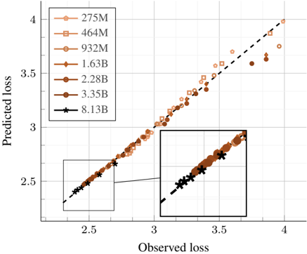
## Scatter Plot: Predicted Loss vs. Observed Loss for Different Model Sizes
### Overview
The image is a scatter plot comparing predicted loss against observed loss for various model sizes, ranging from 275M to 8.13B parameters. The plot includes a dashed diagonal line, representing perfect prediction. The data points are clustered around this line, with some deviation, particularly for smaller model sizes. An inset provides a zoomed-in view of the data points at higher loss values.
### Components/Axes
* **X-axis (Observed loss):** Ranges from approximately 2.3 to 4.0, with gridlines at intervals of 0.5.
* **Y-axis (Predicted loss):** Ranges from approximately 2.3 to 4.0, with gridlines at intervals of 0.5.
* **Legend (Top-Left):**
* 275M (Light Brown, Circle): Lightest shade of brown, circle marker.
* 464M (Light Brown, Square): Slightly darker shade of brown, square marker.
* 932M (Medium Brown, Pentagon): Medium shade of brown, pentagon marker.
* 1.63B (Medium Brown, Diamond): Medium shade of brown, diamond marker.
* 2.28B (Dark Brown, Circle): Darker shade of brown, circle marker.
* 3.35B (Dark Brown, Circle): Darkest shade of brown, circle marker.
* 8.13B (Black, Star): Black, star marker.
* **Diagonal Line:** Dashed black line representing perfect prediction (predicted loss = observed loss).
### Detailed Analysis
* **275M (Light Brown, Circle):** The data points are scattered around the diagonal line, with a tendency to underestimate the loss, especially at higher observed loss values.
* Observed loss range: ~2.4 to ~3.8
* Predicted loss range: ~2.4 to ~3.7
* **464M (Light Brown, Square):** Similar to 275M, the data points are scattered, with underestimation at higher observed loss values.
* Observed loss range: ~2.4 to ~3.8
* Predicted loss range: ~2.4 to ~3.7
* **932M (Medium Brown, Pentagon):** The data points are closer to the diagonal line compared to 275M and 464M.
* Observed loss range: ~2.4 to ~3.8
* Predicted loss range: ~2.4 to ~3.8
* **1.63B (Medium Brown, Diamond):** The data points are even closer to the diagonal line than 932M.
* Observed loss range: ~2.4 to ~3.8
* Predicted loss range: ~2.4 to ~3.8
* **2.28B (Dark Brown, Circle):** The data points are tightly clustered around the diagonal line.
* Observed loss range: ~2.4 to ~3.8
* Predicted loss range: ~2.4 to ~3.8
* **3.35B (Dark Brown, Circle):** The data points are very close to the diagonal line.
* Observed loss range: ~2.4 to ~3.8
* Predicted loss range: ~2.4 to ~3.8
* **8.13B (Black, Star):** The data points are almost perfectly aligned with the diagonal line.
* Observed loss range: ~2.4 to ~3.8
* Predicted loss range: ~2.4 to ~3.8
### Key Observations
* As the model size increases, the predicted loss becomes more aligned with the observed loss.
* Smaller models (275M, 464M) tend to underestimate the loss, especially at higher observed loss values.
* Larger models (2.28B, 3.35B, 8.13B) provide more accurate predictions, with the 8.13B model showing near-perfect alignment.
* The inset highlights the clustering of data points for larger models at higher loss values.
### Interpretation
The scatter plot demonstrates the relationship between model size and prediction accuracy. Smaller models exhibit greater deviation between predicted and observed loss, indicating lower accuracy. As the model size increases, the predictions become more accurate, converging towards the ideal scenario represented by the diagonal line. This suggests that larger models are better at capturing the underlying patterns in the data and making more accurate predictions. The 8.13B model performs exceptionally well, indicating that it has sufficient capacity to model the data effectively. The underestimation of loss by smaller models could be attributed to their limited capacity to capture the complexity of the data.