\n
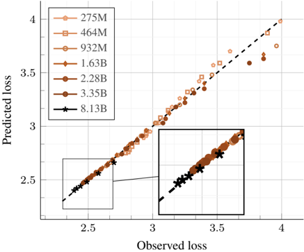
## Scatter Plot: Predicted Loss vs. Observed Loss
### Overview
This image presents a scatter plot comparing predicted loss against observed loss, with data points representing different model sizes (indicated by the legend). The plot appears to be evaluating the performance of a model, potentially in a machine learning context, by assessing how well its predicted loss aligns with the actual observed loss. Two regions are highlighted with black boxes.
### Components/Axes
* **X-axis:** "Observed loss" - Scale ranges from approximately 2.4 to 4.0.
* **Y-axis:** "Predicted loss" - Scale ranges from approximately 2.4 to 4.0.
* **Legend:** Located in the top-left corner. Contains the following data series labels:
* 275M (Light Orange, Circle Marker)
* 464M (Orange, Circle Marker)
* 932M (Darker Orange, Circle Marker)
* 1.63B (Brown, Circle Marker)
* 2.28B (Dark Brown, Circle Marker)
* 3.35B (Very Dark Brown, Circle Marker)
* 8.13B (Black, Asterisk Marker)
* **Highlighted Regions:** Two rectangular regions are highlighted with black borders.
### Detailed Analysis
The plot shows a general upward trend, indicating that as observed loss increases, predicted loss also tends to increase. However, the relationship isn't perfectly linear.
* **275M:** (Light Orange) - Data points are scattered, mostly concentrated between observed loss of 2.5 and 3.5, and predicted loss of 2.5 and 3.5.
* **464M:** (Orange) - Similar to 275M, but with a slightly wider spread and extending to higher observed loss values (up to ~3.8) and predicted loss values (up to ~3.8).
* **932M:** (Darker Orange) - Data points are more densely clustered, extending to observed loss of ~3.8 and predicted loss of ~3.7.
* **1.63B:** (Brown) - Data points continue the trend of increasing spread and higher loss values, reaching observed loss of ~4.0 and predicted loss of ~3.9.
* **2.28B:** (Dark Brown) - Data points are concentrated in the upper-right quadrant, with observed loss ranging from ~3.0 to ~4.0 and predicted loss ranging from ~3.0 to ~4.0.
* **3.35B:** (Very Dark Brown) - Data points are similar to 2.28B, but with a slightly more pronounced upward trend.
* **8.13B:** (Black Asterisk) - Data points are concentrated along a dashed black line, indicating a strong correlation between predicted and observed loss. Observed loss ranges from ~2.5 to ~4.0, and predicted loss ranges from ~2.5 to ~4.0.
Within the first highlighted region (bottom-left), the data points for the smaller models (275M, 464M, 932M) are visible. The second highlighted region (bottom-right) contains data points for the larger models (1.63B, 2.28B, 3.35B, 8.13B).
### Key Observations
* The larger models (especially 8.13B) exhibit a stronger correlation between predicted and observed loss, as evidenced by the points clustering around the dashed black line.
* The smaller models show more scatter, suggesting less accurate predictions.
* The highlighted regions emphasize the difference in behavior between smaller and larger models.
* The dashed black line represents a perfect prediction (predicted loss = observed loss).
### Interpretation
The plot suggests that model size significantly impacts the accuracy of loss prediction. Larger models are better at predicting their own loss, while smaller models exhibit more variability. This could be due to several factors, such as increased model capacity, better generalization, or more stable training dynamics in larger models. The dashed line serves as a benchmark, and the deviation of data points from this line indicates the error in prediction. The two highlighted regions visually separate the performance of smaller and larger models, reinforcing the observation that model size is a key factor in prediction accuracy. The trend suggests that as model size increases, the predicted loss becomes more aligned with the observed loss, indicating improved model calibration.