## Scatter Plot: Predicted vs. Observed Loss Across Model Sizes
### Overview
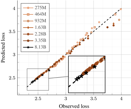
The image is a scatter plot comparing "Predicted loss" (y-axis) against "Observed loss" (x-axis) for machine learning models of varying sizes. A dashed diagonal line represents perfect prediction (where predicted loss equals observed loss). The plot includes a main chart and a zoomed-in inset focusing on the lower-left region. The data points are color-coded and marked with distinct symbols according to model size, as defined in a legend.
### Components/Axes
* **X-Axis:** Labeled "Observed loss". The scale runs from approximately 2.5 to 4.0, with major tick marks at 2.5, 3, 3.5, and 4.
* **Y-Axis:** Labeled "Predicted loss". The scale runs from approximately 2.5 to 4.0, with major tick marks at 2.5, 3, 3.5, and 4.
* **Legend:** Located in the top-left corner of the main chart. It defines seven data series by model size, each with a unique color and marker symbol:
* `275M`: Light orange circle (○)
* `464M`: Light orange square (□)
* `932M`: Medium orange circle (○)
* `1.63B`: Dark orange circle (○)
* `2.28B`: Dark orange circle (○) - *Note: Same marker as 1.63B, color appears slightly darker.*
* `3.35B`: Dark brown circle (○)
* `8.13B`: Black star (★)
* **Reference Line:** A black dashed diagonal line runs from the bottom-left to the top-right corner, representing the line of perfect prediction (y = x).
* **Inset:** A rectangular zoomed-in view is positioned in the bottom-right quadrant of the main chart. It magnifies the region where Observed loss is between approximately 2.5 and 3.5, providing a clearer view of the dense cluster of points in that area. A thin black line connects the inset to its corresponding region on the main plot.
### Detailed Analysis
* **Data Distribution:** All data points cluster very closely along the dashed diagonal reference line. This indicates a strong, positive linear relationship where the predicted loss values are highly accurate estimations of the observed loss values.
* **Trend by Model Size:** The trend is consistent across all model sizes (from 275M to 8.13B parameters). There is no obvious visual separation or systematic deviation of one model size's points from the line compared to others.
* **Inset Detail:** The inset confirms the tight clustering in the lower loss range (2.5 - 3.5). The black star markers for the largest model (`8.13B`) are visible within this cluster, intermingled with the circles of other model sizes.
* **Range of Values:** The observed and predicted loss values for the plotted data range from approximately **2.5 to 4.0**. The highest values (near 4.0) are associated with the `275M` and `464M` models (light orange circles and squares). The lowest values (near 2.5) are associated with the `8.13B` model (black stars).
### Key Observations
1. **High Predictive Accuracy:** The most salient feature is the exceptional alignment of all data points with the y=x line. The prediction error appears minimal across the entire displayed range.
2. **Model Size vs. Loss:** There is a visible trend where larger model sizes (e.g., `8.13B`, `3.35B`) tend to have data points concentrated in the lower-left (lower loss) region of the plot, while smaller models (`275M`, `464M`) have points extending into the upper-right (higher loss) region. This suggests that, for this task, larger models achieve lower loss values.
3. **Consistency:** The relationship between predicted and observed loss is remarkably consistent; no single model size shows a pattern of over-prediction or under-prediction relative to the others.
### Interpretation
This chart serves as a validation plot for a loss prediction model. The near-perfect alignment of points along the diagonal demonstrates that the method used to predict loss is highly reliable and accurate for models ranging from 275 million to 8.13 billion parameters. The underlying data suggests a core finding: **model scale correlates with performance** (lower loss), and this performance can be predicted with high fidelity. The lack of outliers or heteroscedasticity (increasing spread) indicates the prediction method is robust across the evaluated scale. The inset is a technical detail to assure the viewer that the apparent tight fit is not an artifact of the plot scale but holds even upon closer inspection of the densest data region.